Conversion Optimization
Top 29 Cart Page Designs For 2025 (Examples)
October 7, 2025


The average cart abandonment rate across all industries is around 69.57%.
eCommerce businesses must keep trying new things to decrease these cart page drop-offs.
The first step: designing carts better 🙂
Just a heads up, this post also covers:
8 Critical Cart Page Challenges to Avoid
Here are the 29 best cart design templates to consider for your own eCommerce store:

What we love:
Key takeaway: Make your basket page act like an in-store employee by offering expert advice and services (like providing delivery dates, extra info about product sizes, free samples, etc.).

What we love:
As part of their shopping cart design ideas, Smyths offers multiple shipping and delivery options. However, the details are not crowded in one place:
Key takeaway: Cart design with intelligent font formatting and lots of whitespace aids scanning.

What we love:
Key takeaway: Offer editing options in your shopping cart UI, to improve the shopping experience.

What we love:
Key takeaway: Make it really easy to check in directly from the cart page – so you can create more personalized offers.

What we love:
Key takeaway: Offer samples on your shopping cart page, to create a really unique value proposition.

What we love:
Key takeaway: Minimize the amount of text in your cart page layout by using dropdowns, and making all non-essential text smaller.

What we love:
Key takeaway: Use vibrant but non-intrusive in-page pop-ups in your shopping cart, to spotlight important messages.

What we love:
Unlike other shopping cart design templates out there, Crate & Barrel offers shipping info in 4 ways:
Key takeaway: Pull focus on important messages by using contrasting colors and intelligent iconography while exploring cart design ideas.

What we love:
No matter what cart design ideas you explore, you need to make sure yours has a distinctive appeal like Topicals’:
Key takeaway: Keep your cart page design to reflect your brand ideals – like Topicals does by giving off a laid-back premium vibe.

What we love:
Key takeaway: If you offer international shipping or different taxes by areas, make sure your cart design reflects the currency/amount changes.
Pro Tip: For countries where English isn’t the primary language, keep the cart page design copy simple to make it easy to translate through tools.

What we love:
Key takeaway: Tweak your cart design to intelligently upsell as well as downsell without causing information overload.

What we love:
Key takeaway: Use the cart icon to remind shoppers of cart items, when they're browsing beyond the shopping cart.

What we love:
Key takeaway: Include information about stock levels as well as shipping methods on your wesbite shopping cart.
We recommend you read: eCommerce Website Design: 17 Conversion-Boosting Principles

What we love:
Key takeaway: Avoid leading to a separate cart page – instead, turn your cart into a checkout page.

What we love:
Key takeaway: Give space for consideration and scrutiny on the cart page – with sufficient urgency triggers.
Don't forget to read: 21 Last-Minute Mother's Day Marketing Ideas For eCommerce Stores

What we love:
Key takeaway: Design your cart page well, but include the right kind of information, so shoppers don’t feel anxious.

What we love:
Key takeaway: Remind shoppers only about offers they can immediately apply to their shopping carts.
You must also check out: eCommerce Product Catalog: Common Mistakes + How To Fix Them

What we love:
Key takeaway: Close the conversion path by helping shoppers pick up where they left off in their previous shopping browsing session.
You should also read: eCommerce Product Categorization: 10 Scientific Approaches

What we love:
Key takeaway: Give a detailed cost breakdown in the first fold, to maintain cost transparency.
You should also read: 17 Top eCommerce Mobile Site Examples (Not Your Usual Brands)

What we love:
Key takeaway: Design your cart page to put focus on product images, along with trust badges – this will make shoppers feel more secure.
You must also read: How To Use Visual Commerce To Improve Conversions

What we love:
Key takeaway: Reaffirm what makes your brand unique with iconography and some user-generated content in your cart template.

What we love:
Key takeaway: Never skip key product details in your cart page's product summary section.
You must also read: High-Converting Mobile Homepage Blueprint For eCommerce

What we love:
Key takeaway: Prime your shoppers for the next purchase through your shopping cart design – note how Quip brings out the benefits by showing a way lesser “next refill total” in the subtotal.

What we love:
Key takeaway: You don’t always have to have a full cart page – a small but effective pop-up mini cart with brilliant copy also works.
You'll love reading: How to Increase Add to Cart Rate: 26 Brilliant Ideas

What we love:
Key takeaway: You don’t always need to include every “high-converting” element on your cart design template—include elements that will help them check out faster (like the themed product recommendations and slashed pricing all within one pop-up).

What we love:
Key takeaway: Show a progress bar in your cart template if you cater to subscriptions – it helps reduce information clutter.

What we love:
Key takeaway: Give customers instant gratification by displaying coupons, right below the product summary.

What we love:
Key takeaway: Create the need to sign-in and reserve a product, by creating tease elements in your cart page template.

What we love:
Key takeaway: Make sure shoppers know if there’s a custom return and shipping policy for a particular product on your cart page.
Also read: Why A Website Redesign Won't Increase Your eCommerce Conversion Rate
An order summary on your cart page acts as a nudge for customers to complete the purchase without abandoning it.
Without an order summary, customers have no way to trust you at the last stage.
How to solve:
Use a product image.
If customers don’t get the ‘What you see is what you get’ feeling, they will abandon their carts.
Warby Parker uses a captivating product image in their cart page template:

Break down costs.
28% of customers will abandon their carts if they see unexpected shipping costs.
Give a breakdown of the taxes, shipping, product price, and delivery charges(if any).
Dollar Shave Club in their cart example comes clean with the subscription billing, shipping, and tax (calculated at checkout):

Make it easy for customers to edit.
Provide options to edit the size, type, quantity, and variation to reduce a poor UX.
See to it that the edit in order summary reflects the pricing changes in real-time.
Unsurprisingly, 54% of customers say their expectations with customer support have doubled this year.
Including customer support details can stop customers from abandoning their carts owing to queries and hesitations.
How to solve:
Make customer support microcopy / icon easily spottable.
In their shopping cart template, Marc Jacobs mentions the customer support details below the checkout button with microcopy that's hard to miss.

Offer a sticky chat button.
81% of customers prefer live chat support for the convenience it offers.
Case in point, Industrial Hardware includes a simple live chat bubble on the bottom left side of the screen which doesn’t affect the shopping experience.

Pro Tip — Optimize your site for mobile with one-tap action. Tapping on a phone number will open the phone dialer while an email address opens the email app.
Check out this practical guide: eCommerce Website Optimization: 28 Improvements You Can Make Today
Cyber frauds have become a menace with 18% of customers citing trust issues in sharing credit card information as the reason.
If your eCommerce cart page design has to convert better, you’ve got to consider this.
How to solve:
Add an SSL certificate.
The SSL is a digital certificate that will verify your website’s identity and create an encrypted connection for your customer’s data. You can get SSL certification from a valid authority.

Authorize transactions only from legitimate payment gateways
Add a trust badge on the cart page to ensure customers don’t withhold their decision at the last minute.
Godiva includes a Norton trust badge as proof in their shopping cart template:

In a quest to make customers purchase, don’t forget to make product recommendations and increase your AOV.
Without these, shoppers often spend a lot less time in the cart.
How to solve:
Make the upsell subtle.
Here’s an example of displaying product recommendations on the cart page without going hard.

Feature slow sellers as cross-sell nudges.
One way to do this in your eCommerce cart design is to offer smart product bundles at a discounted price. Take a look at how Terra Origin does this:

Use a downsell nudge for cart abandoners.
Use the price point as a difference so cart abandoners have an alternative. Crutchfield does this with an open box version and a version with a dent below

Pro Tip — Ensure you:
Long checkout and complicated forms are the reason 17% of customers abandon their carts. In the event leading to checkout, brands have to make it easy for customers to inspire confidence.
How to solve:
Use action words to inspire checkout.
Ditch the plain old statements like ‘Next’ and use verbs like ‘Take me to checkout’ and ‘Keep shopping’. This creates a subconscious trigger compelling users to act.
Bed, Bath, & Beyond uses ‘Are you ready to checkout?’ which is a nudge to drive users to take action.

Reframe some key CTAs.
High Sierra uses a 'Continue Shopping' CTA to compel users to look for more items—instead of the traditional “go back” or just a back button:

Pro Tip — Make sure your ‘proceed to checkout’ CTAs are bigger than ‘Continue Shopping’ CTAs so that customers are influenced to complete conversions.
Recommended reading: 24 Scientific Strategies to Increase your eCommerce Conversion Rate
Your shopping cart design template won’t rake in the conversions if there’s no obvious urgency—shoppers will assume they can use their own sweet time to compare, consider and buy.
How to solve:
Use the “timer” approach.
The majority of shoppers add items to their shopping cart and forget. ASOS adds a reminder that the items in the cart will disappear after an hour.
You can also feature a limited time offer.

Drive checkout with scarcity triggers
A scarcity alert mentions the items in stock. Etsy makes it even better by mentioning the number of people who have added it to their cart:

You'd also love to read: Why Is Your Conversion Rate Low: Possible Causes + Solutions
Not seeing the preferred choice of payment on the checkout is the biggest upset for customers.
A connected problem is not having a faster checkout through a popular payment method.
How to solve:
Offer more payment options.
Nearly 7% of customers abandon their carts because their preferred payment method wasn’t offered.
Familiarity is one of the effective forms of social proof that drives conversions.
Adidas offers six payment methods on its checkout page.

Make express checkout a standard in your store.
45% of customers use BNPL methods to buy products they can't afford.
BNPL payments are usually interest-free with repayment periods spanning over a six-week term.
UnderArmour offers 4 interest-free payments on Klarna in its cart page design to enable faster checkout.

Pro Tip — Offer two to three BNPL options so that customers have ample choice within the cart page template.
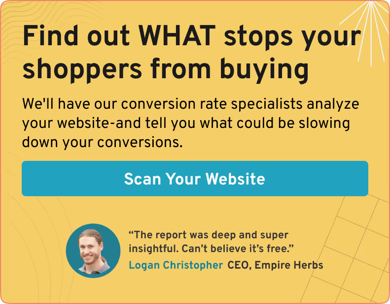
98% of visitors who visit an eCommerce site—drop off without buying anything.
Why: user experience issues that cause friction for visitors.
And this is the problem Convertcart solves.
We've helped 500+ eCommerce stores (in the US) improve user experience—and 2X their conversions.
How we can help you:
Our conversion experts can audit your site—identify UX issues, and suggest changes to improve conversions.
Subscribe for more articles like this!

Read by 5000+ ecommerce store owners
.svg)

.svg)

.svg)
.svg)
2025 Convertcart, All Rights Reserved
33/1, Castle Street, Ashok Nagar, Bengaluru, India
