Conversion Optimization
The Most Powerful CTA Phrases in eCommerce
March 7, 2023


It’s 2026 and “what color should my CTA button be?” is perhaps one of the last thoughts on an eCommerce leader’s mind.
The reason: there are way more critical problems to solve through CTA button optimization than meets the eye.
For example, brands that sign up for our free audits, often bring up CTAs being buried within their mobile experience — or that they’ve tested a lot but haven’t seen meaningful improvements.
And that brings us to writing this piece, which isn’t just about throwing out phrases that we’ve seen bring in conversions — but also telling you about the science behind them.
So, here we go!
In our work around free site audits for eCommerce brands across niches, one consistent pain point we’ve noticed is how shoppers struggle at entry points.
The idea here is not to assume that everyone who visits the first time only has the intent to research or explore.
By using a call to action prompt like “Get 50% off Your First Order”, you create a low-risk entry point for early but high-intent shoppers trying to engage with your brand.
Where to use these call to action words:
👉 On the product page (when shoppers try to subscribe) - let it show up as a CTA when shoppers check the radio button against subscriptions, so that the value of subscribing registers more clearly.
👉 Ad landing pages - this is a great way to capture the interest of top of the funnel traffic, especially for niches where competition is high.
👉 Homepage hero header - though it may seem a bit aggressive, if you’re currently working with the goal of customer acquisition without sending costs associated with it sky high, this call to action phrase works well.
Darwin’s Pet, for example, shows this CTA phrase on the hero image itself, but leads early shoppers into a collections page featuring all their products as well as necessary filters. This placement, aimed at acquiring new customers, makes it one of the best pet eCommerce CTA examples:

Caveat: Some shoppers may just grab the 50% off and churn immediately. To counter this, set:
Price weighs heavy on eCommerce shoppers, even when there’s a “claim x% off” call to action button involved.
But a claim mystery discount / offer shifts the shopper’s attention from price to experience — and this in turn, helps shoppers engage without too much thought, especially early in the funnel.
Some scientific trivia: The information gap theory suggests that human beings experience a natural tendency to close knowledge gaps wherever they appear.
Where to use this call to action phrase:
👉 Homepage hero section - but only when there’s a massive seasonal campaign like Black Friday running or coming up soon.
👉 Pop-ups (both for entry & abandoning visitors) - for the former, choose 5–10 seconds on site or 20–30% scroll depth, and for the latter, trigger for rapid back-to-the-top scrolling and quick cursor movement towards the “close tab” option or URL.
Hair & scalp care brand Jupiter uses this high-converting CTA phrase after a new visitor has stayed on the homepage for about 12 seconds. What additionally works well is the engagement they create through the multi-choice answers, which when a shopper selects from, they feel more invested in clicking the CTA button:

Caveat: Too many steps = friction — and by that we mean how easy it is for shoppers to use the code or apply the discount, has an equally important effect on final conversions.
🔥 Pro Tip: Mention a "guaranteed minimum" in the microcopy to inspire more clicks — something like “Claim Your Mystery Savings (Guaranteed Min: $20)”
If you run an eCommerce brand that stocks limited edition products or uses frequent collaborative launches to engage traffic & wheel in conversions, this is for you.
Exclusivity is often a big reason why shoppers convert across eCommerce stores — even more so when multiple credible brands come together to launch or re-launch a collection or product.
Where to use these call to action words:
👉 Homepage first fold - if the launch is just around the corner, then this position grabs more eyeballs, even if shoppers don’t buy right away.
👉 Homepage second fold - this can be relevant for brands that stock evergreen products across collaborations, and more so if they’re able to showcase the logos of the collaborators.
👉 Separate category page - whether you’re inviting paid traffic or not, a separate collections page with enhanced schema markups can bring in quality, high intent traffic for more clicks to happen.
Accessory brand Enso Rings, which sells silicone rings, features this CTA button callout further down the homepage, along with logos of their key collaborators. This acts as instant social proof for shoppers who may not know the brand just as yet. Additionally, they have positioned this section between one that talks about how many rings have been sold till date and another on 5-star reviews:

Caveat: Not showing collaboration logos dynamically to shoppers based on behavior can backfire in terms of CTA button clicks — the reason is shoppers are looking for brands that they can most relate with.
Out of the 500+ stores we’ve audited and worked with long-term, many have seen low conversions despite a decent site navigation system.
Across at least 30% of them, the real issue was that shoppers were experiencing decision fatigue in real time.
“Shop our Bestsellers” is a call to action phrase that resolves this effectively for shoppers with all kinds of intent (whether they’re comparing or ready to buy).
Where to use this call to action prompt:
👉 Emails in the welcome series - use this call to action as you begin to start sending transactional emails to those who’ve just joined your email list.
👉 Consistent banner across collection pages - imagine it as an additional filter that shoppers can quickly “go to” if they’re feeling too fatigued to keep exploring.
👉 Homepage hero header - while effective around the year, the impact is more during gift-buying seasons or even soon after the launch of a new product collection.
Jewelry brand Kimai uses this call to action example in the hero header of the homepage. And this we feel, is for good reason. Jewelry shoppers often turn out to be comparison shoppers, and when they arrive at a store like this, their first thought is: “Oh, I’ve never bought from here…what’s everyone else liking?”:

Caveat: Though there may be enough click-throughs on a CTA like this, if the landing page doesn’t feel curated, conversions won’t roll in — shoppers, after all, don’t want to see a dump of high-selling SKUs.
This is classic call to action copywriting that averts the “loss bearing” mentality most shoppers walk in with — even when they’re very willing to spend.
Compared to “Buy Now”, this presents a lower psychological barrier, making “exploration” the key outcome rather than “spending”.
However, it needs careful framing to avoid confusion or disappointment.
Where to use this call to action phrase:
👉 Product pages offering samples / trials - if you’re niches like furniture or eyewear, pay-for-shipping swatches or try-at-home packs can get more traction with this CTA.
👉 High-consideration product pages - again, if you’re into tech or fitness equipment, and some of your products need customization before a final purchase can be made.
👉 Homepage when a product has come back stronger - think of the best bestseller becoming even better, or any product that’s worth hyping about across socials and forums.
Men’s grooming brand Every Man Jack, for example, sells their antiperspirant deodorant like hot cake. And that makes for excellent reason for the upgraded version to be touted on the header with “Try It Now” - one of the most proven eCommerce CTAs.

Caveat: If transparency is an issue and shoppers feel misled — that is, if “try” still requires a full purchase without clear refund info, it can feel like a bait-and-switch.
With this call to action nudge, reciprocity bias is super high — when people get something for free, they often feel more inclined to buy later (or upgrade).
But clearly, it’s not meant for high-cost, low-margin products where every free unit costs you a lot (across niches like furniture, electronics, luxury goods etc.)
Where to use this call to action prompt:
👉 Product pages that carry subscription models - much easier if you’re a subscription brand because by default your product pages will be suited to this.
👉 Product pages that feature newly launched products - this can be especially useful if you sell skincare, makeup or even razors.
👉 Homepage below the fold - for early-in-the-funnel shoppers, this can deepen exploration within a step, leading them towards a quiz or customization.
Furniture brand Plush & Oak positions their “Try it for Free” CTA alternative in the second fold of the homepage. To get more clicks, they even do a visual showcase of shades & materials alongside. When someone clicks, they’re led to a collection page with all swatches as well as related swatch collections:

Caveat: Make sure you allay hidden cost objections early on — for example, if shoppers find out later that shipping isn’t free, they’d be quicker to bounce.
Ever thought of creative call to action ideas that are both powerful and delicate.
According to the tests we run, “Compare Pricing” certainly falls in that league. Because instead of pushing a sale, you’re inviting shoppers to evaluate options. This lowers resistance because people don’t feel forced to buy.
Where to use these call to action words:
👉 Within the primary navigation bar - if you generally have a complex catalog with several high-priced categories, this a great tool to showcase right where many shoppers are beginning their search.
👉 On product pages with different pricing plans - this is also applicable if you have product pages where prices vary by size or features or both.
👉 Across collection pages - as a secondary CTA to reduce scroll fatigue for shoppers (for more insights, make sure to go through CTA A/B test results.)
Eyewear brand GlassesUSA uses an alternative of the “Compare Pricing” call to action through “Similar Frames”. When you click on it, a sidebar with similar recommendations open up, along with each product’s price in clear view:


Caveat: Too many options can paralyze shoppers. If your comparison includes 8 products, people may stall out instead of choosing.
It’s 2025 and 82% of shoppers would still pick free shipping over expedited shipping.
So, it’s really anyone’s guess why “Claim Free Shipping” has made it to this list of best CTA phrases in eCommerce.
It mainly works because it reframes shipping as a gain and not an absence of cost.
So, instead of making shoppers think “you won’t pay for shipping,” it says “you’re getting something.”
Where to use this call to action example:
👉 In the mini cart / cart drawer - if, let’s say, the shopper has $42 in their cart, you can show them a CTA with “Claim Free Shipping with $8 more” which when clicked takes them to a curated list of add-ons priced between $8 and $15 (a range ensures you can aim for a higher AOV).
👉 At checkout - as a timed box with recommendations that are otherwise higher priced but are now $X to help the shopper meet the “Free Shipping” condition.
👉 On special sale pop-ups - can especially work well for well-known sale events like Father’s Day or Back-to-School sales.
Stopbox, an eCommerce brand that specializes in portable, mechanical quick-access firearm storage solutions, uses this call to action button on their summer sale pop-up. The reason it works well is because the brand is smart enough to offer various incentives within the pop-up copy and “Claim Free Shipping” is the icing on the cake:

Caveat: Don’t overuse it. If it’s plastered everywhere, it stops feeling special — best to deploy it contextually (like across the cart drawer, upsell pop-ups).
Amongst the best CTA catchphrases we’ve used to test for eCommerce brands is “Build a Bundle”.
It makes it to this list because it has a palpable effect on shopper sentiment — at one go, it’s interactive, personalized, and value-driven — rather than just “buy more.”
The heightened experience of playing an active role in getting the bundle together is also another thing that high-intent shoppers typically love.
Where to use this high-converting CTA:
👉 On the homepage - feature a hero section saying “Build Your Perfect Bundle — Save 20%”, especially if this is a core sales strategy for your business (think skincare routines or coffee subscriptions).
👉 On collection pages - as a tile every few rows to appeal to those who have a habit of scrolling deeply (if multiple products appeal to them in the process, there’s a higher likelihood that they’ll click on the “Build a Bundle” CTA.)
👉 On product pages - as a secondary CTA beneath “Add to Cart”, especially if you’re showcasing a clear price / value advantage with the bundling CTA.
Keys Soulcare uses a bundling CTA callout on the homepage right below the first fold. Why this is highly compelling, especially for first-time visitors, is because the section is placed right beneath the “Welcome Offer” section, promising a higher incentive to those who sign up:

Caveat: Make sure people can’t use “bundle savings” AND other coupon codes simultaneously, or you risk eroding margins.
Times have changed and as of 2025, when brands combine the powers of social discovery and direct commerce, magic happens.
And that means a call to action button like “Shop our Feed” can do wonders for conversions and micro-conversions provided the right niches use it, and position it well across their store.
Where to use these call to action words:
👉 Under featured collections on the homepage - this way Shop our Feed” becomes a visual gateway to show how products look in real life, which can be a gamechanger in acquiring new customers.
👉 On the hero image in the product page gallery - for shoppers in the consideration stage, a segue into the feed from the image gallery can create more conviction instantaneously.
Hemp-based wellness brand Hempz uses this easy selling CTA right above their footer on the homepage. Since their “social wall” comes right above, clicking on this CTA button becomes more compelling for those deeply scrolling:

Caveat: It runs the risk of stale content — if you don’t update the feed, it can break trust.
Underrated as it may sound, “Shop All” is one of the best call to action buttons you can offer to someone who still doesn’t know what they exactly want.
Many stores we’ve audited have done away with it because they think it’s too generic — but if you ask us, we’ll tell you it’s all about how well you: 1) position it and 2) create context around it.
Where to use this call to action phrase:
👉 In the primary navigation menu - if your catalog comprises less than 50 products, this positioning becomes even more impactful and critical.
👉 On lookbook / guide pages - after every slab of content or a collection of images, a “Shop All” CTA can be highly compelling.
Highline Wellness does a stellar job at using this to help shoppers who want a more inclusive product discovery experience (beyond the bestsellers). What helps this scenario is the microcopy that creates instant context for someone scrolling:

Caveat: Don’t only rely on “Shop All.” Returning visitors, high-intent buyers, or segmented campaigns often respond better to precise CTAs (“Shop New Arrivals,” “Shop Gifts Under $50”).
Old as gold and more effective than many businesses would care to admit, this CTA has fetched real conversion success — when applied in the right contexts.
For one, it has the power to create urgency, especially when shoppers have an approach of “Oh, we’ll get to this later.” The subtle bit of FOMO it creates is often enough to convert higher intent.
Where to use this call to action prompt:
👉 Landing pages for flash sales - this is especially effective when you use other scarcity cues in a staggered way, ensuring that the information doesn’t look overtly pushy.
👉 On the homepage header - when a product is back in stock for a short time, provided you convey how fast it has always sold.
👉 In retargeting ads - when a slight nudge is needed for browsers to finish purchasing a product they’ve viewed many times before.
Smart wireless brake light brand Brake Free uses this eCommerce CTA inspiration on their notification bar first when a visitor lands, but because it can be missed, they further create context with an additional button in a separate section:

Caveat: If nothing about the offer is time-sensitive, the word now may feel artificial. Pairing it with genuine reasons to act (low stock, same-day shipping, special price) keeps it credible.
We’ve all heard how less can sometimes be more.
“Find Out More” is an eCommerce CTA example that falls seamlessly into this category — precisely because it comes with such low pressure for shoppers who’re in the discovery and consideration phases of the conversion funnel.
It is most effective at key decision-making points where shoppers have a “desire” — but it is to deepen exploration to know better or more about an individual product, a category or even a curated collection.
Where to use this call to action phrase:
👉 Category pages of high-ticket items - best used as secondary CTAs that shoppers can click.
👉 Homepage banners & headers - whether you’re prepping audiences for a product launch or a new collection has just arrived.
👉 Ad landing pages that carry educational content - especially helps with conversions if you have a distinct & clickable “Shop” button close by.
Cookware brand Ensembl brings in this call to action phrase to pique shoppers’ curiosity about the brand’s USP, leading them straight to the about us page.
The placement on the homepage is especially valuable because Ensembl is a relatively new cookware brand and even high-intent shoppers would love to know more about its principles:

Caveat: Using just the phrase “Find Out More” or its alternative “Explore More” as a standalone can be tempting, but without some context, shoppers may not experience the impetus to click. Ensembl above gets this right with the use of microcopy, which summarizes the “spirit” of the brand.
Be it first-time visitors or infrequent buyers, choice paralysis has a huge role to play in bringing down conversions.
And this is why when “Take the quiz” is a timely, well-placed actionable phrase in eCommerce, clicks, engagement and conversions go up.
The main reason behind this is that shoppers feel the recommended results are “for them,” which boosts their confidence in placing their bet on them. Even if two people get similar results, the process makes it feel tailored.
Where to use this CTA button phrase:
👉 Homepage navigation / header - easy to spot, especially when designed & color coded as a contrast.
👉 Category page call-outs - place a tile with this CTA phrase every few rows apart and make sure the tile looks structurally and visually different.
👉 Product page linked microcopy - a subtle & short one-liner under the product title, something like “Not what you’re looking for? Take the quiz”
Fragrance eComm brand Henry Rose uses a close derivative of “Take the Quiz” and uses it as “Meet your Match”. They make it less conspicuous though, and uses it as a second layer to their “Fragrance Finder” callout in the main navigation as well as a “Discover your scent” section on the homepage:

Caveat: Personal recommendation quizzes do best when brands limit the questions to a max of 7 (if you ask us, 5 is even better) and feature multi-choice answers. Beyond 7 questions, the drop-offs increase sharply.
Amongst the best call to action phrases is this one because even in a stock-out scenario, it gets shoppers with higher intent to get into the email list.
Anyone who clicks on such a call to action button is offering your business critical intent data, using which you can build & optimize retargeting campaigns in the future.
You don’t want to skip these calls to action in a stockout situation, because these leads are usually warmer than those who come through newsletter sign-ups.
Where to use this call to action prompt:
👉 Product page above the fold - wherever the “add to cart” button would be if the product was in stock.
👉 Category page listings - wherever the listing in question is out of stock, made more effective when strong visual cues indicate the product is either a “bestseller” or “awarded #1 for…”
👉 Homepage recommendation section - if you have dedicated section, it’s great to show this call to action phrase there, especially if you’ve been promoting how you’re stocking or selling limited quantities.
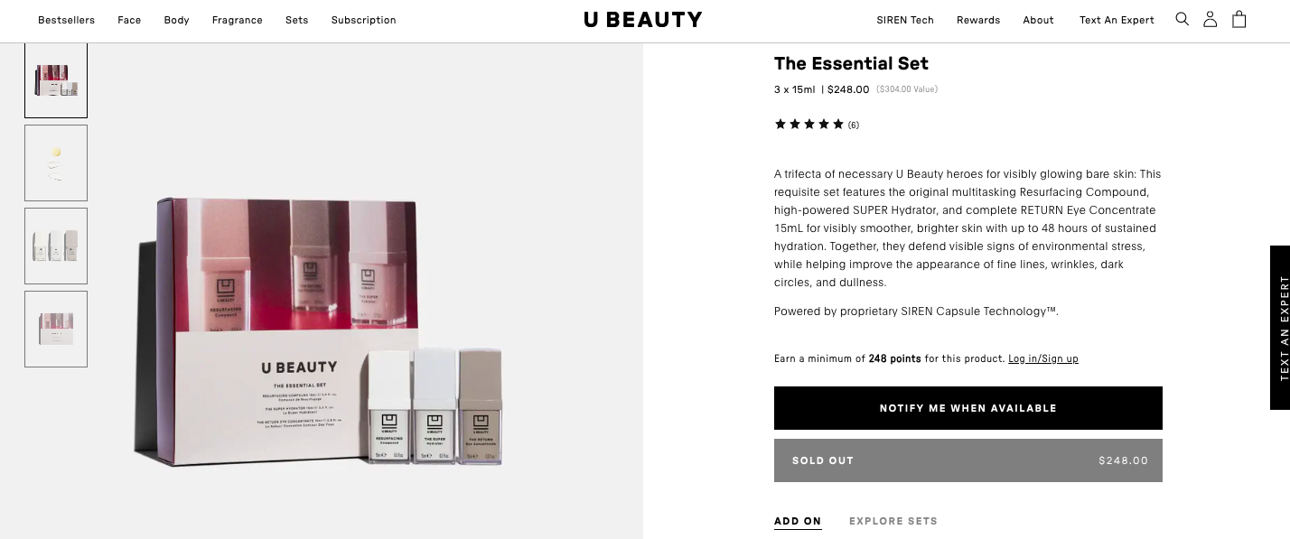
Skincare brand U Beauty capitalizes on this eCommerce call to action strategy, retaining an additional “Sold Out” call-out to ensure there’s no confusion whatsoever:
Caveat: If you notify everyone at once for a small restock, you risk frustrating buyers who still can’t get it.
🔥 Pro Tip: Make use of “tiered notifications” to tap into the highest conversion intent. In this approach, you alert your most engaged or most valuable shoppers first, then open the floodgates based on whether stocks continue to last.
When it comes to high-value products across niches like luxury and furniture, shoppers are naturally cautious.
And while sales & discounts continue to be effective in these spaces, they’re not the most important reason why people buy.
“Get Product Guide” is an ideal call to action phrase for such a scenario — especially if it’s positioned intelligently across the site.
Where to use this call to action phrase:
👉 On a bundle collection page - the guide can explain how to choose the right combo, while elaborating how individual products in the listings work & who they’re ideally for.
👉 On the homepage (but mid-scroll) - this way such non-transactional content doesn’t need to be prioritized over more transactional call to action buttons (to be placed on the hero header).
👉 On season-specific pages / categories - for example, a variation can be “get the holiday guide” when you’re featuring multiple new seasonal categories in the store’s main navigation.
Modular workspace solution brand Room, for example, features products that come with complex specifications, features and even customization possibilities. This makes it absolutely crucial for the brand to promote a product guide, not only to build an email list, but also to nurture customers who may take a longer time to convert:

Caveat: Don’t position this call-to-action button in a way that it hides a clear purchase path. Instead, like Room does, keep it distinct yet out of the way of immediate purchase / seeking customer support decisions.
This is a CTA phrase that appeals to both early stage and mid-stage shoppers with your brand. For the former, it’s all about experiencing your brand through a giveaway or contest before actual purchases are made.
For the latter, it’s the anticipation to win big so that one can buy big eventually.
The reason why an eCommerce call-to-action like ‘Win $200” gets more traction is because it’s way more specific than something like “Get Rewards” or “Join & Save”.
A win for your brand too, because it lets you collect emails (or phone numbers) without guaranteeing a discount to every single person who fills the form.
Where to use this CTA button phrase:
👉 Loyalty engagement pop-ups & emails - engage existing customers either offering them early access to a contest over email or showing them a pop-up for contest entry (with no minimum spend threshold required for it.)
👉 Social media landing pages - this can be especially fruitful during slower sales periods, and you have to bring in & engage traffic first before conversions happen.
We’re back with a CTA button example from office pod brand Room, which sells highly functional yet expensive products. For such a brand, a call to action like this is interesting both for first-time engagement as well as those who’ve been considering buying from the brand for a while:

Caveat: The prize $ needs to feel credible and trustworthy for the call to action phrase to get attention & traction — on one hand, if the reward seems too good to be true, shoppers may doubt the legitimacy. On the other, if it’s too small or vague, it won’t motivate action.
Do you run an eCommerce brand of high-consideration products?
Then “Book a Free Consult” is one of the best eCommerce CTAs that you can test and play with.
It reframes selling as helping and signals personalized attention — both of which are critical if you want to gently nudge shoppers down the conversion funnel.
Where to use this CTA button phrase:
Around sections on “building a routine / regimen” - choice paralysis is real because shoppers often don’t have subject matter expertise especially when they’re trying to buy elevated skincare, makeup, home decor or wellness solutions.
Under upsell nudges - this is especially applicable for tech, gadgets and fitness equipment where an expert suggestion can in fact help shoppers convert at a higher price threshold.
On the about us page - holds true especially for niches like jewelry, luggage and hair tools, where early-in-the-funnel shoppers are still building trust.
Flower delivery brand FlowerBX shows an alternative through “Contact our Team”, around the section on customization and “bespoke” arrangements. This positioning is especially compelling for shoppers with higher intent to purchase for higher values (though the only bit we don’t approve of is the lack of visual importance given to either of the CTAs):

Caveat: Consults add an extra step before purchase — great for high-value sales, but could hurt speed on lower-value items.
More and more eCommerce stores are becoming inclined to capture intent data to improve targeting across the funnel.
That’s where a call to action catchphrase like “Add a Reminder” has a big role to play - it acts as an engagement milestone without needing the shopper to buy immediately.
Where to use this call to action example:
On the product page - if an item is low-stock, seasonal, or coming soon.
On sale banners - especially if an anniversary sale or flash sale is coming up, this is effective in making the shopper feel like you’re taking their consent to send updates.
Inside the cart - instead of nudging them to wishlist if they’re ready to abandon the cart, an “add a reminder” CTA can target more serious intent to buy differently.
Yet another flower delivery brand, Bloom & Wild, makes it to our list because of the ingenious way in which they make this call to action clickable. By adding 3 reminders, a shopper can unlock a £5.

Caveat: On evergreen products with no urgency, it might encourage “I’ll buy later” rather than “I’ll buy now.”
65% of shoppers are interested to know if an eCommerce brand “acts” in a socially / environmentally responsible manner.
And that makes this call to action copy such an important piece of the puzzle, whether you’re into real estate, supplements or makeup.
Where to use this call to action example:
On the homepage - towards the end of the page, after you’ve lined up more transactional content.
On the thank you page - this can actively avert buyer’s remorse once an order is confirmed.
On product pages - let it come somewhere towards the end of the second scroll, so that it does not distract content that’s more directly related to the immediate product in question.
Watch brand Original Grain creates a separate section towards the end of the homepage where they can feature this eCommerce CTA. What truly makes this clickable is the context the brand creates through the headline and the microcopy:

Caveat: Always back statements with real evidence, certifications, or third-party validation — “impact washing” can erode customer trust.
If swapping this verb for that was the main challenge around creating the best CTA examples across eCommerce brands, everyone would've converted more.
Since that's not the case, let's look at strategies that you'd want to consider if you really want those clicks going — and from there, conversions too.
Too many brands forget that shoppers across the funnel won't respond equally to a "Shop Now" button.
The idea is to show copy that a shopper will readily resonate with, based on where they are in their journey in the store.
For example: if the shopper is in the discovery stage, "See the Difference" is more likely to induce clicks than "Buy Now".
This is especially true when you attach a CTA to a slab of product content or a section of UGC. In such scenarios, click worthiness increases, when shoppers are able to close the knowledge gap with what they see on the CTA.
For example: "Help me Choose the Right Size" is often way more directional than "Learn More", if what precedes is a content on how a brand customizes its products.
Since CTAs need to be short and smart, context-building is essential. And relevant microcopy, with *key highlights* can actually assure shoppers enough to click.
For example: If your CTA says "Try it Free", your microcopy needs to elaborate on how a shopper can "Cancel anytime—takes just 1 click."
Instead of just a verb, anchor your CTA in what the shopper gains right now.
This allows a typical shopper's benefit-driven mindset to run free and build on anticipation, instead of staying locked up in "transaction" mode.
For example: “Get Recipes with this Ingredient” (for F&B brands) is likely to garner more interest than just "Get Recipes".
98% of visitors who visit an eCommerce site—drop off without buying anything.
Why: user experience issues that cause friction for visitors.
And this includes CTAs that are either mis-placed or under-optimized.
This is one of the most critical problems Convertcart solves.
We've helped 500+ eCommerce stores (in the US) improve user experience—and 2X their conversions.
How we can help you:
Our conversion experts can audit your site—identify UX issues, and suggest changes to improve conversions.
Subscribe for more articles like this!


Read by 5000+ ecommerce store owners
.svg)

.svg)

.svg)
.svg)
2026 Convertcart, All Rights Reserved
33/1, Castle Street, Ashok Nagar, Bengaluru, India
