Target specific missions: Aim for "men’s waterproof hiking boots" over broad terms like "boots" to win high-intent shoppers.
Greet them above the fold: Use clear H1s and intro copy to confirm they’re in the right place instantly.
Clean indexing: Prevent "thin" filter-generated pages from cluttering your search footprint.
🧭 UX: Reduce Load, Increase Momentum
Prioritize smart filters: Show only the 4-5 filters that actually help a human decide faster.
Default to popularity: Sort by "Best Sellers" to show the user what the community already trusts.
The 5-second scan: Design a visual hierarchy that makes your variety and price range clear at a glance.
💰 Conversion: Turn Browsing into Decisions
Use decision shortcuts: Add "Editor’s Pick" or "Top Rated" badges to help indecisive shoppers act.
Social proof early: Display star ratings and review counts directly on the product grid.
Value at a glance: Show pricing and key differentiators without forcing a click to the product page.
In 2026, the rules for what makes a category page actually convert have shifted considerably.
We've spent years auditing category pages across hundreds of US eCommerce stores, and the gap between what founders think is working and what the data actually shows is, frankly, startling.
eCommerce category page SEO is the process of optimizing product listing pages so they rank for high-intent commercial queries, "running shoes for men," "wireless headphones under $100," "linen bedding queen size," the kinds of searches people make when they are ready to buy but haven't yet chosen what.
It involves tuning on-page elements like title tags, H1 headings, and URLs, building a site structure that search engines can follow without getting lost, and creating an experience that doesn't send shoppers fleeing back to Google.
What eCommerce Category Pages are Converting Now in 2026?
1. All Major Categories Showcased as Filters
Studies show that stores that align category page layout with shopper intent see up to 30% lower bounce rates and significantly higher add-to-cart rates than those using a one-size-fits-all template.
The stores that convert best in 2026 design their category pages around where shoppers are in their decision-making, not just what products they sell.
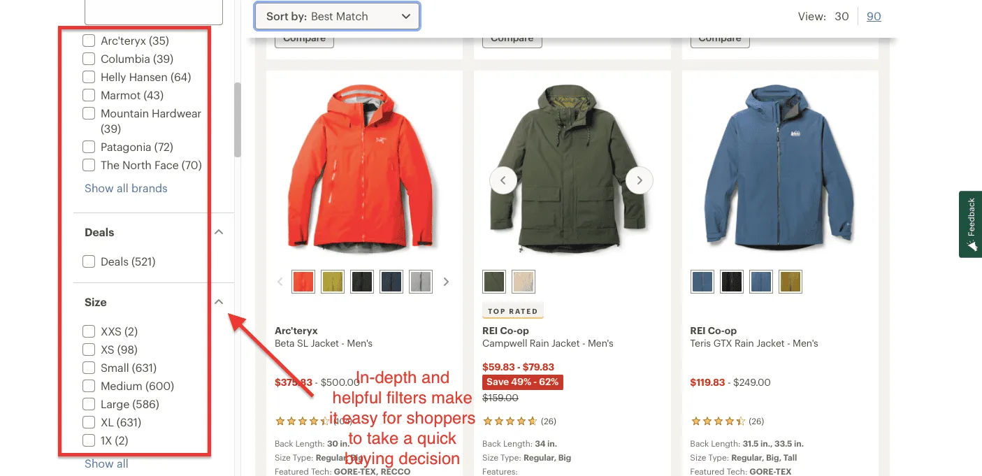
REI's Men's Jackets category page is one of the clearest examples of this thinking in action.
Every element on the page is organized around a single question: where is this shopper in their decision?
A shopper who knows they want a Patagonia jacket in Large is in a fundamentally different headspace than someone who just typed "men's rain jackets" into Google and landed here.
REI's page serves both at once without either feeling neglected.
For the decided shopper, the filters are precise and functional: brand names with real-time inventory counts, size availability, deal flags, and technical specs like GORE-TEX and RECCO surfaced directly on product cards.
No clicking through to product pages just to discover a jacket doesn't come in your size.
For the browsing shopper, the product grid does the heavy lifting, with multiple colorway swatches on hover, a "TOP RATED" badge that cuts out social validation, and a price range displayed upfront so there's no sticker shock mid-journey.
2. AI-Powered Product Display
AI merchandising tools now sort category pages in real time based on a sophisticated cocktail of signals: inventory levels, profit margins, return rates, seasonal trends, and individual shopper behavior.
AI algorithms promote products that convert well. Slow movers get strategically repositioned or flagged for intervention.
In fact, stores using automated merchandising report up to 20% improvement in category page revenue without changing a single product or price.
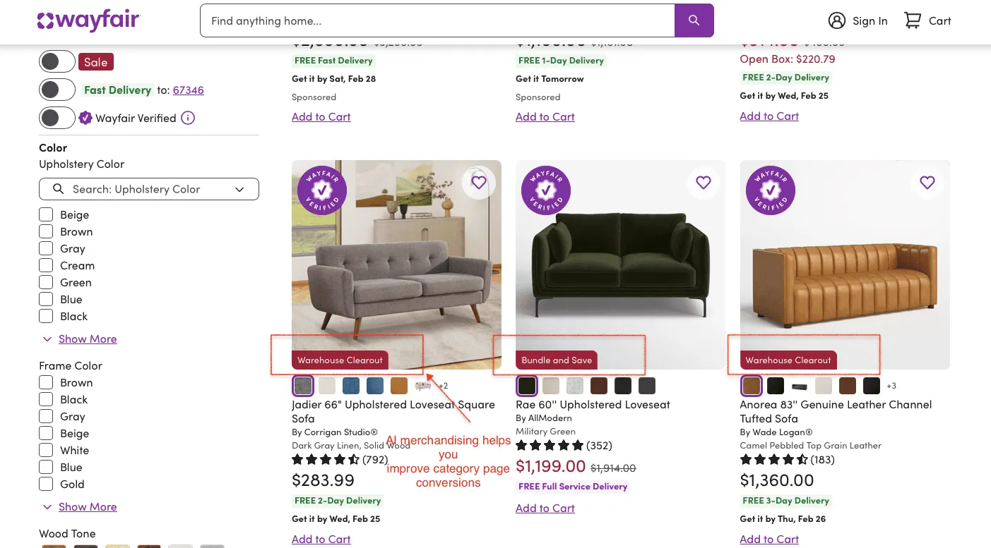
Wayfair is perhaps the most sophisticated example of what this looks like at scale.
Three signals stand out immediately. First, delivery intelligence is baked into every card: "Get it Tomorrow," "Get it by Sat, Feb 28," "Get it by Wed, Feb 25." Wayfair's AI knows your zip code, current inventory, and fulfillment capacity, and ranks products partly based on what it can actually deliver fast.
Faster delivery = higher conversion. The algorithm knows this and merchandises accordingly.
Second, promotional badges are dynamically assigned; "Warehouse Clearance" and "Bundle and Save" aren't manually tagged by a merchandising team.
They're algorithmically surfaced based on margin targets, inventory age, and conversion probability.
Third, the "Wayfair Verified" trust badge appears selectively, not on every product, but on those that have cleared quality and return-rate thresholds.
What to steal from Wayfair: Start with delivery-based sorting. If you can show shoppers which products arrive fastest based on their location, surface those first.
It's the single highest-impact AI merchandising move available to founder-led US eCommerce stores right now, and several Shopify apps make it accessible without enterprise-level investment.
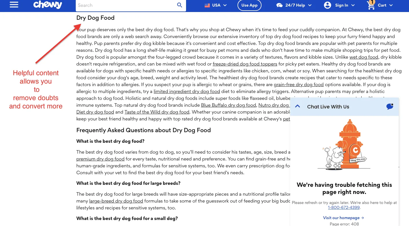
What works as CRO gold in 2026 is content that genuinely helps shoppers make better decisions: buying guides, comparison charts, use-case explainers, and FAQ sections that answer the questions real customers actually ask.
This kind of content does double duty: it builds purchase confidence for shoppers on the fence, and it signals expertise to Google at a time when E-E-A-T (Experience, Expertise, Authoritativeness, Trust) is more central to rankings than ever.
For example, Chewy’s Dry Dog Food category page carries a substantive content block that reads like it’s from an expert.
Also, below that, a structured FAQ section answers the questions shoppers are actually typing into Google, "What is the best dry dog food for large breeds?" in plain, confident language.
This does double duty: it builds purchase confidence among undecided shoppers and signals genuine expertise to search engines at a time when E-E-A-T is more central to rankings than ever.
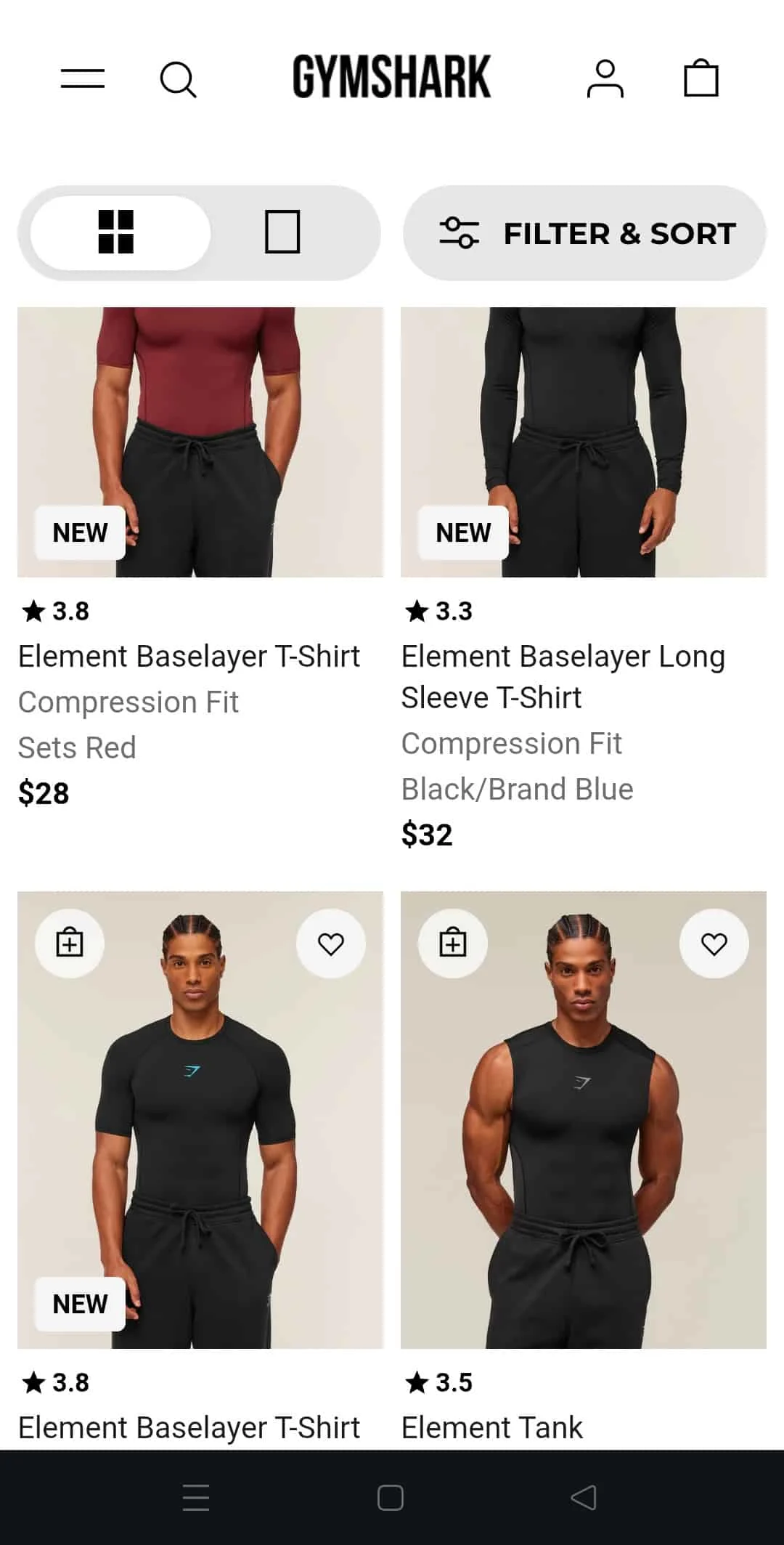
4. Mobile UX That Closes the Conversion Gap
The difference between a mobile category page that converts and one that doesn't comes down to a handful of specifics: sub-2-second load times, tap-friendly filter interfaces that don't require pinching and zooming, progressive content loading that keeps the page feeling fast, and thumb-zone-friendly product cards.
And Gymshark is one of the few DTC brands that has genuinely cracked it.
Everything about their mobile category page is built around the thumb, not the cursor.
The grid/single-column toggle sits in the top left, prominent, intuitive, and one tap.
The "Filter & Sort" button is large, pill-shaped, and impossible to miss, no squinting, no pinching, no frustration.
For a category with hundreds of products, that single design decision dramatically reduces the friction between landing and finding.
The product cards themselves are doing serious work. Full-bleed imagery that fills the screen edge-to-edge.
Star ratings, fit type, colorway, and price surfaced immediately, no tap required to get the information needed to make a decision.
A "NEW" badge communicates freshness without clutter. And the quick-add and wishlist icons on the lower cards appear contextually, keeping the interface clean until the shopper signals intent.
The bottom navigation bar stays fixed throughout, meaning core site functions are always within thumb reach, no matter how far down the shopper scrolls.
What to steal from Gymshark: Audit your mobile category page with one rule: if it requires two hands or a precise tap, it's costing you conversions. Simplify brutally, and make filtering effortless.
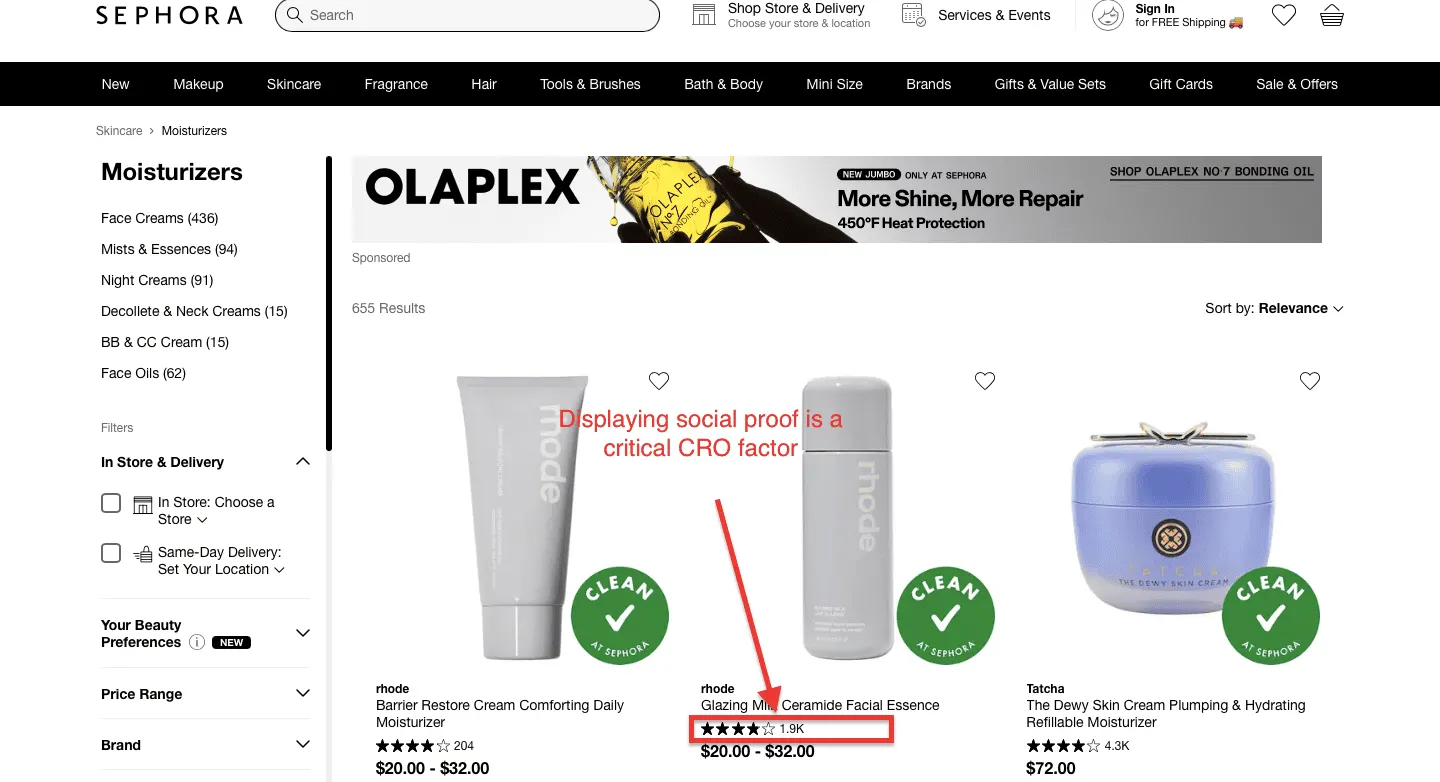
5. Social Proof Woven Into the Category Grid
Displaying star ratings on product cards is no longer enough. The best-converting category pages now weave social proof directly into the category browsing experience in ways that feel native rather than promotional.
Their "Best Seller" and "Staff Pick" badges are earned, not assigned arbitrarily.
According to research, shoppers exposed to social proof signals within category pages are 71% more likely to complete a purchase than those who aren't.
Here’s why Sephora’s category page is a textbook example.
Three layers of social proof are working simultaneously on every product card.
First, star ratings with review volume, not just 4.2 stars, but 4.2 stars from 1.9K reviews.
Second, the "Clean at Sephora" badge appears directly on product imagery as a third-party-style quality signal that conveys ingredient standards without requiring shoppers to read a single word of the product description.
For a skincare shopper who cares about what goes on their skin, that green badge is often the deciding factor between clicking and scrolling past.
What to steal from Sephora: Never show a star rating without a review count. And identify the one trust signal most meaningful to your specific category ingredient standards, durability ratings, and fit accuracy, and make it visible at the grid level, before the shopper ever clicks through.
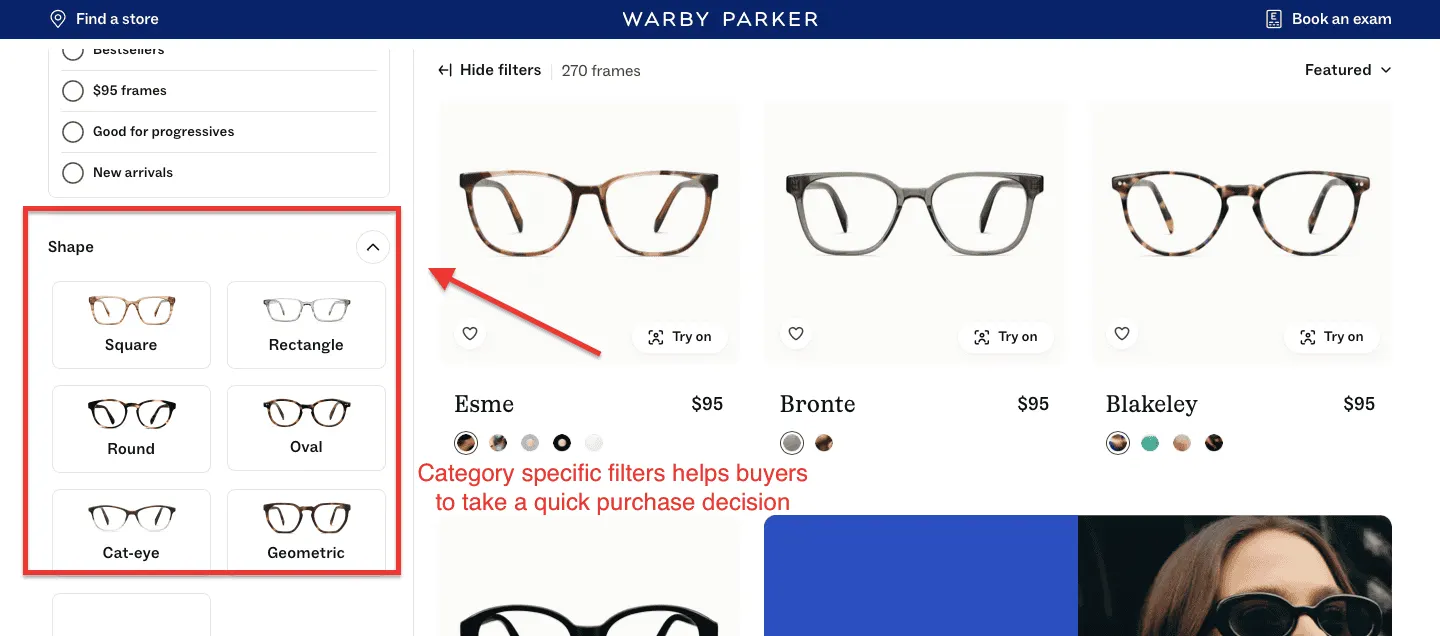
6. Decision Specific Filters
Today, high-converting category pages feature filters that reflect shoppers' specific decision criteria in that category. For instance, A skincare store's filters should surface Skin Type, Concern, and Key Ingredient.
When filters speak the customer's language, shoppers find what they need faster, and conversion rates in filtered sessions run 26% higher than in unfiltered sessions.
Warby Parker's eyewear page is one of the cleanest demonstrations of that distinction in eCommerce today.
Nobody browses for glasses thinking "I want a product with attribute X." They think "what's going to look good on myface?" Warby Parker's Shape filter speaks exactly that language — six visually illustrated options (Square, Rectangle, Round, Oval, Cat-eye, Geometric) with miniature frame illustrations for each.
No guesswork, no jargon. A shopper with a round face can identify their filter in under two seconds without reading a single word of guidance.
What to steal from Warby Parker: Identify the one question your shoppers are asking before they buy, and build a filter around that question, not around your product taxonomy.
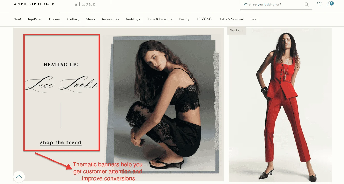
7. Subcategory Promotional Banners
Moving beyond plain product grids, the best stores in 2026 use curated editorial banners within category pages to guide shoppers toward subcategories based on occasion, mood, or use case rather than product type.
For example, Anthropologie’s "Heating Up: Lace Looks — Shop the Trend" banner sits directly within the category grid, interrupting the browsing flow at precisely the right moment.
This isn't a traditional promotional banner. It's a trend signal: a piece of editorial content that stirs desire by telling shoppers what's culturally relevant right now.
Second, the banner interrupts the onset of decision fatigue. A shopper scrolling through 270 clothing items will inevitably hit a wall of too many options, diminishing engagement, and rising bounce probability. It creates a new entry point in the catalog.
Also, research shows that stores that use editorial banners within category grids report up to 25% higher pages-per-session than those using uninterrupted product grids.
What to steal from Anthropologie: Identify your top two or three trend moments each season and build editorial banners that speak to cultural context rather than promotional urgency. The goal isn't to create a sale, it’s to make your category pages more inspirational.
The eCommerce Category Page SEO Framework
There is a temptation, when confronted with an underperforming category page, to reach for a keyword and sprinkle it around like seasoning, then declare the job done.
It occasionally works out. Usually, it doesn't.
Ranking category pages consistently requires optimization across several layers simultaneously:
Keyword targeting is where it starts. The goal is commercial-intent queries: phrases that signal a shopper is actively browsing a category, not just idly curious. "Best noise-cancelling headphones" is a more useful target than "what is a headphone."
On-page SEO is the housekeeping: title tags, H1s, and URLs that are clear, descriptive, and contain the primary keyword without reading like they were written by a robot having an anxious episode.
The content layer adds supporting copy that gives search engines the context they need to understand what the page is actually about. This doesn't mean 800 words of prose no shopper will read. A focused 100–200-word introduction does the job efficiently.
Internal linking connects your category pages to relevant subcategories and best-selling products, distributing authority and providing users and crawlers with a logical path forward.
Technical SEO manages the less visible but critically important mechanics: faceted navigation, filter URLs, and canonical tags that prevent search engines from indexing seventeen near-identical versions of the same page and concluding, reasonably enough, that something suspicious is going on.
UX and engagement tie it together. Fast load times, a sensible layout, and mobile usability aren't aesthetic niceties. They're ranking signals, because search engines have learned, over a great deal of time and effort, to notice when people leave quickly and never come back.
Strong category pages sit at the intersection of all of this. Not SEO alone. Not UX alone. Both sensibly combined.
eCommerce Category Page SEO Best Practices
If you were to audit your category pages today, and you probably should, the following checklist will tell you, fairly quickly, where the problems are hiding.
Keyword-focused title tag and H1: The page should make its subject clear to both search engines and humans within the first few seconds. "Men's Running Shoes | Brand Name" is good: "Products" is not.
100–200 words of supporting SEO content: An introductory paragraph above the product grid, or a brief section below it, gives search engines the context they need and adds genuine value for shoppers who want it.
Short, readable, descriptive URLs: /mens-running-shoes is excellent. /category?id=4872&filter=true&sort=default is the kind of URL that makes everyone slightly uneasy.
Filter and parameter URLs are kept out of the index: Every size-color-price combination your filters can generate should not become its own indexable page. Canonical tags and noindex rules exist precisely for this.
Links to subcategories and best-selling products: Guide shoppers and crawlers toward the things most worth finding.
Fast load times, particularly on mobile: Over 70% of eCommerce traffic arrives via mobile. A slow page on a small screen is a conversion problem that no amount of keyword optimization will fix.
Consistent, informative product cards: Price, image, ratings, and key variants visible without clicking through. If shoppers have to work for basic information, some of them simply won't bother.
Regular updates: Fresh inventory, current internal links, seasonal adjustments. Category pages are not set-and-forget assets.
Small improvements here compound quickly, especially across large catalogs where a consistent lift across dozens of pages adds up to something significant.
eCommerce Category Page Design and SEO
It is a common organizational habit to treat Design and SEO as separate disciplines that operate in separate rooms and occasionally pass notes under the door.
This is understandable, but it produces worse category pages than the alternative, which is treating them as the same conversation.
Category page design has a direct and measurable effect on SEO performance, and the mechanism is straightforward.
When a layout is intuitive, when filters work sensibly, when the visual hierarchy makes it obvious where to look next, shoppers stay longer, click further, and bounce less frequently. Search engines have spent considerable effort learning to interpret these behavioral signals as indicators of page quality.
Low bounce rates and strong engagement don't just suggest a well-designed page; they actively reinforce rankings.
Your Category Page Is a Revenue Decision, Not a Design Decision
Here's the thing about category pages: they've been hiding in plain sight for years, doing enormous work while everyone fussed over homepages and checkout flows.
The stores winning in 2026 aren't the ones with the biggest ad budgets or the flashiest product pages.
They're the ones who looked at this overlooked middle chapter of the customer journey and decided, rather sensibly, to take it seriously.
The gap between a category page that converts and one that doesn't is rarely dramatic. It's a filter panel that speaks the wrong language.
A product grid that looks identical to every visitor.
A mobile experience that was never really designed for mobile.
Small things. Expensive things.
The good news is that every single mistake on this list is fixable, and fixing even two or three of them will move your numbers in ways that are genuinely startling.
Not sure where your category pages are leaking revenue? Our eCommerce CRO specialists will audit your store, identify exactly what's holding your category pages back, and tell you precisely what to fix first, completely free.
A category page is a product listing page that gathers related items under a single, browsable destination, "women's boots," say, or "outdoor furniture," and targets the broader, high-intent keywords that shoppers use when they're actively considering a purchase but haven't yet settled on a specific product.
They tend to rank for more competitive terms than individual product pages and, done well, drive a disproportionate share of organic traffic and revenue.
How much content should a category page have?
Somewhere in the range of 100–300 words of supporting copy is generally sufficient. The purpose of this content is to give search engines the context they need to understand the page, not to produce something shoppers are expected to read in its entirety.
A focused introductory paragraph, or a brief section below the product grid, accomplishes this without getting in the way of the actual shopping.
Should eCommerce category pages be indexed?
Yes, your core category pages should absolutely be indexed. The more nuanced question is what else gets indexed. Filtered and faceted variations of a category page (every combination of size, color, price range, and sort order) can generate dozens of near-duplicate URLs from a single page.
These should be managed carefully using canonical tags or noindex rules, so search engines are looking at one authoritative version rather than a crowd of confusingly similar ones.
Do filters affect eCommerce SEO?
They can, and often do, when left unmanaged. Faceted navigation, the filter systems that let shoppers narrow by size, color, brand, price, and so on, is useful for shoppers and genuinely problematic for SEO if every filter combination creates a new, indexable URL.
The result is duplicate content, diluted rankings, and wasted crawl budget: search engine resources spent on low-value pages that didn't need to exist. The fix is straightforward in principle: decide which filtered views, if any, deserve to be indexed, and use canonicals or noindex to manage the rest.
Subscribe for more articles like this!
Thank you - we'll see you in your inbox soon!
Oops! Something went wrong while submitting the form.
Read by 5000+ ecommerce store owners
Subscribe for more articles like this!
Thank you - we'll see you in your inbox soon!
Oops! Something went wrong while submitting the form.


.jpg)


.svg)

.svg)

.svg)
.svg)
