Conversion Optimization
23 Ways to Boost eCommerce Homepage Conversions
May 2, 2025


Before a shopper is able to move through any other page on your eCommerce website, they find themselves on your homepage.
And this is why the homepage holds such critical centrality to overall UX.
It is through the homepage that visitors find their way to pages that create conversions, including the product pages and the checkout page.
A smooth user experience starting with the homepage will give visitors more reasons to continue exploration and even convert.
Keep reading to understand how you can apply 23 tested UX guidelines to make your homepage perform better.
Think omnichannel and build your homepage using that as the basis.
Omnichannel experience in the eCommerce space naturally means users have unpredictable behavior - they could be browsing your site across multiple channels, using certain channels more than others etc.
This makes it necessary for the homepage to deliver a consistency of experience that extends to other aspects of your brand (such as social media presence, the way your emails look and read, what your downloadables talk about etc.).
To boost homepage conversions, you'd want to keep some branding principles in mind:
(For example, let’s say, your user has accessed your website through Instagram and has added a product to their cart. Ensure, if they are accessing your homepage on their desktop, your cart button reflects this action.)
In the eCommerce space, it’s not for nothing that Sephora has earned such a name for their omnichannel strategies. Here’s what you can learn from their approach.

Because choice trumps everything else in an omnichannel approach.
This includes a store locator along with what’s happening across stores. Because users would want to find value as soon as they land on your homepage.
Because a detailed, informative approach can quickly make even first-time visitors trust a brand more.
Letting aesthetics get in the way of usability is one of the gravest conversion mistake you can make on your eCommerce homepage.
Take the following example of Ling’s Cars.

It’s clear that the brand is attempting to create a snazzy outlook to their brand.
But what’s happening in the process is that a visitor doesn’t really know what to look for when they land up on the homepage.
The layout is cluttered, so much so that as first-timers to the site when we wanted to explore, we felt we’re at a loss.
The antidote for this is to put function over fashion.
Here are a few pointers that you can use as your north star while planning the UX for your eCommerce homepage:
Ideally, elements like the menu, search bar and add-to-cart functions make it to the top nav bar. Other functional but secondary links like about us, careers, FAQs and shipping policy can be reserved for the bottom bar.
The UX function of the hero header is to bring attention to the CTA while conveying the overall tone of the brand. Keeping it clean, well-contrasted and readable is key, if you want users to keep scrolling beyond the hero header.
The function of this section is to help visitors build a better view of what your brand can offer. Here are the questions they might end up asking:
- As I scroll, am I getting a better understanding of how this website can help me?
- As I scroll, am I finding information that’s already helping me visualize how the products might help me if I buy?
- As I scroll, am I feeling inspired enough to keep browsing?
If the text and visuals in these sections don’t help answer the above questions in the affirmative, your conversion rate will take a hit.
After all, the reason your footer exists is to take the information burden off your top nav bar. To heighten your homepage UX through the footer:
- Make sure it does not contain broken links.
- It is not cluttered. (If there’s too much information, see if you can club sections under specific categories.)
- Ensure all links open in new tabs.
Imagine what a customer is looking for when they land up on your homepage.
Are they already sure they want to buy? Are they looking for more information?
The next layer to this is made by what you want them to do.
Do you want them to go over to their product pages right away? Or would you rather lead them to a specific landing page?
In the end, what you want these questions to do is to answer what hierarchy will maximize the conversion rate.
When you base your homepage navigation on a coherent narrative that builds on one action from another, the user’s experience immediately improves.
Here’s a quick look at the elements you’ll need to consider when you are planning the information flow on your homepage:
These would determine what they would like to see and act on. In turn, they would want to prioritize certain actions over others.
It is the values that decide what a visitor most wants once they are on your homepage. For example, if they want freedom, your customer action hierarchy may look quite different from if they were looking more for beauty.
This is so intricate that this then would automatically be tied with other aspects like CTA, body text etc.
The idea behind any user flow working is that users have their questions answered automatically at every step. And the better you get at this, the better your homepage conversion rate.
Here’s a look at how Disguise Cosmetics manages to build on their priorities through timely product features and content blocks. All in a coherent flow.
In the following example, a visual feature of their matte lipsticks is immediately followed by content that talks about what some publications have said about their lipsticks.

To boost your homepage conversion rate, it becomes crucial to design a navigation menu based on what your users are most likely to do.
As you might already know, users are usually of four different kinds:
Now considering you can choose from a hamburger menu, sticky menu, mega menu and double menu, think of what your visitors are most likely to behave.
For example, if users are largely unaware, a standalone hamburger menu might not work at all, as it tends to hide away categories in order to save space.
However, it may still work if you combine a hamburger menu with a mega menu. In this case, the mega menu will make it intuitively possible for users to hover over and then reveal sub-categories.
To cater to users of varying awareness levels, businesses also use multi-level menus. This ensures primary and secondary navigation don’t get confusing without entirely splitting them apart.
Here’s how Walmart has given the double menu treatment to their homepage, making it uncluttered and fairly simple to access for every kind of user.

Sticky menus, on the other hand, have traditionally been paired up with longer homepages. However, more and more businesses seem to be opting for it whether their homepage is long or not.
The idea is to be of service to the user with tappable options as they scroll, and also aid quick conversion if the user does decide to buy right away.
A case in point is the Cuvee Coffee homepage, which isn’t all that long, and yet features a sticky menu.

Hey, have you seen this? Sticky Menus : Things NOT to Do On Your eComm site + 8 Inspiring Examples
On the homepage, it is the value proposition that clinches the customer’s imagination on how a brand’s products can help.
Not declaring this value proposition as soon as a visitor lands on your homepage means two things:
To get your value proposition right up there, you need to ask three simple questions:
Your value proposition is hidden in the combined answer from all these three questions.
So, when you’re communicating this USP above-the-fold through a main headline, a sub-headline and a visual (the typical structure), these insights need to reflect in the copywriting.
Let’s look at an example. Hers uses a simple one-liner to inform the user what the brand is about and what they can expect to solve using the brand’s science-based capabilities.

Let’s get one thing straight.
A homepage is often the main entry point for visitors to get acquainted with the rest of your brand.
This is the main reason why it has to work harder to look, inform and act differently than all your other pages.
For example, you can’t possibly give your homepage the same treatment as you would give to one of your landing pages.
While a user can only do three things - convert, sign up or leave - on a landing page, the homepage offers them many more choices.
And that’s why it needs to stand out from a conversion POV.
So what can possibly create a visual differentiation for your homepage?
This should play with copy and text to align with the tasks a user needs to accomplish.
These would maintain their consistency even when accessed from mobile devices.
This includes the top nav bar, the visual and information architecture on the page filled with visuals, CTAs and content blocks, and lastly, the footer. This is a visual structure that clearly depicts that it’s a homepage.
We love what Bolthouse Farms has done with their homepage visual UX, which is a clear reflection of how they have treated the rest of their website as well.

Here are a few things that we think work really well for them:

While conveying a strong brand is definitely a priority, doing it at the cost of the user’s time is a no-no.
And this is why you might want to avoid using a splash screen before your homepage loads.
The point of a splash screen/page is to typically orient users to the brand’s elements, which may include the logo and the tagline.
When such screens and pages were first used before a homepage loaded, it was to keep the viewer assured and engaged.
However, splash screens seem to have a few clear disadvantages, including extending the time taken to load as well as showing content that users can’t instantly act on.
This might not be ideal for an eCommerce site, where visitors come looking to act - to search, to add to cart and to checkout.
The solution?
Design a homepage that talks brand and sets the tone for user action from the go. This way, an additional splash screen won’t be necessary to create user engagement.
The Wellbefore homepage showcases what the brand is known for (and what visitors have to know to trust the brand) above-the-fold. This makes a splash screen a non-essential.

And, even if you do decide to use a splash screen, here are a few ways you can go about it:
The mark of a not-so-great eCommerce homepage is the amount of distraction it creates through its visuals. Here’s a look at an example.

Visuals are just a different medium of conveying relevant information to your audience - information that is likely to make navigation easier as well as their big picture journey with your brand.
While determining visual hierarchy, you have to work effectively with color, contrast, shapes, alignment, positioning and overall arrangement.
Here are a few pointers to remember and incorporate when you’re trying to work out a conversion-friendly home page visual design:
The homepage of MVMT Watches won our hearts because it showcases a subtle balance between visuals and information.

Every visual on that page has a function and it helps visitors explore their products more deeply.

Hey, you'll love this: Above the Fold: 9 ideas for better conversions (+ amazing examples)
When visitors land on your homepage, they may not even know why it’s being such a smooth, seamless experience.
However, chances are you’ve defined your navigation menu so well that exploration for visitors has turned intuitive.
Here are a few pointers that’ll help you create a homepage navigation menu stand out for visitors:
This will help the menu bar to stand out and have visual contrast from the rest of the page.
This way, visitors don’t necessarily have to scroll down to find what they’re looking for.
This could provide more context and depth of experience.
Categories and their-subcategories should be well-aligned and self explanatory.
Here’s a look at one of our favorites, the Kettle & Fire navigation menu which is in a color that contrasts and blends in turn.
What’s also great is that it is a sticky menu, which incorporates the most important aspects about the site IN ONE PLACE.


When visitors come to your homepage, they may have a list of priorities to resolve.
The most common would be to buy or explore products.
However, there would be people who’d be interested in knowing more about how your brand came to be, the people behind it, the idea that kickstarted it and what kind of features you’ve received from the press.
This is the reason why clubbing “about us”, “history”, “approach”, “press”, “investor relations” and “careers” under one tab in the menu is the way to go.
When a visitor is able to view such foundationally critical information at one go, it helps in building credibility and trust.
Here’s a look at how Truwood manages to do this without looking clunky or seeming pretentious.

There are often many other hyped elements in a homepage that get all the attention from designers.
In the process, something like product categories gets left behind.
But here’s the thing: if your product line isn’t clearly visible or instantly accessible, it’s likely that your visitors will have to work harder to find out your offerings.
And that’s bad news, because only a few would have the patience or the time to hang out on your site.
When putting your product line in place to be viewed and accessed, remember the following pointers:
This is because the average visitor deals with a short attention span.
Mr. Clean uses visuals as part of their hover feature on their top nav bar, which features select categories.

Here’s a screengrab of how Missguided does it using bold type, colors and visuals and highlights their categories.

It's best to use manageable and understandable clusters.
Building further content around these keywords then becomes easier.
It is after all imagination that leads people to explore and even convert.
…and make all of it clickable and easily accessible.
We love how Silk Road Teas does a great job at categorizing their offerings.

Similarly, Specialized finds a way to showcase their products with great visuals.

While everyone loves visuals and text, especially when they come together to bring a brand alive, too much of either is a terrible idea.
This is where negative space becomes an important factor. Its underlying motive is always to balance aesthetics with the function of guiding users to the next steps.
Negative space, otherwise known as white space, is what offers breathing room in a design layout.
Not leaving enough negative space between your visual and textual elements can create visual chaos for visitors.
Here are a few pointers to take seriously while you make space for white space on your homepage.
This will help users take in more without making a lot of extra effort.
This may need your design team to figure out shortcuts. Negative space at the cost of what the user needs is a no-no.
This pathway will organize the entire content of your homepage in say, 15 points. You could use this pathway to then prioritize the planning of macro and micro negative space.
Here’s a quick look at how Lively has efficiently organized their white space.

Another great example is Home Chef.

To ease a user’s journey, it’s essential to create promotions that are easily viewable and accessible.
Keeping your products separate from your promotions would be a functional way of achieving better conversion rates.
Here are a few pointers to consider when you are trying to incorporate promotions into your homepage layout:
Bellroy talks about promotions on their homepage with just a band running across, above-the-fold. Once clicked, it takes the visitor to a page that features all of Bellroy’s products currently on sale.

Nike does it slightly differently with a ticker running above-the-fold, offering information solely about discounts and free shipping.

While inherently they seem to do the same thing - have the user click - CTAs are more user friendly than links.
For one, CTA’s, when worded relevantly and powerfully, have the ability to drive immediate action. Secondly, with good design, CTAs can become a visual guide for users.
Links are less intuitive in that sense and may not inspire the user to click at all.
Links are essentially effective when clicked but until they are, they are passive.
So, work on optimizing your CTA so well that visitors have no option but to engage and even better, buy.
Here’s a quick list of to-remembers when you’re crafting your CTAs:
We’ll cite the example of one of our favorite brands Innocent. They manage to keep it simple and also bring in design around their CTAs that’s fun and engaging.

Want more? Check out 21 ways to create call-to-action buttons that convert
By now, we’ve shared enough about visuals and visual treatment.
Let’s talk about the other important facet that immediately decides if a visitor wants to engage, becomes confused or wants to walk away.
Copy.
It is necessary that you take extra care to not just make the copywriting on your eCommerce homepage interesting but also simple.
Here a few pointers that can help:
Always remember that customers are looking to you to make some part of their lives easier. Hence, benefits resonate more.
It’s for nothing that a research study by Hill Holliday revealed that 59% would immediately stop buying if they knew a brand is using fake content. Conversely, 64% would buy from a brand if they knew the latter is authentic and genuine.
They are there for a reason. Use capitalization where necessary, avoid writing in upper case and stay away from exclamation marks.
How would they otherwise know what’s next or what they may want to explore?
This makes more users read what you’ve got to say.
Here’s a couple of screen grabs from Funky Chunky, a brand we admire and helped convert. Their language is direct but not without flavor and emotion.

The search functionality is perhaps one of the most important drivers of visitor engagement and conversion.
If your homepage search isn’t effective, accessible and simple, how do you expect your visitors to buy from you?
Also, reliable research results show that when users are not able to find what they are looking for in their first query, their success rate drops further with each eventual query.
Here’s a quick list:
It is not as intuitive for a user as a field box is.
The most intuitive is having it at the top right corner of the nav bar. However, some brands use the left corner effectively too with adequate visibility.
After all, real estate is often tight on the homepage and the search box needs to be visible while being concise. Typically, when a search box is designed to accommodate 27 characters, it is able to make up for 90% of the queries.
Simple search typically makes it easy for visitors to move from page to page with greater ease and much lesser effort.
This immediately gives visitors full access to your whole site, which is desirable given that you want them to know your products better.
It prevents confusing your visitors with a plethora of options from across the Internet. It can potentially diffuse focus from your brand and offerings.
This is important because most users won’t look beyond the second page of search results.
Bonobos captures how we like the search functionality - to be embedded in the top navigation bar. In their case, because it’s a sticky menu, it further adds to the simple sitewide search functionality.

The basic idea is to treat the homepage as a gateway to your brand’s entire universe gathered within the site.
This makes it essential for you to stay away from distractions. They could be in the form of aggressive ads or loud graphic elements that steal a visitor’s focus.
The following are the areas that you need to be especially careful about:
Here are a few quick tips on how you can stay off distractions:

This most naturally mimics a warm, human tone, which further eases readability and acting on information.
All the above are likely to fall into place if you know your users and their workflows.
Here are a few screen grabs from the homepage of Hello Fresh, a brand that has managed to keep off distractions and lend a clean, fresh treatment.

What we especially love is how they’ve kept the CTAs unbothered and have not cluttered the negative space either.

If you view some eCommerce sites, you may be able to notice some patterns sooner or later.
They may have very different visual treatment from one another but certain features may have similarities. What we perceive as similarities, are in fact certain standard protocols that take in the user’s viewing and browsing behavior into consideration.
In this context, here are a few things you may want to remember while designing your eCommerce homepage:
Be it the search bar being on the top right or the products being displayed in a grid. The more familiar users are with the overall pattern you choose, the smoother their experience of scanning and exploring.
For a second, imagine a real estate builder site using pinks and mauves like a make-up brand. Draw inspiration from industry standards but don’t be limited by them. Use your brand’s own differentiated elements to add texture.
Unnecessary use of shapes, lines and colors can result in a highly chaotic visual experience. This can in turn slow down how fast the user acts on certain critical tasks.
A decently high contrast gets rid of multiple issues created by low contrast - lack of discoverability, mobile optimization and usage difficulties and lack of accessibility for people with disabilities, amongst others.
Even when you have limitless visual combinations available to you, you choose selectively to offer the user predictability of experience.
Here’s a look at how Rhone creates a pattern by establishing their brand motif on button labels.

Horizontal scroll bars are not usual anymore and take up a lot of space. The scrolling function can also potentially be distracting for users - something you need to avoid come what may.
There are specific use cases for dropdown menus but under no circumstance should you think they can be applied everywhere.
The homepage has the tough task of leading your visitors further into the layers of category pages and product pages.
This means you’ll have to carefully assess whether a dropdown menu will make sense.
Here are a few points to remember if you’re considering using such a menu:
This is mainly because dropdown menus are preferred by those who need to do preliminary research. For those who already know what they want, a simple search bar is enough.
In this case, a well-designed dropdown menu will ensure they can be accessed within a few clicks. This may also promote better sitewide visibility.
This can be confusing for users as options don’t stay consistent and with a different click, they run the risk of not being able to find the option they had initially accessed.
Nothing like a user being able to see all their options without having to scroll. At any point, it’s best practice not to let your drop down menu go beyond two-levels deep.
You may have several categories and subcategories to display. You have to ensure the way the subcategories are displayed maintain a consistent visual style, so that the user has a cohesive experience.
In the following example, notice how options change as users select different parts of the same menu. This can be highly disorienting when a user is trying to focus on a certain critical task.

Outdoor brand Patagonia has so many sub-categories that they’ve used a dropdown menu on their page. It’s designed in a way that visitors can see all the sub-categories within a scroll and a little more.

Most eCommerce sites now make use of pop-ups because they’re a great way to inform visitors about a facet of the brand. It could be about a discount for first-time buyers, a range of products launching soon or even the perks of buying a subscription plan.
However, pop-ups aren’t for every kind of information. So what kind of information would you rather not have on a pop-up?
In short, anything that’s critical.
Think company information. Or press coverage. Or even a new category you’ve launched in (especially if your main menu does not primarily feature it).
Anything that’s long-term and is better featured on the homepage because it’ll require greater time and focus from the visitor.
Confused? Here's 18 ways to make Shopify popups less annoying (+ examples)
Remember how we were mentioning the idea of the homepage being a gateway to the rest of your brand’s universe, a little earlier?
What if you were to make it so exciting and inspiring that visitors would consider coming back many times over?
While this sounds like a best case scenario, it’s not impossible.
Here are a few ways you could create relevant hooks for customers on your homepage:
The more the latter are based on engagement and user behavior, the more they can be relevantly channeled.
This could be a small discount or a price decrease.
BootyBands introduces a spin-to-win for first-time users to claim some attractive discounts.

Here’s a look at how fashion brand ASOS conveys their hooks, without wasting an inch of space - from discounts to worldwide free shipping, there’s always more for a visitor to come back for.

No worries if you have several categories and sub-categories and don’t want to waste precious header real estate. If you have more links that you think should make it to your homepage, consider using the footer.
Here are a few pointers to consider while you’re assessing what to put in your footer:
We can’t get over how brilliantly designed the homepage footer of Vanity Planet is. What do we especially love? That it contains a “track your order” feature and also shows the whole shop for visitors to access.

While what we live in is clearly an age of excess choice, what we want is very specific to our needs, wants and desires. This is the simple idea that drives better UX and in turn creates better conversions.
Here’s what you have to consider while personalizing to enhance UX for your homepage:
We think the more the merrier, as long as you can track results steadily and make necessary adjustments as consequence.
This takes personalization to the next level. Each visitor sees a homepage based on their location, preferences, buying behavior and purchase history.
Sunday, the lawn care brand, personalizes through pop-ups and homepage sections.

In the following example, they’re offering a discount code to first-time users - something that reflects in a pop-up and also a content band on their homepage.

Ah, the million-dollar question. You’re getting traffic, but people just bounce or worse, scroll for a second and leave.
That’s usually because your homepage isn’t doing what it’s supposed to do: give visitors a clear, instant idea of who you are, what you sell, and why they should care.
Common culprits:
Your homepage is like a storefront window. If people don’t “get it” in the first 5 seconds, they move on.
Because it’s your first impression—and in ecommerce, you only get seconds to make it count.
Imagine someone walking past a brick-and-mortar store. If the window display is confusing, boring, or unclear about what’s being sold, they’ll just keep walking. Same thing online.
Your homepage tells people:
If that info isn’t obvious or engaging, people bounce. A high-converting homepage acts like a great salesperson: welcoming, clear, and guiding people toward action, whether that’s checking out your bestsellers, subscribing to your list, or diving into a product collection.
So if conversions are sluggish, your homepage might not be giving people a reason to stick around or explore deeper.
Massively. These days, most ecommerce traffic comes from phones and mobile shoppers are brutal. If it’s hard to navigate, slow to load, or cluttered? They’re gone.
Here’s what matters on mobile:
Think of your mobile homepage like a quick pitch. Keep it clean, confident, and action-oriented, because if someone’s on their phone, they’re likely browsing between things. Don’t waste their time.
Honestly? Simplify.
Most homepages try to do too much.
Pick one goal for your homepage, like pushing people to a product page, signing up for your list, or exploring collections, and design around that. Then:
You don’t need to rebuild your site—sometimes, it’s just a matter of giving your homepage room to breathe and speak clearly.
Think of “above the fold” like the top half of a magazine cover, you want your best stuff there.
That means:
No need to throw your whole brand story up there, just give people a reason to keep scrolling (or better yet, clicking).
98% of visitors who visit an eCommerce site—drop off without buying anything.
Why: user experience issues that cause friction for visitors.
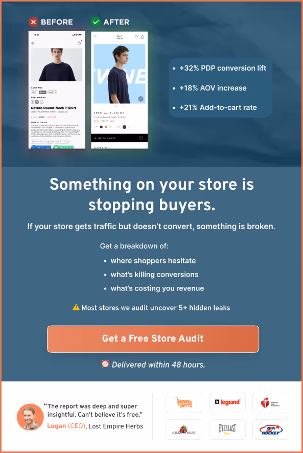
And this is the problem that ConvertCart solves.
We've helped 500+ eCommerce stores (in the US) improve user experience—and 2X their conversions.
How we can help you:
Our conversion experts can audit your site—identify UX issues, and suggest changes to improve conversions.
Subscribe for more articles like this!


Read by 5000+ ecommerce store owners
.svg)

.svg)

.svg)
.svg)
2026 Convertcart, All Rights Reserved
33/1, Castle Street, Ashok Nagar, Bengaluru, India