Conversion Optimization
17 Top eCommerce Mobile Site Examples (Not Your Usual Brands)
March 19, 2025


Two out of three site sessions start on mobile. This is why finding answers to “What helps create the best eCommerce mobile experience” is more important than ever.
The good news is that we’ve done the work – here are answers from these best eCommerce mobile site examples:
Let’s go!

What’s awesome about Build.com’s hardware eCommerce store’s mobile site?
✅ Homepage
✅ Navigation
✅ Category
✅ Product
✅ Order confirmation page
💡 Pro Tip: Consider your target audience when designing your mobile store – utility always trumps visuals – Build by Ferguson proves exactly that with a fairly simple design that avoids fancy animations and scroll effects.
Also read:
i. 30 Mobile Optimization Tips For eCommerce (+ Examples)
ii. 18 Ideas to Boost Online Hardware Stores' Conversions

What’s awesome about Figs’s mobile eCommerce site?
✅ Homepage
✅ Pop-up
✅ Category
✅ Product
✅ Cart & Checkout
💡 Pro Tip: Use animated elements to bring out details like finish, materials used, etc. – Figs keeps most of its photo elements animated to make sure the visuals lead the user to dive in.
Also read: eCommerce Mobile UX: 27 Ways to Get More Conversions

What’s awesome about BJ’s Wholesale Club’s eCommerce mobile site?
✅ Homepage
✅ Navigation
✅ Category
✅ Product
✅ Search
💡 Pro Tip: Try minimizing scrolling on mobile if you're using sticky headers – this helps ensure that your page loads quickly.
Also read: What’s a Good Mobile eCommerce Conversion Rate in 2024

What’s awesome about Sunday Golf’s mobile eCommerce website?
✅ Homepage
✅ Pop-up
✅ Product
💡 Pro Tip: Consider using a nudge to get users to scroll horizontally – like an animated arrow button that goes off every 10 ms.
Also read: Optimize your Shopify Store for Mobile: Proven ideas + Examples

What’s awesome about World Market’s mobile site?
✅ Search
✅ Category
✅ Product
✅ Mini-cart
✅ Cart
✅ Checkout
✅ Guides
💡 Pro Tip: Use lighter and darker shades of your brand colors to bring out elements – but make sure you're using them in moderation—note how World Market puts a light yellow to use for their loyalty points sign-up reminder.
Also Read: Mobile Cart Page: 17 Brilliant Examples (& Why They Work)

What’s awesome about Autozone’s mobile site?
✅ Product page
✅ Category
💡 Pro Tip: Consider looping in a video to help with certain products that require high-expertise – along with ready-to-avail customer service options.

What works in Nuts.com’s mobile site example?
✅ Product page
✅ Live chat
✅ Help page
💡 Pro Tip: Instead of using intrusive pop-ups, use a non-intrusive call-out to handle cart abandons or show messages like “X amount of customers save $X on average with subscriptions.”
Also read: How to write product descriptions for mobile: 22 proven ideas (with examples)

What’s awesome about Thuma’s mobile site?
✅ Homepage
✅ Product page
💡 Pro Tip: Consider showing products in a real life setting to help customers visualize the product size – Thuma does this through the videos where it shows the product being assembled.
Also read: 20 Reasons Why Your Online Furniture Store Has Low Conversions (+ ways to fix)

What works in Status.co’s mobile eCommerce store?
✅ Navigation
✅ Product Page
💡 Pro Tip: Show some social proof from customers – if it's a new product, add in a callout ribbon asking users to review in exchange for a reward.
Also read: Build the perfect mobile product page (22 proven ideas)

What works in Dormify’s mobile site example?
✅ Landing page
✅ Category page
✅ Pop-up
💡 Pro Tip: Test different lead gen magnets – for example, a ‘which college will you be attending’ can be a great question for Dormify – ready with autofill form fields, that suggest names as a user types in.

What works in Hims’s mobile site example?
✅ Homepage
✅ Navigation
✅ About Us & Policy Pages
💡 Pro Tip: Consider using lazy loading – but make sure the top portion of the page loads as fast as possible.
Also read: eCommerce Website Design: 17 Conversion-Boosting Principles

What works in Black Milk’s mobile site example?
✅ Homepage
✅ Pop-up
✅ Product page
💡 Pro Tip: If you're using third-party plugins for displaying UGC, consider adding in a functionality, where the section doesn't display till it's fully loaded.

What makes Birddogs’s website a good mobile site?
✅ Blogs
✅ Product
💡 Pro Tip: Great copy is what comes first, overly long or copy that doesn't read right won't bode well for the mobile experience – Birddogs proves that with their minimalistic yet awesome mobile site.

What works in Genuine Fred’s mobile site example?
✅ Navigation
✅ Product page
💡 Pro Tip: Consider adding certain brand elements to your footer permanently like you would do in emails, to show the brand's benefits (like Free Shipping above $XX).
Do check out: How To Use Visual Commerce To Improve Conversions

What works in Klean Kanteen’s mobile site example?
✅ Cart & Pop-up
✅ Checkout
💡 Pro Tip: Consider removing your headers and footers in the cart and checkout pages – and instead use support links to make sure users don't leave.
Also read: Mobile Product Page Breadcrumbs: 6 Common Mistakes (& 10 Brilliant Ideas)

What works in Me Undies’s mobile site example?
✅ Product
✅ Navigation menu
💡 Pro Tip: If you have trouble with size guides, consider adding in models of various body shapes, heights, and ethnicities to display your products – while displaying fit info and tips.
Also read: Make your mobile payment page “conversion-friendly” (13 UX hacks)


What changes between the desktop and mobile versions of Parade’s website?
💡 Pro Tip: Use a separate subdomain to lead to your mobile version pages – this helps cut down on load time by a lot – and make sure your desktop version gets triggered by screen-size (this ensures people opening on desktop don’t accidentally open the mobile version).
Also read: 15 Brilliant (Non-Intrusive) Mobile Pop-up Examples In eCommerce
> Desktop and mobile UI(s) need not match (but the color consistency should exist)
> Utility is greater than visuals
> Horizontal scrolling is the best replacement for vertical scrolling – it's much easier to swipe than drag fingers up and down the screen
> The navigation bar is the most underrated element of a mobile website
> Short footers help reduce page length by a great extent
> Product pages need to have some form of rich (and complete) data
> Font sizes are as important as colors – one doesn’t go without the other
> Sticky headers and add-to-carts work best on product pages
> Focus on branding and bring out the personality of your brand through shapes
> Policy pages don’t need to be boring
> Good copy can save a mobile website
If you’ve ever wondered “what elements create a great mobile e-commerce site”, this is all you need to create a mobile-friendly eCommerce website – in sync with the best mobile eCommerce trends for 2025:
✅ Is the homepage design clean, minimalistic, and free of distractions?
TIP: After the banner, add only part of your USP(s) to create curiosity and nudge users to scroll — too much text upfront can feel overwhelming – just offer a sneak peek of the icons instead.
✅ Is the homepage’s hero section engaging with a clear, bold CTA?
TIP: Ensure the CTA isn’t buried — place it in the top third of the screen and make it contrast with the background for instant visibility and clear hierarchy.
✅ Does the mobile site offer a personalized homepage experience (e.g., personalized product recommendations)?
TIP: Check if returning users see recently viewed items or a ‘Because you liked...’ section instead of generic product highlights – if you don’t have previous history, tailor products by location (like seasonal products for winter locations).
✅ Are key elements such as search bar, navigation, and account/cart icons easy to locate and tap?
TIP: Ensure these elements are at least 44px x 44px and remain visible as users scroll (either as a sticky header or bottom navigation).
You might also like: High-Converting Mobile Homepage Blueprint For eCommerce
✅ Are high-quality product images used with a zoom feature?
TIP: Ensure zoom previews don’t distort or pixelate the images. Check if users can easily pinch-to-zoom or tap a “+” icon for magnified details.
✅ Is there a clear product title, price, and “Add to Cart” button above the fold?
TIP: Ensure these details appear without scrolling — ideally within the top 60% of the page – here’s how you should do it – check Colorescience’s mobile website:

✅ Does the page offer additional product images, including a 360-degree view or video demos?
TIP: Make the video content autoplay silently when scrolled into view — forcing users to hit play can reduce engagement.
✅ Are user reviews and ratings visible on the product page for social proof?
TIP: Display the average rating with stars near the product title for instant credibility – or, a quick snippet of reviews.
✅ Is there an intuitive product filter or variant selection (size, color, etc.) for easy navigation?
TIP: Ensure filters don’t refresh the entire page — variant changes should feel instant with no reload delay.
✅ Does the page feature a prominent "Add to Wishlist" option for users to save items for later?
TIP: Show a heart icon near the “Add to Cart” button — avoid burying the wishlist feature inside account settings.
✅ Are “Related Products” or “Customers Also Bought” suggestions displayed to encourage cross-selling?
TIP: Ensure related products are contextual — recommend items based on category or user behavior – or on location data.
✅ Is the product description brief and easy to read with bullet points for key features?
TIP: Use 3-5 bullet points for core details, and shift longer descriptions to an expandable accordion for clarity – pair the text with icons or images.
✅ Are long product descriptions collapsed into expandable accordions?
TIP: Ensure the first 2-3 lines of text remain visible with a ‘Read More’ link to expand the rest.
✅ Are tooltips used to explain complex product details?
TIP: Add small (i) icons that reveal details on tap, for technical specs, ingredients, or size guides.
✅ Is the cart icon visible at all times with an easy-to-tap CTA?
TIP: Use a floating cart icon that pulses or displays the number of items, when items are added — this reduces confusion for users unfamiliar with your cart flow (you can also make the CTA change to ‘checkout now’)
✅ Does the cart page allow users to modify quantities or remove items quickly?
TIP: Ensure that the quantity buttons are large and separated by spacing to reduce erroneous clicks.
✅ Are promotional discounts, offers, or coupon code fields easily accessible in the cart?
TIP: If your mobile eCommerce platform doesn’t support auto-applied codes, modify your cart page template to show your year-round offers below the coupon code field on the cart page.
✅ Is there a one-click checkout option?
TIP: Offer a mobile payment gateway (like GPay or ApplePay) right from the cart page – this way, you get shoppers to fill in just their contact deets and move to payment – doing this helps you complete checkouts faster than ever.
✅ Are shipping fees, taxes, and total cost clear on the cart page?
TIP: Show an “Estimated Total” upfront with a ‘+ Details’ link for order total breakdowns — don’t force users to reach checkout to see final costs.
✅ Does the checkout process have minimal steps, ideally a single page or step-by-step progression?
TIP: Use progress indicators (e.g., Step 1, Step 2) either as a breadcrumb or in a single fold through vertical accordions — this will help ease anxiety about “how long this will take.”
✅ Is there an option for guest checkout to avoid forcing customers to create accounts?
TIP: Position the “Continue as Guest” button above the account creation option for higher conversions – or offer an option to sign in with socials (Single Sign On or SSO).
✅ Are form fields optimized for mobile (large enough, easy to fill)?
TIP: Ensure fields automatically switch to numeric keyboard for ZIP codes, phone numbers, or credit card entries – with Luhn Validation (this ensures people don’t enter the wrong deets).
✅ Is there a visible CTA to review order details before final submission?
TIP: Use a collapsible order summary that appears by default but can be minimized.
✅ Are trust signals like SSL, payment security logos, and money-back guarantees visible during checkout?
TIP: Offer direct and crisp text + icons + links about your return and refund policy – for example, you should always highlight features like ‘100% same-day refund available.’
✅ Is the order confirmation page clear with an order number and essential details?
TIP: Ensure the order summary is downloadable and shareable for shoppers who want to share away.
✅ Does the confirmation page encourage users to share their purchase on social media?
TIP: Add a “Brag about your order” CTA with pre-filled text like “Just grabbed this amazing deal!”
✅ Is there a clear CTA for tracking orders or viewing order history?
TIP: Use a greyed-out high-contrast button labeled “Order Tracking Will Be Active in XX:XX” with microcopy like “The tracking link once active, will be sent to you via email or SMS” instead of leading to a second tracking page, where a shopper learns the package isn’t even processed yet.
✅ Does the confirmation page suggest related products for upselling or cross-selling?
TIP: Show complementary items (e.g., matching accessories or refills) rather than random recommendations.
✅ Are all interactive elements (buttons, links) large enough to tap easily on mobile screens?
TIP: Tap targets should be at least 44px by 44px to ensure easy tapping. Ensure there's at least 8px spacing between clickable elements to prevent accidental taps.
✅ Does the mobile site perform well on slow connections?
TIP: Check if images load progressively — ensure text and CTAs appear before visuals on slower connections like 3G or 4G (just ensure the first fold loads first).
✅ Does the mobile site use sticky headers or floating navigation to provide easy access to key features (search, cart, menu)?
TIP: Ensure sticky headers shrink slightly on scroll to preserve valuable screen space.
✅ Are pop-ups used sparingly and easy to close?
TIP: Avoid pop-ups that load on entry — delay them until the user has scrolled at least 30% down the page.
✅ Is the mobile eCommerce site responsive and functional in both portrait and landscape modes?
TIP: Test landscape view for issues like CTA getting cutoff, menu overlap, or cropped images.
✅ Does the mobile site offer a smooth, distraction-free checkout with auto-filled forms and minimal clicks?
TIP: Ensure the checkout form auto-fills user details by matching fields to browser-stored data (e.g., autocomplete="email").
✅ Does the mobile website provide an easy way to contact support (live chat, FAQs, or contact form)?
TIP: Position live chat icons in the bottom right corner for easy thumb reach – but keep it as low in space, as you can – but visible enough, so users know when to trigger it.
✅ Is the search bar fully visible across your mobile eCommerce site?
TIP: Ensure the search bar is fixed in your sticky header or bottom navigation — hiding it behind icons can frustrate mobile users.
✅ Does the chatbot offer voice support for mobile eCommerce shoppers?
TIP: Test if the chatbot can recognize common product-related questions via voice — this improves accessibility and speeds up search for on-the-go users – or do it, like Supergoop does, by merging AI into the product description:

✅ Can mobile eCommerce shoppers filter product reviews easily?
TIP: Provide filters like "Most Helpful," "Recent," or "With Photos" upfront — avoid forcing users to scroll endlessly for relevant reviews.
✅ Does the 404-page feature helpful suggestions for mistyped searches in your mobile eCommerce store?
TIP: Add a “Did you mean...?” feature with clickable search suggestions or popular categories to guide lost shoppers.
✅ Are product page URLs consistent in structure?
TIP: Use a clear pattern like:
Also read: 43 Ways Online Sports Stores Can Boost Conversions
Over 60% of online shopping is done via mobile devices. A mobile-friendly site improves user experience, increases conversions, and enhances your site's SEO rankings.
A mobile site is accessed through a web browser, while a mobile app requires downloading and installation. Fun fact: all the best eCommerce mobile sites are generally cheaper to build and maintain than a native mobile eCommerce app.
Use a responsive design, optimize images and code for faster loading, simplify navigation, and ensure buttons and text are easy to interact with on smaller screens.
Use compressed images, reduce HTTP requests, implement caching, and use a Content Delivery Network (CDN). Avoid excessive use of animations and large files.
Yes, if they implement security measures like HTTPS encryption, secure payment gateways, and regular updates. Always prioritize data protection and privacy.
Mobile-first design means designing your site for mobile devices first and scaling up for larger screens like tablets and desktops.
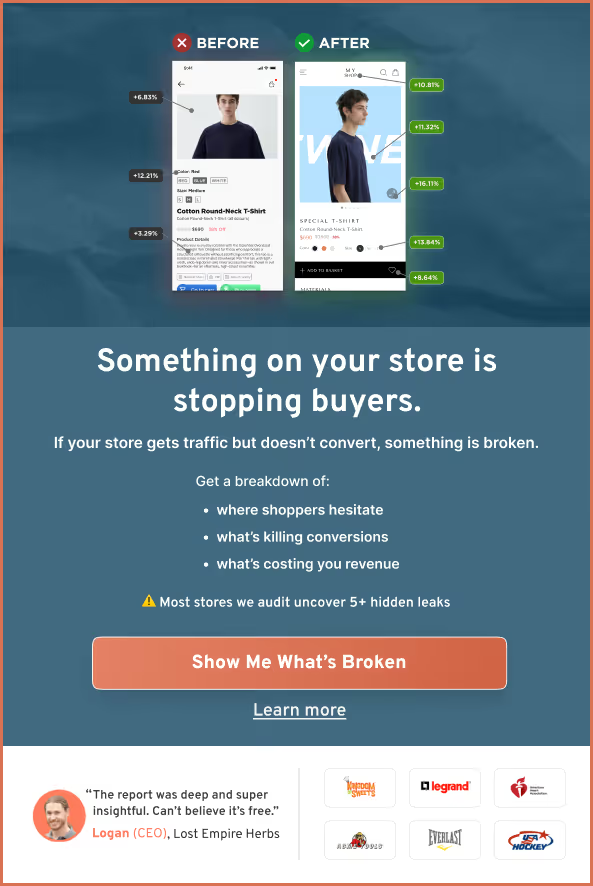
98% of visitors who visit an eCommerce mobile store—drop off without buying anything.
Why: user experience issues that cause friction for visitors.
And this is the problem Convertcart solves.
We've helped 500+ eCommerce stores (in the US) improve user experience—and 2X their conversions.
How we can help you:
Our conversion experts can audit your site—identify UX issues, and suggest changes to improve conversions.
Subscribe for more articles like this!

Read by 5000+ ecommerce store owners
.svg)

.svg)

.svg)
.svg)
2026 Convertcart, All Rights Reserved
33/1, Castle Street, Ashok Nagar, Bengaluru, India