eCommerce navigation is the system shoppers use to browse categories, search for products, apply filters, and move through your online store.
Good navigation reduces the effort required to find products, improves product discovery, and helps more shoppers reach checkout.
Optimizing your navigation menu, category structure, filters, and search experience can increase engagement, reduce exits, and improve conversion rates.
A shopper rarely abandons a store because they can't click a button. More often, they leave because they can't find what they're looking for quickly enough.
Navigation determines how easily shoppers move from curiosity to purchase. Every menu label, category, filter, and search result either helps them make progress or creates another reason to leave.
The difficult part is knowing what to fix first.
Should you simplify your menu? Reorganize collections? Improve filters? Add featured categories? Not every navigation improvement delivers the same business impact.
After auditing hundreds of eCommerce stores, we found that the highest-performing sites prioritize navigation improvements instead of trying to redesign everything at once.
That's why we've organized this guide around the ConvertCart Navigation Prioritization Framework, which maps 15 navigation strategies by their expected conversion impact and implementation effort, helping you identify the changes most likely to improve product discovery and revenue.
The eCommerce Navigation Prioritization Framework: What to Fix First
Do first
High impact · low effort
Ship in days, not sprints
1
Strip checkout navigationRemove all escape routes from the purchase flow
2
Sticky add-to-cart barAlways-visible ATC anchored to the bottom on mobile
3
Rotating benefits barTrust signals above the fold, cycling every 3–4 s
4
Surface deals in the navSecondary bar below main nav for active promos
5
Seasonal nav item + color cuePlace last in nav; use a color that appears nowhere else
Plan next
High impact · higher effort
Requires a proper sprint
6
Category-specific faceted filtersPer-category filter sets, real-time updates, no "Apply" button
7
Intent-labeled mega menuSubcategories by shopper goal, not product taxonomy
8
Use-case navigation structureOrganize by what shoppers are trying to accomplish
9
Predictive search + visual resultsThumbnails, typo handling, trending before typing
10
"Pick up where you left off"Personalized re-entry for returning visitors
Quick wins
Lower impact · low effort
Do opportunistically
11
Color-coded active nav statesDistinct highlight on current section at all times
12
Inline FAQ below product descriptionExpandable accordions sourced from real support tickets
13
Trust-forward conversational footerSecond-person headers, returns first, search bar included
Plan for scale
High impact · high effort
After basics work
14
Guided selling quiz in the nav≤5 questions, ends with direct add-to-cart recommendation
15
Bundle builder as nav experienceDedicated nav link, running total, pre-built options
A note on the ordering: within each quadrant, strategies run from highest to lowest priority. If you’re in “Do first” but can only tackle two things this month, start from the top.
Do First: High-Impact, Low-Effort Navigation Improvements
These five navigation improvements deliver the biggest conversion gains for the least implementation effort. Most can be completed with simple CSS updates, copy changes, or a single UI component, making them ideal for quick wins. If you can only improve a few parts of your navigation this quarter, start here.
1. Strip Checkout Navigation to Essentials
The worst thing a checkout page can do is remind shoppers there are other places to go.
Every navigation link above the fold is an opportunity for shoppers to leave the purchase flow.
The principle is straightforward: once shoppers reach checkout, product discovery is over. Your navigation should no longer encourage exploration—it should reduce distractions and help shoppers complete their purchase.
What to implement:
Remove the primary navigation from checkout pages.
Keep only your logo and an easy-to-find support link.
Display a progress indicator so shoppers know how many steps remain.
Keep the order summary visible, with an option to edit the cart.
Pre-select the returning shopper's last-used payment method when appropriate.
Quick Audit: Count every link on your checkout page that takes shoppers away from completing their purchase. Each unnecessary link is a potential exit point.
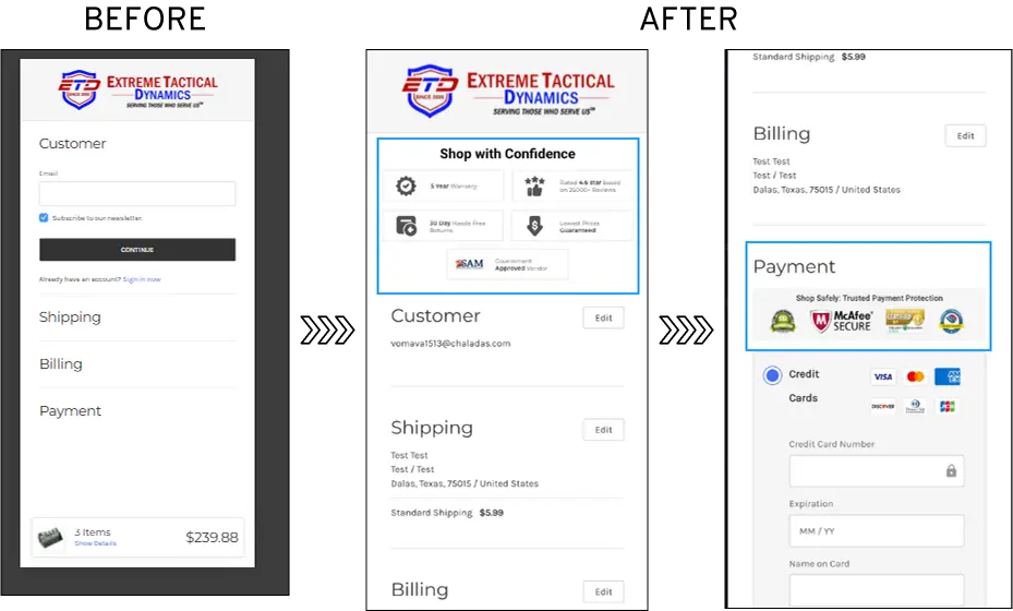
Convertcart Experiment: Removing Checkout Navigation Reduced Abandonment by 11%
Problem:
ConvertCart's audit of Extreme Tactical Dynamics found that
41% of shoppers abandoned checkout.
The page contained visual
clutter, lacked reassuring trust signals, and included multiple navigation
links that encouraged shoppers to leave before completing their purchase.
Hypothesis:
Once shoppers reach checkout, their goal is to complete the purchase, not
continue browsing.
Removing unnecessary navigation and reinforcing trust at
the point of payment should increase checkout completion.
What Changed:
Removed the primary navigation from checkout.
Added a checkout progress indicator.
Placed payment trust badges beside the CTA and order summary.
Why It Worked:
Removing navigation eliminated unnecessary exit paths and reduced cognitive
load.
Placing trust signals next to the payment action addressed last-minute
purchase anxiety at the exact moment shoppers needed reassurance.
Results
11% reduction in checkout abandonment 16.23% increase in desktop conversions
2. Add a Sticky Add-to-Cart Bar on Product Pages
A sticky add-to-cart bar keeps the purchase action visible as shoppers scroll, reducing friction on long product pages and making it easier to buy the moment they're ready.
Product pages often extend far beyond the initial add-to-cart button.
Shoppers browse images, read product descriptions, compare sizes, and scan reviews. By the time they've decided to purchase, the original CTA may be several screens away.
My Happy V solves this by anchoring a compact add-to-cart bar to the bottom of the screen.
As shoppers scroll, the bar keeps the product name, price, review rating, and add-to-cart button constantly visible, eliminating the need to scroll back up.
This is especially valuable on mobile, where product pages frequently require fifteen or more scrolls to reach the bottom.
Keeping the purchase action within thumb's reach removes unnecessary effort at the moment of intent.
What to implement:
Anchor the sticky bar to the bottom of the mobile screen.
Display the product price, review rating, and selected variant.
Show the sticky bar only after shoppers scroll past the primary add-to-cart button.
Keep the design compact so it doesn't obstruct product content.
Convertart Insight: If you offer subscriptions, display both the one-time purchase price and the subscribe-and-save price inside the sticky bar. This introduces the subscription option without requiring additional page space.
3. Add a Rotating Benefits Bar Above the Fold
A rotating benefits bar communicates your biggest trust signals before shoppers begin browsing, helping reduce uncertainty without taking up valuable page space.
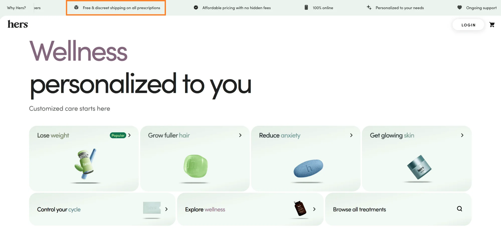
Hers places a rotating notification bar at the very top of every page.
It cycles through concise messages highlighting free shipping thresholds, easy returns, subscription savings, and brand guarantees. Each message is paired with a simple icon and automatically rotates every few seconds.
This isn't just a promotional banner. It's a trust-building tool. New shoppers often want answers to the same questions before they engage with a store. Can I return my order? How much is shipping? Is this brand reliable? By answering these questions immediately, the benefits bar reduces hesitation before shoppers even reach the product catalog.
What to implement:
Keep each message to six words or fewer.
Pair every message with a simple, recognizable icon.
Rotate messages every three to four seconds.
Let shoppers pause or manually navigate between messages.
Update messages during seasonal campaigns to highlight limited-time offers.
Convertcart Insight: Personalize the benefits bar based on acquisition source whenever possible. A shopper arriving from a branded search may respond better to messages about shipping speed or loyalty benefits, while someone arriving from a product-focused search often needs stronger trust signals such as free returns or satisfaction guarantees.
4. Surface Deals and Promotions Inside Your Navigation (Kohl's)
Shoppers shouldn't have to search for your best offers. If a promotion can influence a purchase decision, it should be visible from the moment someone lands on your store.
Kohl's places a dedicated promotional bar directly below its primary navigation, making coupon codes, limited-time sales, and featured offers impossible to miss.
Instead of hiding discounts behind a "Sale" page, the store brings them into the shopper's natural browsing path.
This small navigation change can have a big psychological impact. When savings are immediately visible, shoppers spend less time wondering whether a better deal exists and more time exploring products. The buying mindset shifts from "Should I shop here?" to "Which offer is right for me?"
Best practices
Add a dedicated promotions bar below your primary navigation instead of mixing offers with trust messages.
Keep active coupon codes and major sale events visible throughout the shopping session.
Let shoppers copy coupon codes with a single click.
Personalize featured promotions based on the categories or collections the shopper has already viewed.
Convertcart Insight: Avoid showing every active promotion at once. Highlight one primary offer and one secondary offer. Too many competing discounts create decision fatigue and reduce the perceived value of each promotion.
5. Highlight Seasonal Navigation Items with a High-Contrast Color Cue
Your navigation shouldn't treat every category equally. During seasonal campaigns, high-priority collections deserve visual emphasis so shoppers notice them immediately.
A simple color accent can draw attention to gift guides, holiday collections, limited-time launches, or clearance events without redesigning your entire navigation. The goal isn't to make your menu louder. It's to create a clear visual anchor that guides shoppers toward the categories that matter most right now.
Best practices
Place seasonal categories near the end of the primary navigation where they naturally attract attention.
Use a single accent color that isn't used elsewhere in the navigation.
Reserve the treatment for one or two priority items to maintain visual contrast.
Remove the highlight when the campaign ends to preserve its effectiveness.
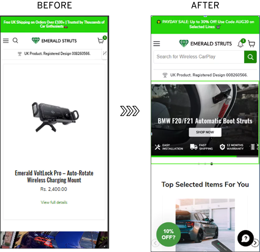
Convertcart Experiment: 39.57% Conversion Lift from High-Contrast Navigation Cues
Problem:
ConvertCart's audit of Emerald Struts found that seasonal promotions blended into the standard storefront. High-value campaign categories lacked visual contrast, causing shoppers to scroll past them without noticing they existed.
Hypothesis:
Seasonal navigation items should immediately stand out from the surrounding interface. Introducing a high-contrast, mobile-first visual anchor would naturally attract attention and increase engagement with promotional categories.
What Changed:
Introduced a high-contrast visual element designed specifically for mobile shoppers.
Created a distinct visual cue for seasonal and promotional categories.
Directed shopper attention toward the store's highest-priority campaigns.
Why It Worked:
Shoppers cannot click what they don't notice. High visual contrast interrupts scanning behavior, draws attention to priority navigation items, and encourages more shoppers to explore seasonal collections.
Outcome
This experiment resulted in a 39.57% increase in conversions.
🧭
Is your navigation helping shoppers find products or making them leave?
Your free ConvertCart audit identifies the biggest navigation and product discovery opportunities across your store, including:
Navigation paths that create unnecessary shopper friction
Category and collection pages that reduce product discovery
Search, filters, and mega menu improvements
Product page, cart, and checkout opportunities that increase conversions
"The report was deep and super insightful. Can't believe it's free."
Logan Christopher
CEO, Empire Herbs
Plan Next: High-Impact, Higher-Effort Navigation Improvements
These advanced eCommerce navigation improvements typically require engineering support and a dedicated implementation sprint. They optimize product discovery, search, filtering, and navigation structure, making it easier for shoppers to find the right products while improving conversion rates as your store scales.
6. Smart, category-specific faceted filters
A hardware store and a clothing store have almost nothing in common.
A ceiling fan shopper needs to filter by blade span and mounting type. A shirt shopper needs size, color, and fit.
Lowe’s understands this; their filters change for every category, showing only the attributes that actually matter for those products, and updating results in real time as shoppers select.
Generic filters applied across an entire catalog are one of the most consistent conversion killers in eCommerce.
They show too many irrelevant options, load slowly, and train shoppers to ignore them.
Build filter sets per category, not one universal set for the whole store
Show the most-used filters in the first fold, let shoppers expand to see more
Update results in real time on filter selection, no “apply filters” button
Allow multiple filters to be selected simultaneously, with easy individual dismissal
If a category has fewer than 20 products, skip filters entirely — they create friction without benefit
Convertcart insight: Track filter usage in your analytics. Filters that get almost no clicks are prime candidates for removal. Filters that get heavy use but few purchases suggest a merchandising problem, not a navigation one.
7. Organize Your Mega Menu Around Shopper Intent, Not Product Taxonomy
The best mega menus don't mirror your internal catalog. They mirror how shoppers think.
Instead of grouping products by departments or inventory structure, organize your navigation around shopper goals, use cases, or buying intent. When visitors immediately recognize where they should click, they spend less time searching and more time exploring products.
Best practices
Group categories by shopper goals instead of internal product hierarchies.
Create clear visual separation between major navigation groups.
Prioritize your highest-performing categories in the first column or row.
Limit the number of choices within each section to reduce decision fatigue.
Use descriptive labels that shoppers understand at a glance.
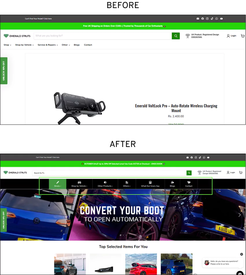
How Convertcart Redesigned Desktop Navigation to Secure a 16.05% Improvement in Conversions
Problem:
ConvertCart's audit of Emerald Struts found that the desktop navigation had become a dense collection of competing links with no clear hierarchy or visual logic. Shoppers arrived with purchase intent but struggled to find the right path to products.
Hypothesis:
Restructuring the navigation into logical, goal-oriented groupings with a clear visual hierarchy would reduce decision paralysis and encourage more shoppers to click through to product pages.
What Changed:
Removed unnecessary navigation clutter.
Rebuilt the desktop navigation around shopper goals instead of internal product taxonomy.
Introduced a clearer visual hierarchy and structured discovery pathways.
Why It Worked:
Navigation performs best when it reflects how shoppers think, not how products are organized internally. Simplifying the decision process and grouping related categories by intent reduced cognitive load, helping shoppers find products faster and browse with greater confidence.
Outcome
This experiment resulted in a 16.05% increase in sitewide conversion rate.
8. Use-case-based navigation structure
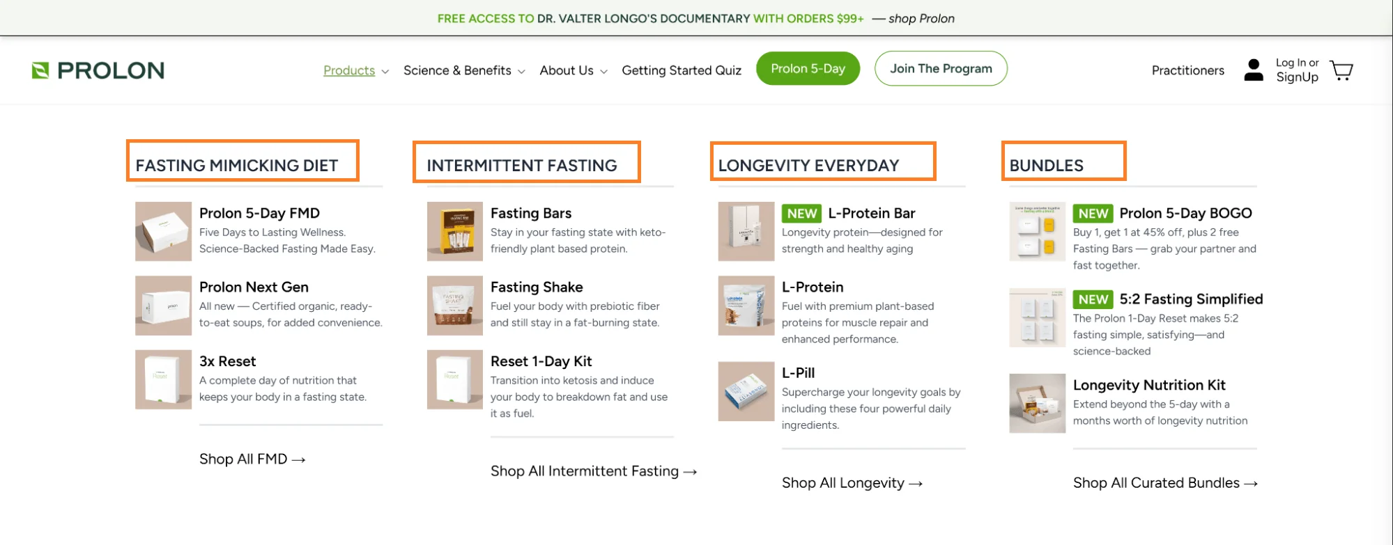
Prolon sells fasting programs and supplements.
Their navigation ignores product types entirely and organizes by what shoppers are trying to do: “Fasting Mimicking Diet,” “Intermittent Fasting,” “Longevity Everyday.”
Under each goal, the best-matched products appear with their bestsellers and new launches.
This approach is particularly effective for high-consideration products, supplements, skincare, technical equipment, or anything where the shopper arrives with a goal rather than a specific product in mind.
Organizing by use case meets them where they are, rather than asking them to translate their needs into product category language.
Map your top five or six customer goals before restructuring your navigation
Put multi-use products under multiple parent categories with slightly different framing
Pair each use-case category with its top two or three bestsellers visible in the dropdown
What advanced brands do: Run a short survey or review-mining exercise to find the exact language shoppers use to describe their goals. That language becomes the nav label. “Help me sleep” outperforms “Sleep supplements” every time.
How do the best online retailers structure their product listing grids to maximize clicks and sales? Explore these real-world eCommerce category pages to borrow their UX tactics.
9. Add Predictive Search with Visual Product Suggestions
Predictive search should do more than autocomplete keywords. It should help shoppers discover relevant products before they even reach the search results page.
The best predictive search experiences combine product thumbnails, pricing, ratings, and intelligent suggestions as shoppers type. They reduce typing, shorten the path to product discovery, and keep high-intent visitors moving toward a purchase instead of forcing them to refine searches repeatedly.
Include prices and ratings to help shoppers evaluate products immediately.
Handle spelling mistakes, synonyms, and partial product names.
Show trending products or popular searches before shoppers begin typing.
Recommend related products directly from the search experience.
How Convertcart Used Advanced Discovery to Get a 29.4% Increase in Conversions
Problem:
ConvertCart's audit of Extreme Tactical Dynamics found that
shoppers using site search frequently reached dead ends. Product pages
offered no easy way to continue browsing, compare similar products, or
discover related items, despite search users being the store's
highest-intent visitors.
Hypothesis:
Shoppers who explore multiple products are more likely to convert than those
who view a single item. Creating continuous product discovery pathways would
encourage deeper browsing and increase overall conversions.
What Changed:
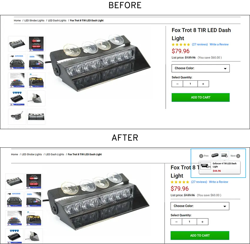
Introduced Previous and Next navigation between related products.
Added intelligent cross-sell recommendations on product pages.
Turned isolated product pages into a continuous product discovery experience.
Why It Worked:
The experiment confirmed that keeping high-intent shoppers moving through
relevant products increases purchase likelihood.
Outcome
This experiment resulted in a 29.4% increase in overall conversions.
Visitors who viewed
three or more products converted at 5.04%, compared with
2.77% for shoppers who viewed only one product.
10. “Pick up where you left off”
J.Crew’s search bar transforms once a shopper has interacted with the site.
Instead of generic trending items, it surfaces a personalized re-entry point: recently viewed products, previously browsed categories, and items related to past purchases.
For a shopper who browsed sweaters three days ago and just returned, the navigation instantly reflects where they were.
Returning visitors are the warmest traffic a store gets. They already know the brand. They came back. Forcing them to rediscover products they already looked at is an unnecessary friction that costs repurchases and reduces lifetime value.
Show “Recently Viewed” in the search bar dropdown before the shopper starts typing
Break it down by category: “Recently Viewed: Outerwear” rather than a flat list
For shoppers without a session history, default to location-appropriate trending items
Update in real time, stale recommendations are worse than none
Quick Wins: Low-Effort Navigation Improvements
These navigation improvements are quick to implement and require little development effort, making them ideal for improving the shopping experience without a major redesign. While they won't have the same conversion impact as navigation architecture, search, or filtering improvements, they reduce friction, strengthen trust, and make your store easier to browse.
Treat these as quick wins after you've addressed the higher-priority navigation issues. Together, they create a smoother customer experience and can deliver meaningful incremental gains over time.
11. Color-coded active navigation states
Bespoke Post uses color coding and subtle highlights in its navigation bar to show shoppers exactly which section of the store they are currently in.
It is a small thing. It costs almost nothing to implement. And it prevents the surprisingly common experience of a shopper scrolling through a category and forgetting how they got there or how to get back.
For large catalogs with multiple levels of subcategories, orientation cues are particularly valuable. Shoppers who know where they are explore more broadly. Shoppers who feel lost leave.
Use a distinct color or underline on the active parent category at all times
For returning shoppers, you can identify and subtly shift the highlight to reflect their most-browsed category
12. Inline FAQ below the product description
Pressed Juicery places a short FAQ section immediately after the product description, formatted as navigation buttons rather than a static block of text.
The questions are the exact ones that prevent purchase: ingredient sourcing, shelf life, subscription flexibility, and delivery windows.
The answers are two to three sentences each. Shoppers who have a question get the answer without leaving the product page.
Every time a shopper leaves a product page to find an answer, there is a meaningful chance they do not come back. Inline FAQs eliminate those exits.
Source questions from your actual support tickets and review text, not from guessing what shoppers want to know
Keep answers under four sentences; longer answers belong on a dedicated FAQ page
Format as expandable accordions so the page does not feel overwhelming
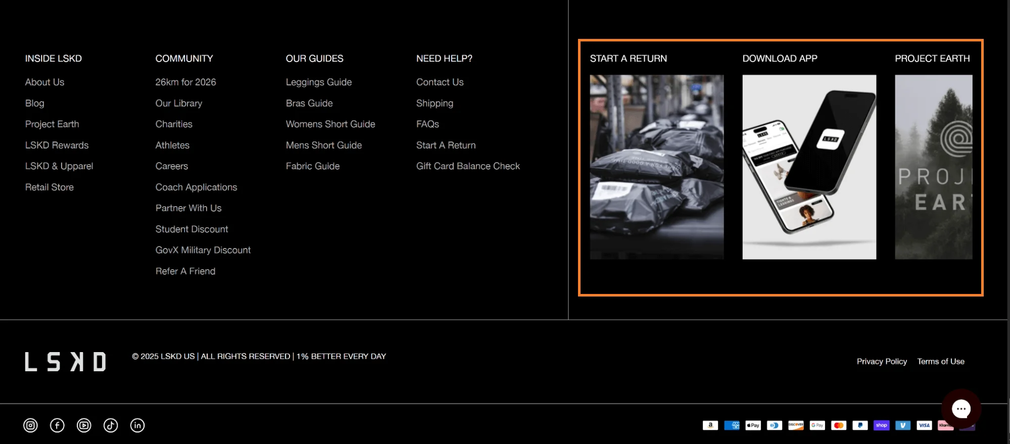
People who scroll to the footer of a product or collection page are almost always there for one reason: they want to know if they can trust the store. LSKD’s footer understands this.
The section headers do not say “Customer Service” and “About.” They say “Need help?” and “Stay connected.”
The links underneath are practical: “Start a Return,” “Download the App,” “Project Earth.”
Payment icons and trust badges sit alongside social links without screaming for attention.
Write footer section headers in the second person, “Need help?” not “Customer Service.”
Lead with the most anxiety-reducing links: returns, tracking, contact
Add a search bar in the footer so shoppers can search without scrolling back to the top
Surface your sustainability credentials or certifications here; high-intent shoppers who reach the footer often care about these
Plan for Scale: High-Impact, High-Effort Navigation Investments
These advanced navigation improvements deliver significant long-term value, but they require substantial investment in technology, data, and ongoing optimization. Features like AI-powered personalization and dynamic navigation perform best once your core navigation, search, and filtering experience are already optimized.
Implement these initiatives after you've addressed your foundational navigation issues. A strong navigation structure is what allows these advanced capabilities to deliver their full impact on product discovery, customer experience, and conversions.
14. Guided selling quiz embedded in the navigation
Nuun Hydration puts a “Find Your Match” quiz directly in their navigation bar alongside the standard category links.
The quiz takes ninety seconds, asks about activity level, hydration goals, and flavor preferences, and returns a personalized product recommendation with a direct add-to-cart path.
This works because Nuun has a deep enough product catalog that the choice is genuinely overwhelming. Electrolyte tablets, energy drinks, rest formulas, and immunity blends, a first-time visitor has no clear starting points without guidance.
The quiz solves that problem. It does not work as well for stores with ten products, where the choice is simple enough that a quiz feels condescending.
Run a quiz only if you have more than fifteen to twenty products that are genuinely difficult to differentiate at a glance
Keep the quiz to five questions or fewer — each additional question reduces completion rate
End every quiz with a direct add-to-cart recommendation, not a filtered category page
Store quiz results and resurface them on return visits
What advanced brands do: Use quiz responses to power post-purchase email sequences. A shopper who said they run five times a week gets different replenishment emails than one who said they cycle on weekends.
15. Bundle builder as a nav-triggered experience
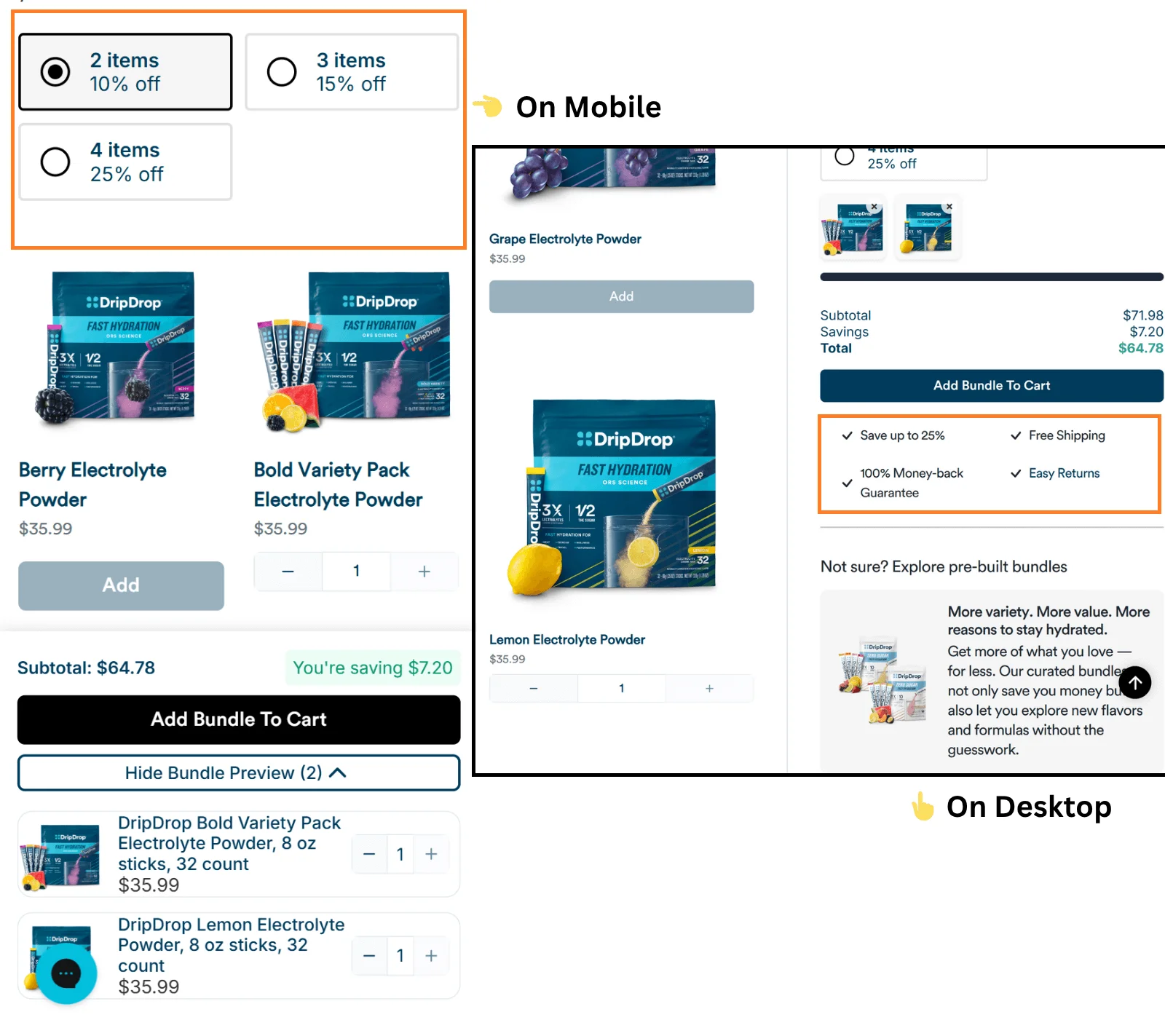
Drip Drop’s “Build Your Own Bundle” link in the navigation opens into a dedicated guided experience.
The main navigation disappears. On mobile, shoppers see two CTAs: add more items or preview the bundle.
On desktop, it’s a 60/40 split: the left side walks through the build step by step, the right side shows the running total, available perks, and pre-built bundles for shoppers who want to skip the configuration entirely.
Nothing about it feels like a checkout form. It feels like building something.
The business case is straightforward: bundles lift average order value, and a guided builder removes the cognitive work of putting a bundle together manually. The implementation case is more demanding: it requires product, engineering, and UX to agree on the logic, the discounting rules, and the mobile experience. Build it right or not at all.
Gate the bundle builder behind a dedicated nav link, not a product page popup
On mobile, reduce the experience to its absolute minimum: item selection and a running total
Show the savings unlocked at each bundle tier to create a progression incentive
Offer two to three pre-built bundles at the end of the flow for shoppers who don’t want to configure
Navigation audit checklist
Use this before you start and after you’re done. It maps directly to the four quadrants above.
Item No.
Audit Checklist Item
A. Desktop Header & Global Navigation
1
Top parent categories are strictly limited to 7 or fewer items to minimize cognitive overload.
2
Menu labels use predictable, standard industry terms (e.g., "Shop All," "New Arrivals") rather than abstract brand marketing speak.
3
Mega menus utilize clear visual columns with bold section headers to group sub-categories logically.
4
A distinct, global "Sale" or "Clearance" link is colored uniquely (e.g., red) to draw immediate high-intent click volume.
5
Persistent utility links (Cart, Account, Store Locator, Support) remain separated from product categories, usually aligned to the far right.
6
Drop-down menus employ a slight hover-delay (150-300ms) to prevent accidental trigger loops when a mouse tracks across the screen.
B. Mobile Drawer Menu (Hamburger UX)
7
Hamburger toggle icon is positioned predictably within comfortable thumb-reach (top left or top right corner).
8
Sub-categories utilize clean accordion expand/collapse triggers (+ / - or downward carets) instead of redirecting users to separate pages.
9
Clickable touch targets are styled to a minimum size of 44 x 44 pixels to prevent accidental fat-finger inputs.
10
The active shopping cart button and global site search icon remain permanently sticky at the top or bottom of the mobile viewport.
11
Primary contact options, order tracking links, and language/currency selectors are cleanly housed at the bottom of the drawer.
C. On-Site Search Engine Experience
12
The search input box is fully expanded on desktop by default, rather than hidden behind a small magnifying glass icon.
13
Autocomplete functionalities trigger immediately after 3 characters are entered into the search field.
14
Live search drop-down displays rich visual feedback including thumbnail product images, clear pricing, and current stock status.
15
The engine parses common typographic misspellings, synonyms, and plural variants smoothly without breaking.
16
"Zero Results" landing pages display fallback alternative categories, curated best-sellers, or an open live-chat assistance link instead of a dead end.
17
On mobile devices, tap actions on the search field launch an auto-focused keyboard overlay instantly.
D. Product Listing Pages (PLP) & Filtering
18
Desktop filter arrays feature horizontal positioning directly above the product grid to maximize vertical viewing space.
19
Mobile filter triggers launch a dedicated full-screen drawer accompanied by a fixed, sticky "Show [X] Results" count button.
20
Filter parameters allow for multi-select combinations without refreshing or reloading the entire page structure on every individual click.
21
Applied filter states are highlighted clearly at the top of the grid with straightforward, individual "X" removal tokens.
22
Sorting logic variables (Price: Low to High, Best Sellers, Newest) are kept distinct from qualitative trait filters.
23
Product count numbers adjust dynamically next to every filter parameter option to accurately represent current inventory totals.
E. Corporate Footer Architecture
24
Structural links are mapped out cleanly under standardized semantic blocks (e.g., "Customer Service," "About Us," "Legal").
25
Essential transactional entry points like Order Tracking, Return Portals, and Shipping Information are easy to spot.
26
Direct contact methods (Phone lines, Email addresses, Live Support hours) live directly above or below social media profile grids.
27
Accepted payment gateway graphics (Visa, Mastercard, PayPal) and regulatory trust markers are positioned neatly at the baseline.
28
Email capture fields feature clear feedback states to acknowledge successful sign-up confirmation loops immediately.
Before you go...
Most navigation debt is invisible in the aggregate. But they accumulate.
The framework in this post exists to make that debt visible and actionable. Start in the top-left quadrant.
Fix checkout navigation. Add the sticky bar. Put your promotions where shoppers can see them. Then, when those are done, move to the filters, the mega menu, and the search experience.
If you want a faster path to finding where your specific store is losing shoppers, our CRO team audits navigation as part of a free conversion review.
Frequently Asked Questions About eCommerce Navigation
1. What is eCommerce navigation?
eCommerce navigation is the system that helps shoppers move through an online store to find and purchase products. It includes the main menu, search bar, category pages, filters, breadcrumbs, footer links, and other navigation elements.
Good navigation reduces friction, improves product discovery, and increases conversions by helping shoppers find what they need quickly.
2. How many items should an eCommerce navigation menu have?
There is no single ideal number of navigation items. The right structure depends on the size of your product catalog and how shoppers browse your store.
For smaller catalogs, a simple top-level menu may be enough. Larger stores should organize products into logical groups using a well-structured mega menu instead of listing every category in the main navigation. A clear hierarchy makes products easier to find and reduces cognitive load.
3. What is the difference between a mega menu and a dropdown menu?
A dropdown menu displays a simple list of links beneath a navigation item and works well for smaller product catalogs.
A mega menu displays multiple columns of categories, featured products, images, and promotional content within a larger panel. It helps shoppers explore large catalogs more efficiently by exposing more of your site's structure without requiring multiple clicks.
4. How do I know if my eCommerce navigation needs improvement?
Poor navigation often appears in shopper behavior before it affects revenue. Common signs include shoppers relying heavily on site search, high exit rates on category or collection pages, low engagement with navigation links, and session recordings that show visitors repeatedly backtracking or abandoning their journey.
Reviewing analytics, heatmaps, and session recordings can help identify where shoppers experience navigation friction.
5. Which eCommerce navigation improvements have the biggest impact on conversions?
The highest-impact navigation improvements depend on where shoppers encounter friction, but the biggest opportunities usually include simplifying checkout navigation, improving product filtering and search, optimizing mega menus for product discovery, adding sticky navigation or sticky Add-to-Cart bars on mobile, and personalizing navigation for returning shoppers.
Prioritize improvements based on both their expected impact on conversions and the effort required to implement them. The ConvertCart Navigation Prioritization Framework can help you identify which changes to tackle first.
6. When to avoid nudges in luxury eCommerce?
Luxury shoppers expect exclusivity, confidence, and a premium buying experience. Avoid nudges that create unnecessary urgency or make the brand feel promotional, such as aggressive countdown timers, constant pop-ups, fake scarcity, or excessive discount messaging. Instead, use subtle nudges like expert recommendations, craftsmanship details, limited-edition information, concierge support, and social proof from verified customers. The goal is to reduce purchase anxiety without reducing perceived brand value.
Subscribe for more articles like this!
Thank you - we'll see you in your inbox soon!
Oops! Something went wrong while submitting the form.
Read by 5000+ ecommerce store owners
Subscribe for more articles like this!
Thank you - we'll see you in your inbox soon!
Oops! Something went wrong while submitting the form.











.avif)
.svg)


.svg)

.svg)
.svg)
