The problem isn't that stores aren't personalizing. It's that they're personalizing at customers rather than for them. Product recommendation widgets that suggest the item just purchased. "Welcome back" banners that address nobody by name.
Popups triggered by geography that offer a discount to someone about to pay full price anyway.
To separate genuinely high-converting personalization from the decorative kind, we analyzed patterns across dozens of eCommerce brands and built a scoring framework.
Then we applied it to five of the best personalization examples we've found, to show exactly why they work, and what you can steal.
Before we get to the examples, here's the lens we're using to evaluate them. High-converting eCommerce personalization doesn't optimize one thing in isolation; it works across five dimensions simultaneously.
🧠 Signal Intelligence: Is the personalization based on meaningful behavioral data, or is it a blunt instrument? (Score: /5)
🎯 Relevance Precision: Does the personalization feel tailored to this shopper, right now, or does it feel like it could apply to anyone? (Score: /5)
⚡ Friction Impact: Does the personalization reduce the effort required to make a purchase decision? (Score: /5)
🤝 Trust Contribution: Does the personalization make the shopper feel understood rather than surveilled? (Score: /5)
💰 Revenue Intentionality: Is there a clear, non-disruptive mechanism for increasing AOV or repeat purchase? (Score: /5)
Total: /25: Scores below 15 suggest personalization that looks busy but underperforms. Scores above 20 indicate genuine conversion architecture.
Use this framework to score your store and see what to fix
The Personalization Scoring Checklist (Audit Your Store in 5 Minutes)
Before you look at anyone else's approach, it's worth running this diagnostic on your own category and product pages.
Signal Intelligence
Are you personalizing based on session behavior, or only on login/account history?
Do you have a fallback logic for first-time visitors with no data?
Are you distinguishing between browsers and buyers in how you serve recommendations?
Relevance Precision
Does your recommendation engine surface products from categories the shopper has actually engaged with?
Are size, color, or variant preferences being remembered and applied?
Are your "recommended for you" labels earned or just applied to everything?
Friction Impact
Is checkout autofilling address and payment data wherever possible?
Are size guides, stock availability, and delivery estimates surfaced before the shopper has to ask?
Does personalization reduce clicks to purchase or add them?
Trust Contribution
Are personalized offers presented transparently, or does the shopper feel they stumbled into something?
Is loyalty program enrollment nudged at the right moment, with a clear reason to join?
Are personalized discounts shown near decision points, not buried in footers?
Revenue Intentionality
Are upsell and cross-sell recommendations placed at moments of high intent (cart, PDP, post-purchase)?
Is AOV-boosting personalization subtle enough not to feel like a checkout obstacle?
Are your bundles and add-ons dynamically built from the shopper's browsing history?
The Personalization Evaluation Matrix
Dimension
What "Good" Looks Like
Score
Signal Intelligence
Behavioral + account data, with first-visit fallback
/5
Relevance Precision
Variant-level recommendations, not just category-level
/5
Friction Impact
Fewer clicks to purchase than without personalization
/5
Trust Contribution
Shopper feels helped, not followed
/5
Revenue Intentionality
Clear AOV mechanism at high-intent moments
/5
eCommerce Personalization Examples (Scored and Analyzed)
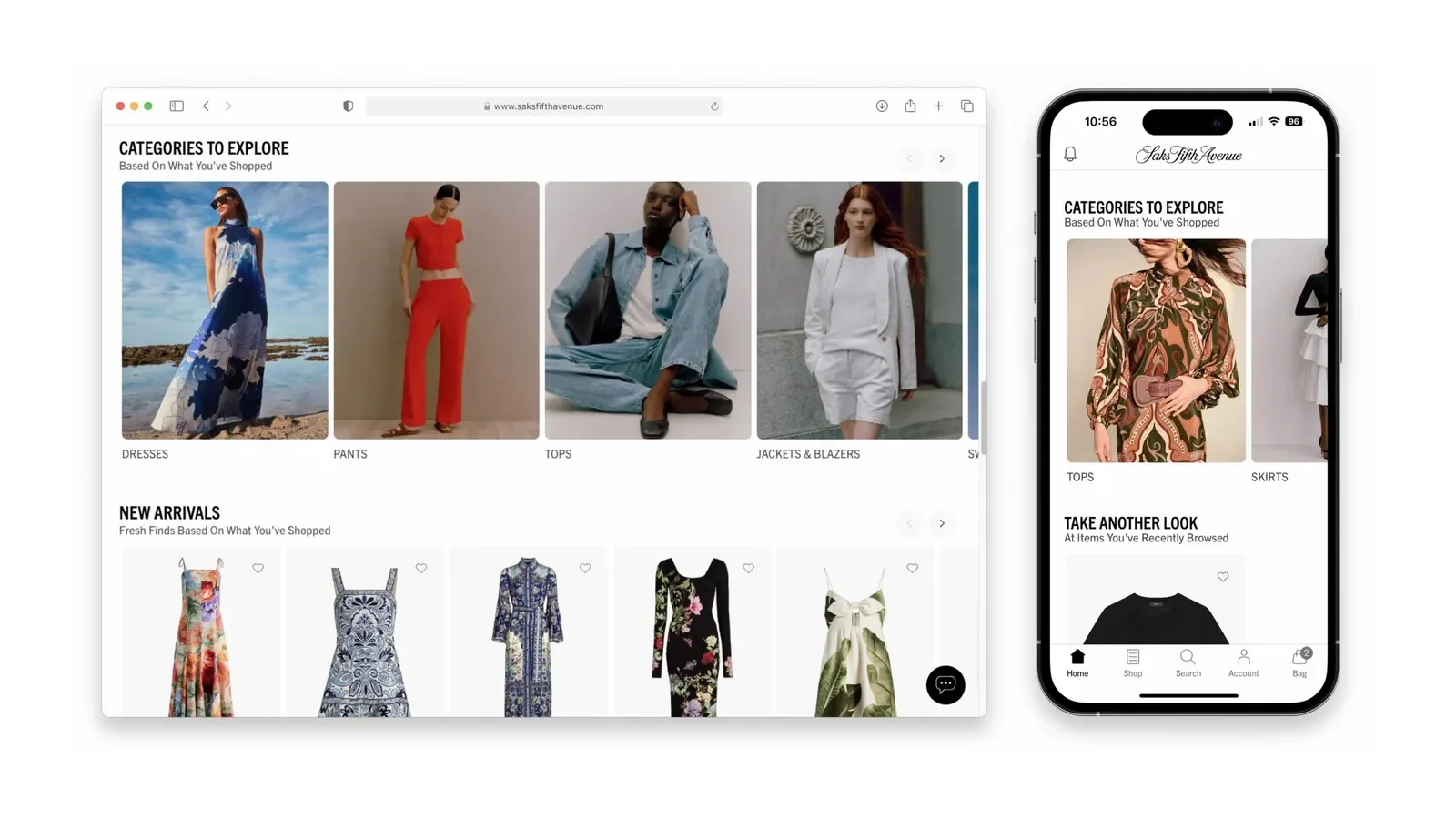
The entire Saks homepage is built on dynamic content blocks: sections that shift and rearrange themselves based on a shopper's account history, purchase behavior, and browsing patterns. The "categories to explore" section is also tailored to each shopper's demonstrated tastes.
Someone who has spent three sessions browsing outerwear sees something different from someone whose history skews toward shoes and accessories.
What elevates this above standard recommendation widgets is Saks' fallback logic.
For first-time visitors, the unknown quantities who arrive with no account history and no behavioral trail, the system pivots elegantly to real-time session behavior. What did they click on? What did they linger over?
Within minutes, the homepage begins adjusting to reflect what this particular shopper appears to care about, even without a login. This matters because most personalization engines serve generic "bestsellers" to new visitors, which is a missed opportunity.
What to steal: Build explicit fallback logic for anonymous visitors. Real-time session behavior (what they click, how long they linger) is a signal. Use it.
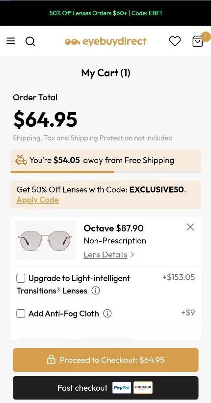
There is a moment in every shopping session that, if you know how to read it, tells you a great deal about whether a purchase is going to happen. The cart page visit. Not the checkout cart.
Eye Buy Direct has thought carefully about this moment. Their cart page personalization uses machine learning to predict, in real time, which shoppers are price-sensitive and which are not, and then serves each group a different experience.
Price-sensitive shoppers see a dynamic free shipping bar (showing exactly how much more they need to spend to qualify) alongside a prominently displayed, one-tap discount code. Premium-oriented shoppers see optional upgrades and accessory bundles instead.
The sophistication here is in the segmentation.
Eye Buy Direct's approach preserves margin with high-intent premium shoppers while rescuing at-risk carts with timely offers. The one-tap discount application is a particularly neat piece of friction reduction. The code is visible, already entered, requiring only a single tap to apply. There is no coupon-hunting, no copy-pasting, no moment of distraction that might send the shopper to Google in search of a better deal.
The slight knock on relevance precision is that the product recommendations within the cart could be more granular; they don't yet appear to adapt to the specific items in the cart, only to the shopper's broader behavioral profile.
A small limitation in an otherwise excellent execution.
What to steal: Don't apply personalized discounts uniformly. Identify which shoppers need a price nudge and which don't and serve accordingly. You'll convert more and protect more margin simultaneously.
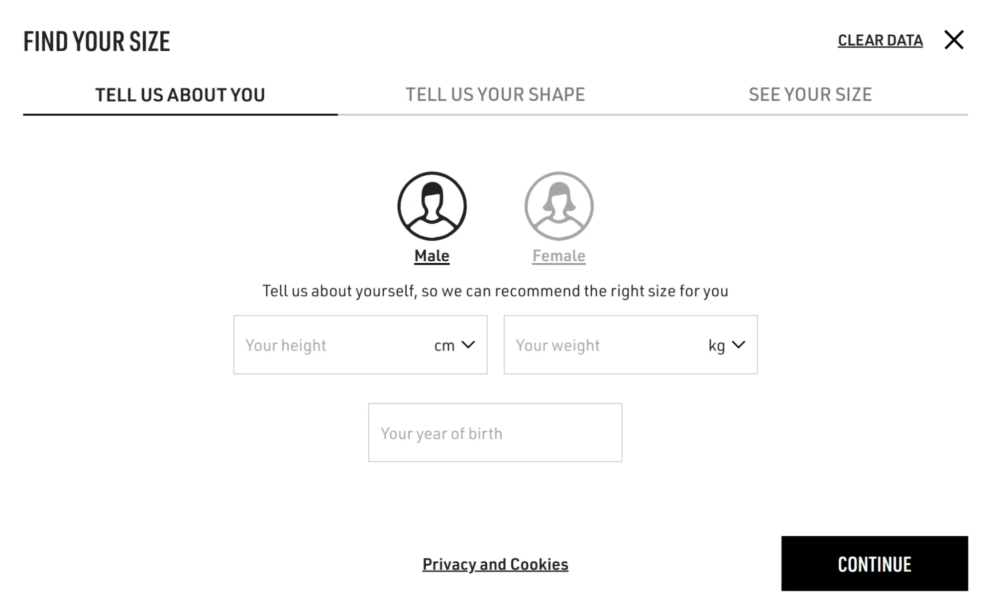
Here’s something worth understanding about shoe shopping online: sizing anxiety is a genuine conversion blocker, not a minor inconvenience.
Golden Goose decided to address this directly, with a quiz-based size predictor that works from real inputs, body shape, weight, age, and foot width rather than the blunt instrument of a standard size chart.
The execution is impressive in two dimensions. The quiz itself is well-constructed: short enough not to be a nuisance, specific enough to generate a recommendation that feels earned rather than generic. And the data retention is the quiet masterstroke. Once a shopper completes the quiz, Golden Goose stores their sizing profile and applies it automatically on subsequent visits.
Pre-selected sizes appear on product pages. Stock nudges ("only two left in your size") are specific to the shopper's profile, not a generic scarcity tactic.
The trust contribution scores perfectly because the personalization is explicitly helpful.
The revenue intentionality score is lower because the sizing personalization, excellent as it is, stops at the confidence-building stage.
There is a relatively straightforward opportunity to extend it: once a shopper's size profile is established, dynamically surfacing "more products in your size" recommendations or low-stock alerts would close the loop between trust-building and purchase.
What to steal: Retained sizing data is an underused asset. Once you have it, build inventory nudges and recommendations around it. "Only 1 left in your size" is considerably more persuasive than "Only 1 left."
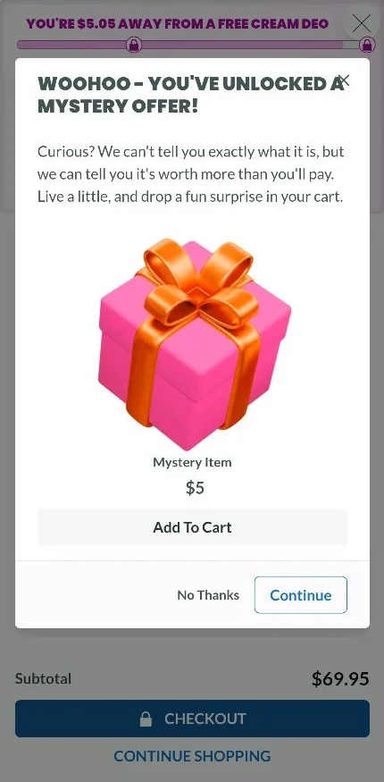
The checkout upsell is one of the most commonly botched moments in eCommerce. Done well, it feels like a helpful suggestion from someone who knew exactly what you were already thinking.
Lume's checkout personalization falls decisively in this category. The mechanic is elegantly simple: a $5 mystery item, presented directly on the checkout page, positioned not as an upsell but as an unlock.
The framing matters. Lume's loyalty program is structured so that certain purchase thresholds trigger free products, and $5 happens to be the precise amount needed to reach the next threshold in many carts.
The mystery item offer is therefore not an arbitrary add-on. It is a logical next step that Lume has made visible and frictionless, at the moment the shopper is most receptive to it.
Combined with the low price point (typically around 10% of cart value, which makes the decision feel trivial) and one-click application, the conversion mechanic is tidy.
The signal intelligence score is modest because this personalization is relatively blunt it doesn't appear to adjust the offer based on the specific products in the cart or the shopper's purchase history.
A first-time buyer and a repeat customer see essentially the same mechanic. There is headroom here.
What to steal: Price your checkout upsells in relation to the existing cart value, not as standalone offers. A $5 addition that unlocks something feels different from a $5 add-on that stands alone. Context changes the arithmetic.
Loyalty programs are, as a rule, less interesting than their designers believe them to be.
They offer points. Points accumulate. Points are eventually redeemed, often for things the shopper didn't particularly want.
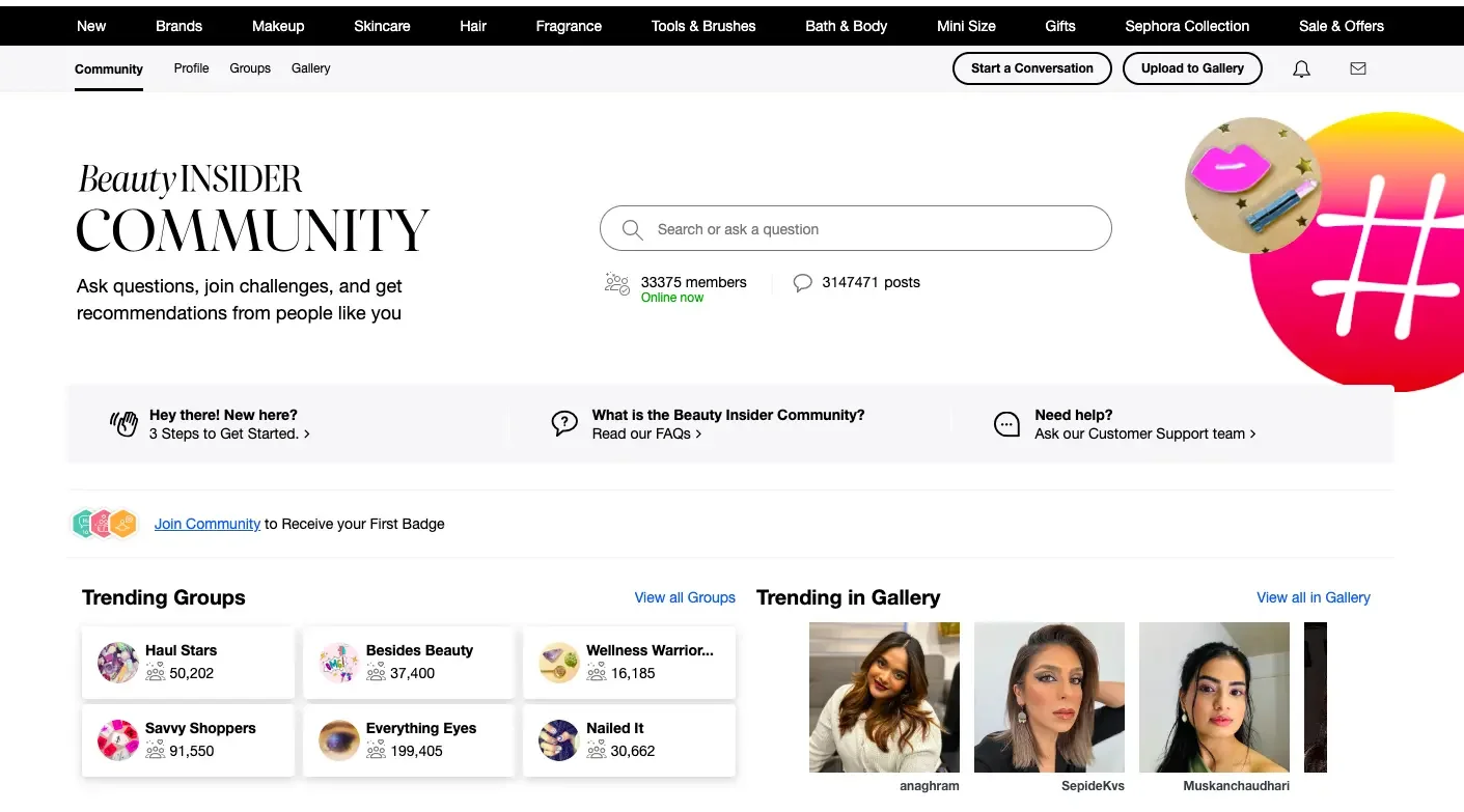
The shopper feels mildly satisfied and then largely forgets about it. Sephora's Beauty Insider program is a notable exception.
The Beauty Insider community is a searchable, gamified, personalized ecosystem.
The search bar within the community autocompletes based on what the shopper has previously searched for and what's currently trending among users with a similar profile.
"Trending" sections surface content that is algorithmically relevant to each shopper's tier, product preferences, and engagement history.
Popular questions, frequently used products, and highly-rated community members are weighted differently for different shoppers.
What makes this remarkable, from a personalization standpoint, is that Sephora has embedded the trust mechanism inside the loyalty mechanism.
When a shopper sees that someone with similar preferences found a particular foundation shade useful, that is a trust signal delivered through personalization not a generic review from an unidentified person, but a recommendation from someone algorithmically identified as sharing the shopper's profile.
Social proof, in other words, is made specific.
The gamification layer tiers, points, and community status keep shoppers engaged in between purchase decisions, which is a personalization challenge most stores ignore entirely.
Most personalization happens during a visit. Sephora's personalization happens continuously, maintaining a relationship with the shopper that doesn't require them to be actively shopping.
What to steal: Use autofill and trending content within your search experience as personalization surfaces, not just navigation tools. A search bar that remembers and anticipates is a small but significant trust signal.
What the Highest-Scoring Personalization Examples Have in Common
Having applied the framework across these five examples, and across dozens of others we reviewed and discarded, certain patterns emerge.
They personalize the decision, not just the display: The difference between showing a shopper "products you might like" and showing them "the right size, at the right moment, with a reason to act" is the difference between decoration and architecture. The highest-scoring examples reduce the actual cognitive work of choosing, not merely the visual noise of browsing.
They have fallback logic: No personalization system has data on every visitor. The brands that score highest treat the unknown visitor not as an unsolvable problem but as a first-session opportunity using real-time behavioral signals, trending content, or broad category relevance to deliver something approximating personalization even without account history.
They are transparent about what they're doing: Shoppers in 2026 are not naive about personalization. They know that recommendations are generated, that discounts are targeted, and that their behavior is being tracked. The brands that earn high trust scores don't pretend otherwise; they frame their personalization as a service ("here's what we found in your size") rather than a mechanism ("our algorithm has determined").
They pick their moment. Cart page, checkout, post-purchase, size quiz every high-scoring example deploys personalization at a specific, intentional point in the shopper's journey. Personalization applied everywhere, at every moment, becomes noise. Personalization applied at the right moment becomes the experience.
Score Your Store
Use the matrix below to evaluate one page of your store. Pick the highest-traffic one before moving to others.
Dimension
What to Look For
Your Score
Signal Intelligence
Behavioral data in use, with first-visit fallback
/5
Relevance Precision
Variant-level, not just category-level
/5
Friction Impact
Fewer steps to purchase with personalization active
/5
Trust Contribution
Shopper feels helped, not surveilled
/5
Revenue Intentionality
Clear AOV mechanism at a high-intent moment
/5
Total Score
/25
Below 15: Your personalization is likely a decorative present, but not doing meaningful conversion work. Start with friction impact and signal intelligence.
15–19: Solid foundations, but probably one or two dimensions dragging the overall score. Relevance, precision, and revenue intentionality are the most common weak points.
20–25: You're in the territory of genuine conversion architecture. The question now is consistency: are all your high-traffic pages scoring this well?
If you'd like a personalized audit of your store's top pages, book a free audit with Convertcart.


.svg)

.svg)

.svg)
.svg)
