15 eCommerce Sites With Amazing User Experience (Real-World Examples)


If you’re looking to build an eCommerce brand in 2026, you already know the internet isn’t exactly suffering from a shortage of online stores.
It’s a bit like walking into a mega–supermarket where every aisle is labeled “Snacks,” every shelf claims to be “New & Improved,” and every passerby is shouting about free shipping.
In this chaos, the only way to truly stand out is to deliver a user experience so smooth and so intuitive that shoppers don’t just buy… they come back.
The curious thing is: great UX rarely draws attention to itself. When a site is beautifully designed around the customer’s buying instincts, it almost disappears.
Pages load with a sense of purpose. Navigation feels like it’s reading your mind. Product pages anticipate objections before the shopper fully forms them.
You don’t notice these details when they work, only when they don’t, which is how most founders end up diagnosing UX problems the same way one discovers a leaky pipe: far too late and with mild despair.
This post is your shortcut. We’ve rounded up 15 eCommerce brands, real, profitable examples that have turned UX into a competitive advantage.
These aren’t theoretical frameworks or slides from a conference deck.
They’re living, breathing storefronts that show how design, psychology, and user empathy translate into higher conversions and healthier customer LTV.
Are you ready? Let’s begin.
If you want to improve user experience on your eCommerce website in 2026, focus on the simple things that make online shopping feel smoother, quicker, and more human.
The big wins come from faster pages, clearer product information, effortless navigation, and mobile experiences that don’t require acrobatics from your thumbs.
Add in intelligent search, trustworthy reviews, and checkout flows that behave as if they’ve actually met a real shopper before.
Suddenly, your store becomes a place people enjoy visiting rather than merely tolerating.
This guide walks you through 15 real-world eCommerce UX examples that show what “great” actually looks like.
From user-experience website design upgrades to minor, practical customer experience tweaks, each example offers something founders can copy immediately.
No jargon.
No theory. Just proven eCommerce UX best practices you can use to build a site that sells better in 2026.
Great eCommerce UX rarely announces itself; it simply gets out of the way and lets people buy without friction or second-guessing.
So, here are some eCommerce websites that do UX right by making shopping feel obvious, reassuring, and oddly satisfying.
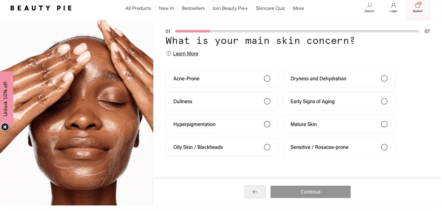
Beauty Pie, the popular cosmetics brand, does well to engage with its audience through its website.
What we like about Beauty Pie’s UX is its user-friendly and helpful product search feature.
This feature helps users find the most relevant products for their hair and skin.
They’ve also created a simple skin-related quiz that helps users find products that are a perfect fit for their skin type.
Besides that, their navigation bar features a bestsellers section to help look over the most popular products without much effort.
If you visit their cart, you’ll find links to their privacy policy and returns policy.
This is the kind of information that gives prospects a much-needed sense of assurance when buying products from a brand like Beauty Pie.
Finally, their website's UX consistently reflects their brand’s tone and colors, enhancing the user experience.
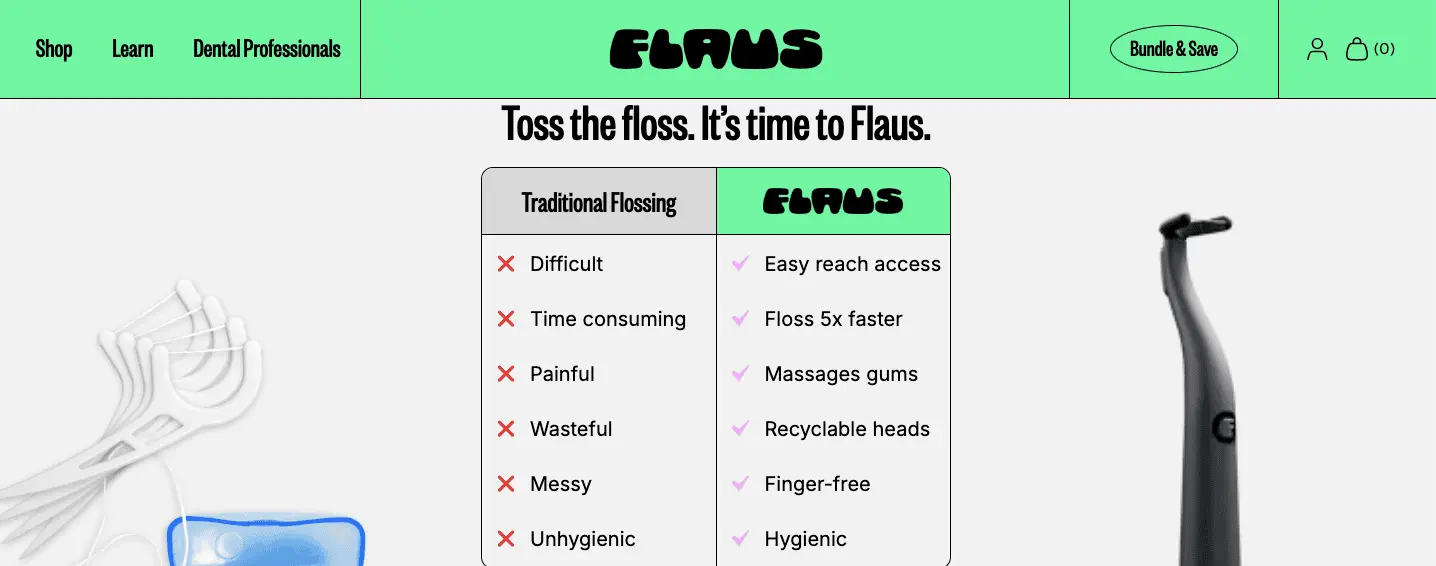
Flaus isn’t a fashion brand at all; it’s a personal-care/ oral-hygiene brand.
Their flagship product is an electric flosser (often called “the world’s first eco-friendly electric flosser”).
The idea: make flossing as easy, quick, and satisfying as brushing your teeth, using sonic-vibration technology, ergonomic design, and recyclable floss-head refills to tackle the usual complaints about traditional floss (messy, time-consuming, uncomfortable).
When you scroll down on their site’s home page, you see a comparison box that showcases the benefits of Flaus’s electric flosser.
The site also features a ticker displaying a 60-day money-back guarantee, an extended warranty, and free shipping over $60.
An introductory video from the company's founder is the cherry on the cake because it gives you another reason to believe in the product's quality.
Scroll further, and you’ll find a helpful FAQs section, and then you’ll also see some quality seals right after.
All in all, this site does everything an eCommerce store selling electronic products should do.
It makes it easy for customers to locate and understand the product’s advantages and relevant social proof.
Cabaia is a European brand focused on backpacks, luggage, and fashion accessory bags that stand out because of style, sustainability, and customization.
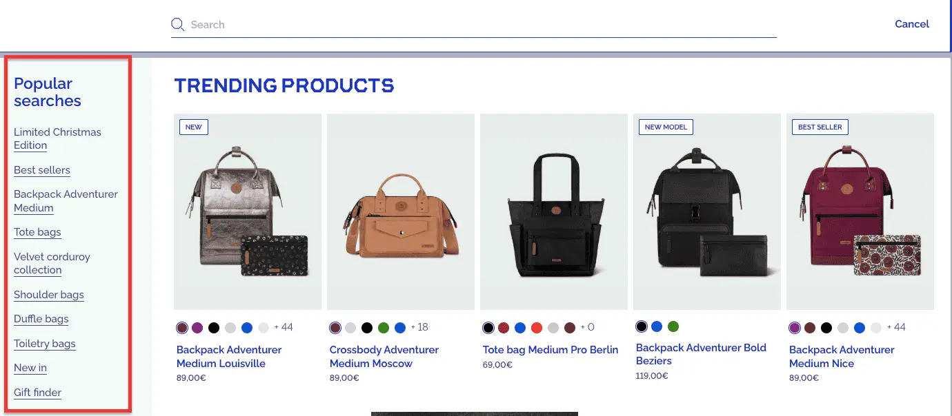
What we really liked about this site’s UX is its highly intuitive search feature, which allows users to find the right product for their needs.
They also feature a “popular searches” section on the left side that helps users search within a specific product category.
Cabia also offers a separate size guide to help customers compare products of different sizes and volumes, allowing them to make an informed decision.
Cabia has a ‘track my parcel’ page that enables users to check the status of their delivery.
This and other features, such as a lifetime guarantee on bags, free returns (under certain conditions), and secure payments, make this site one of the best in its category in terms of overall user experience.
What is striking about Grind’s UX is its minimalist lean (few fluff elements, no heavy video backgrounds or overly complex UI); it’s well-positioned to perform well across devices.
The fewer decorative assets, the easier it is to optimize load time and responsiveness.
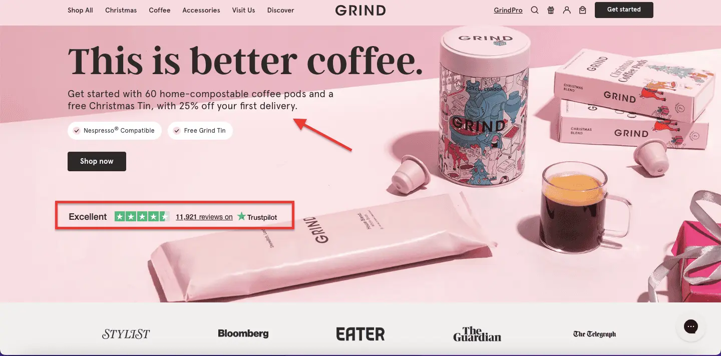
We also liked how they’ve used the first fold of their website to highlight an attractive offer: “25% off on first delivery”.
What’s more interesting is how they’ve placed the Trustpilot reviews link below this offer, along with the press features that follow.
This is intelligent marketing because showcasing social proof and the offer at the beginning of your interaction with prospective customers makes them less likely to leave for a competing site.
Grind displays its rewards program at the bottom of the home page, which can work like magic for customer retention in this product category.
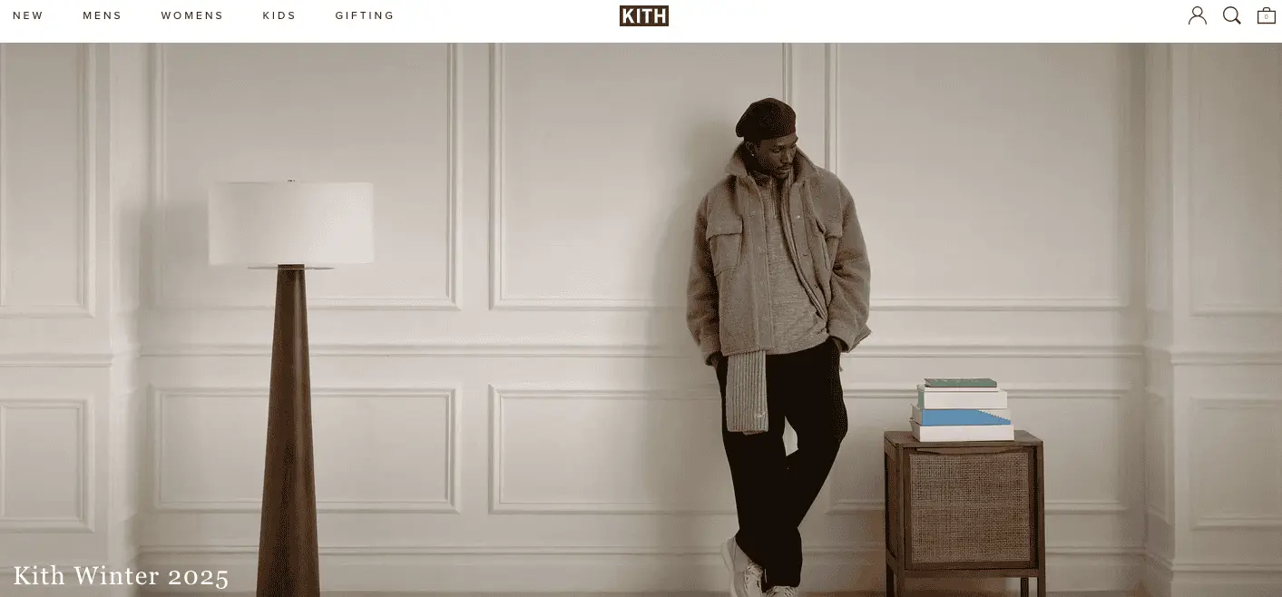
Kith isn’t just selling clothes. Its website is structured more like a fashion magazine or cultural hub: full-bleed photos and “lookbook”- style imagery that invite visitors to aspire.
Their homepage and collection pages don’t look like commodity racks; they look like curated canvases.
Kith presents its designs with high-resolution images and video content, keeping visitors engaged.
On product-detail pages and lookbooks, Kith uses clean, neutral backgrounds, intense lighting, and model photography that show clothing in “real-use/style” context.
This helps customers imagine how items might look in a lifestyle context, which is more emotionally engaging than a plain catalog.
This doesn’t just offer an exceptional brand experience to customers, which often converts better than commodity-style UXs that prioritize price as the primary motivator.
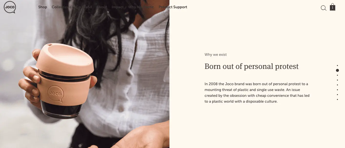
Joco is an eCommerce store known for its reusable beverage vessels.
What we really liked about their website is that it showcases a carousel of lifestyle product images on its homepage.
This allows users to browse through some of their main products without visiting their individual category pages.
The other thing that’s striking about this eCommerce website is the authentic storytelling that weaves a strong brand promise through great product design and eco-innovation.
The narrative not only adds to the user experience but also builds a deep connection with prospects, ensuring brand loyalty and customer retention.
Another area where this website excels is its product pages.
They’ve done a tremendous job at explaining the features, dimensions, and materials for each of their products, adding a much-needed clarity and quality assurance to their offerings.
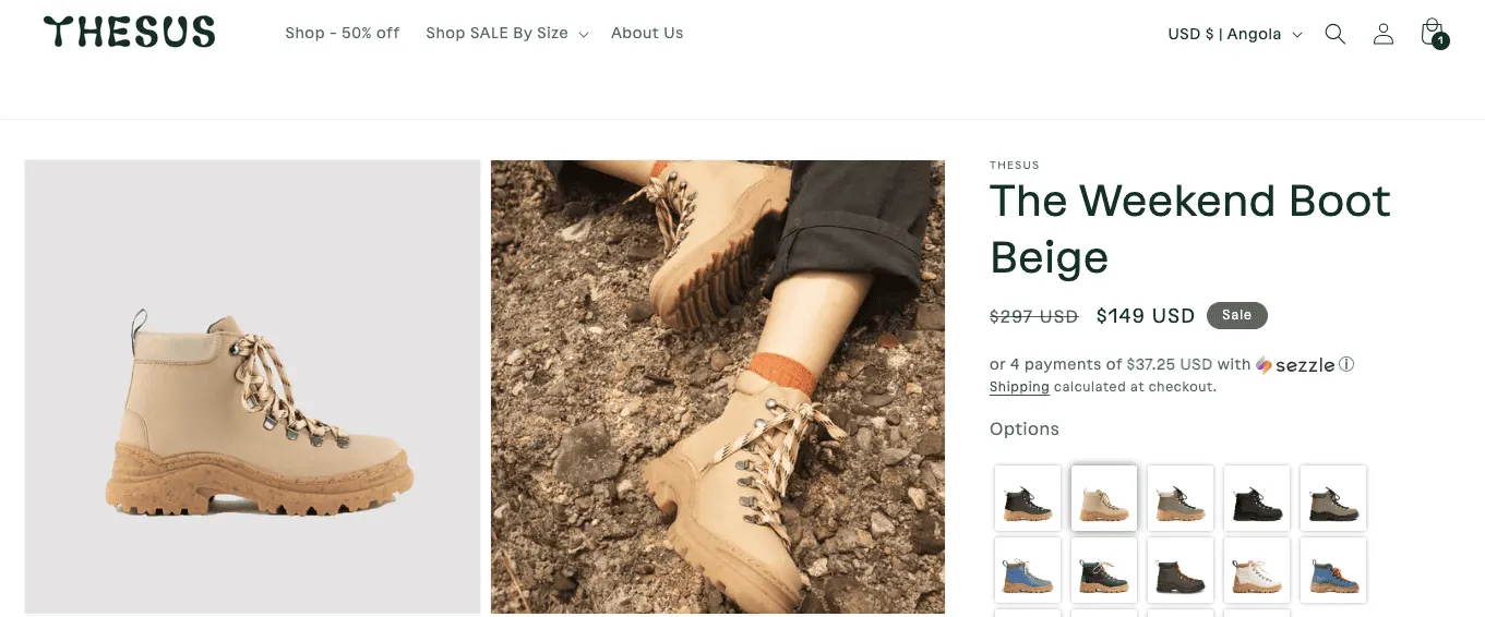
Thesus is a popular outdoor footwear eCommerce brand. What we particularly liked is their clear and detailed product pages.
The product pages don’t just list “boots”; they give a full breakdown of the materials that go into making them.
This level of transparency is especially good if you’re targeting eco-conscious consumers.
It serves as a strong “reason to believe”: you see exactly what the boots are made of and how sustainable they are, which helps build trust.
Good product pages often “anticipate and answer user questions” about materials, use, and benefits.
They include a full-size chart EU size → cm → USA/UK equivalents, and give sensible fit advice (“runs true to size,” “size up if between sizes,” and suggestions about thicker socks).
This is precisely the kind of clarity shoppers appreciate, reducing uncertainty when ordering footwear online.
They clearly list available sizes and mark sold-out ones with a “join waitlist” option. The pricing, too, is transparent and easy to understand.
Further Reading: 20 Powerful FOMO Marketing Examples for eCommerce
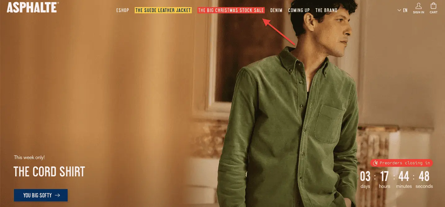
The moment you land on Asphalte’s website, the hero image immediately grabs your attention.
And well, attention is a critical part of an eCommerce store’s user experience, especially when you’re targeting apparel buyers.
The next thing you notice on this site is the Christmas Sale highlighted in red on the top navigation bar.
Again, this is a smart move because showing what matters to your customers adds value to their overall experience with your store.
We also like how this site uses contrasting colors in its CTAs, making them easy to see for users.
They’ve also added an intuitive category and size filter that helps users find the right products for their needs.
If you’re an eCommerce founder in the fashion niche, there’s undoubtedly some inspiration for you in this eCommerce site’s UX.

White Walnut Estate is a small, organic & biodynamic vineyard and winery located in the Dundee Hills region of the Willamette Valley in Oregon, United States.
Visiting the website is less like browsing a generic product shop and more like being invited into someone’s private vineyard journal.
The clean, minimalist UX is definitely an inspiration for eCommerce founders in this product category. The main menu items are displayed up front.
Each represents a dimension of the estate’s identity: land, people, philosophy, wine list, buying, membership, and visual storytelling.
The photos (vineyards, grapes, walnut trees, wine bottles, tasting room) are lush and atmospheric.
They transport you to the place, making you almost smell the soil, feel the vines, and imagine sipping wine in the Oregon hills. It’s not a “shop,” but an experience.
When you reach the “Purchase” page, wines are presented with tasting notes, accolades (critics' scores), clear prices, and shipping information (e.g., free shipping on 12+ bottles, minimum order of 3 bottles).
That lets serious buyers transact, while preserving the mood of craftsmanship and exclusivity.
Further Reading: 38-Point Landing Page "Conversion Rate Optimization" Checklist: Lessons From Real Audits

Recess stands out as a shining example of how to blend brand storytelling, emotional design, and commerce functionality.
The site nails the “chill, calm, relaxed” brand promise with a pastel-heavy palette, soft color transitions, and clean whitespace, giving an almost “zen spa meets modern beverage brand” vibe.
Product images (especially the cans) stand out crisply against the softer background, making them pop.
It’s a great way to keep focus on products while still maintaining a relaxed aesthetic.
Recess stands out as a terrific example of a site that offers users an immersive, interactive web experience.
As you scroll, colour changes, subtle animations (hover effects over flavours, background shifts, micro-interactions) contribute to an experience that feels fluid and alive.
On a desktop, this makes the browsing feel more like exploring than shopping.
Their homepage carousel/product showcase uses cut-out imagery and dynamic background-color rollovers to highlight different flavours and give each product a bit of personality.
What we loved is how the subscription options on this site are clearly explained on product pages (frequency, edit/skip options), which is excellent for customer clarity.
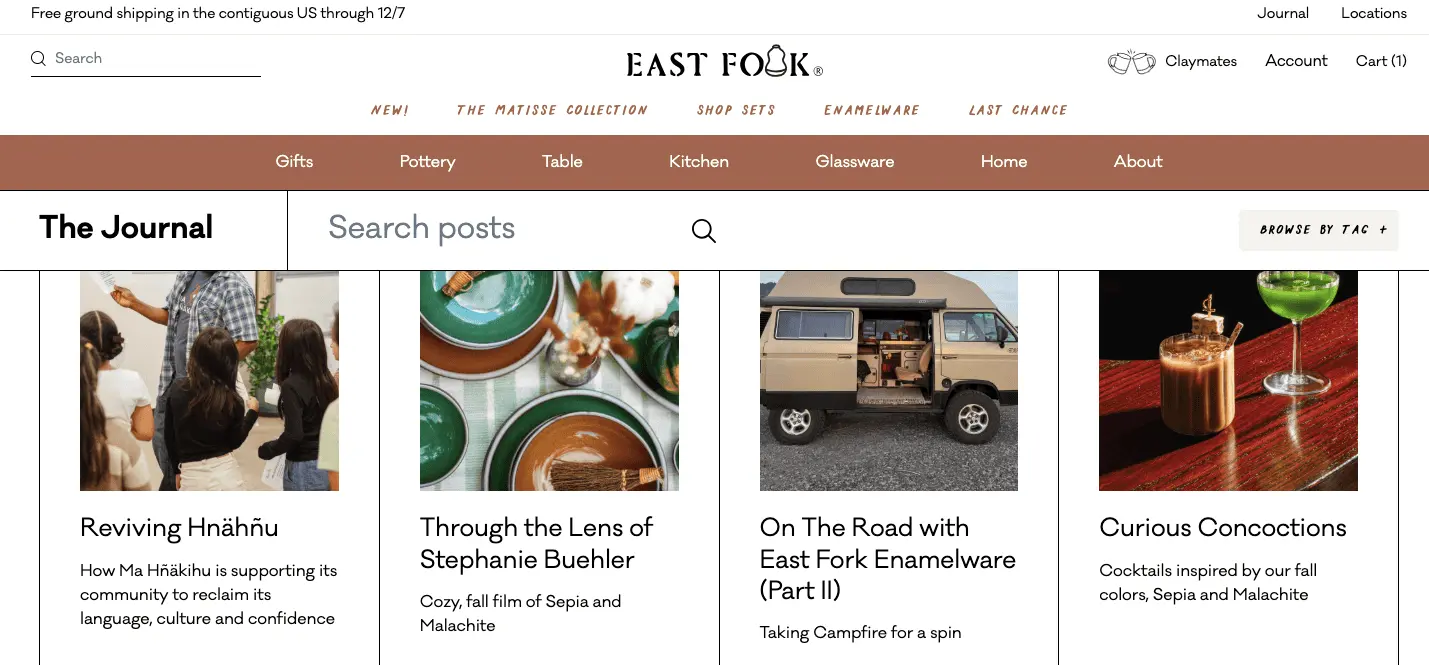
East Fork is an American eCommerce company that sells contemporary ceramic dinnerware. What impressed us most about their website’s UX is their checkout process.
East Fork explicitly offers Shop Pay at checkout, allowing customers to pay in full or in 4 installments.
That’s a pro because providing multiple payment methods, especially flexible ones, makes it convenient for shoppers.
Their FAQ/shipping page explains that shipping costs are calculated based on the weight of all items in the cart and that customers will see those charges at checkout. This upfront information reduces “sticker shock” at the final step, a common cause of cart abandonment.
On their about page, East Fork notes that they make it easy for customers to “contribute through a simple in-cart donation at checkout.”
This shows they integrate their values into the purchase flow, aligning with their brand identity and potentially enhancing emotional engagement among value-driven customers.
What’s also interesting about East Fork’s website is a unique blog section.
The blog features inspiring anecdotes from their founder, recipe posts, and even behind-the-scenes from the company, which adds tremendous value to its visitors.
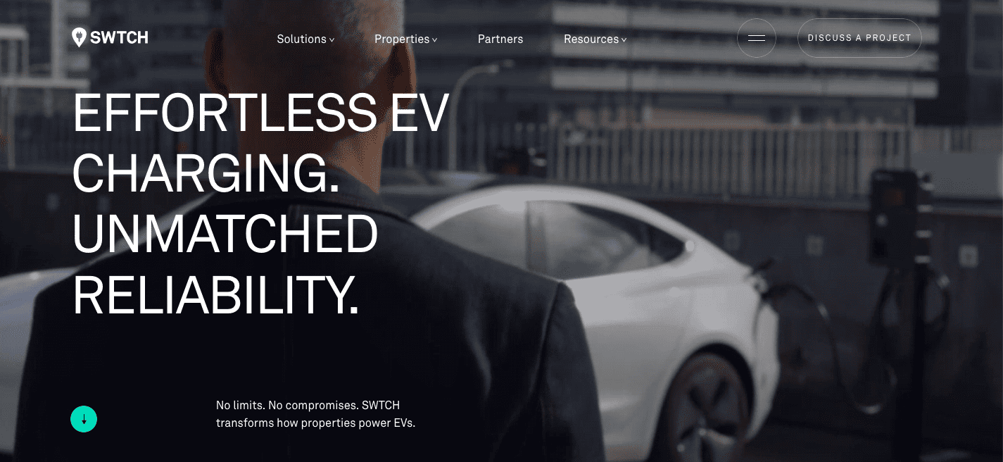
SWTCH is a B2B eCommerce company that provides electric-vehicle (EV) charging infrastructure and management solutions primarily focused on multi-tenant residential buildings, workplaces, public/retail properties, and parking facilities across North America.
From first glance, the site presents a clear and bold headline: “Effortless EV Charging. Unmatched Reliability.”
That sets the tone: SWTCH is offering EV-charging infrastructure and services for properties, not simply a retail product.
The site clearly lays out their offerings: from “properties” (multifamily, workplace, public/retail, parking, etc.) to “technology & services,” making it obvious who their target customers are (property managers, building owners, workplaces). The site does an excellent job of building trust with its users by showcasing the relevant social proof.
On the homepage, they display logos of their notable clients (property managers, real-estate firms, utilities, etc.).
That helps build trust, especially for first-time visitors evaluating a vendor.
They highlight certifications and compliance (e.g., OCPP-certified solutions, energy-management compliance, security standards) to build credibility with their customers.
They have a separate section to showcase case studies, which enhances the B2B buyer’s user experience because buyers are looking for tangible ROI when making purchase decisions.
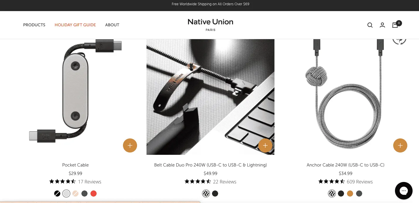
Native Union is a tech-accessory brand that aims to bring design, style, and refinement to everyday tech gear.
What really stands out for Native Union is that they offer “Free Worldwide Shipping on All Orders Over $69”, which helps make the brand available beyond limited geographies.
Native Union treats social proof the way some brands treat fine leather, carefully placed, beautifully stitched, and impossible to ignore.
Instead of dumping reviews in one dusty corner of the site, they weave them into the shopping journey.
They showcase positive customer reviews and ratings across their website, including on category and product pages and in the hero section, ensuring customers receive the assurance they need every step of the way.
Native Union augments customer reviews with sprinkles of press mentions (“As featured in…” style). This elevates their authority in customers' minds.
If you’re an eCommerce player looking for inspiration on how to showcase your customer reviews across your site artfully, then Native Union is a great place to be.
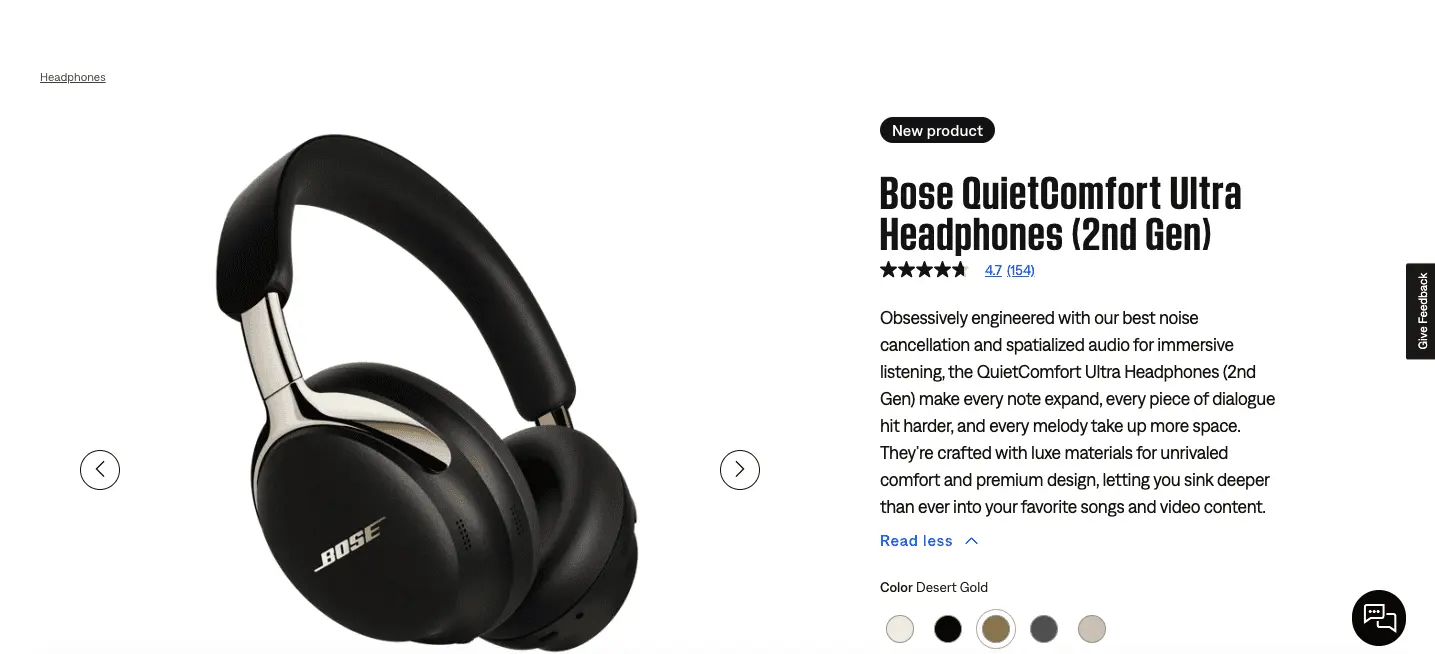
Bose builds a broad range of audio products: high-quality headphones and earbuds (noise-cancelling, wireless), Bluetooth speakers, soundbars & home audio equipment, and other sound-related devices, all aimed at delivering premium audio experiences rather than basic commodity gear.
The site reflects Bose’s heritage: quality audio, a wide product range (headphones, speakers, soundbars, etc.), and a brand tone aligned with a premium audio experience.
That helps reassure buyers that they’re dealing with a serious, established company.
What’s most striking about this website's UX is its product pages.
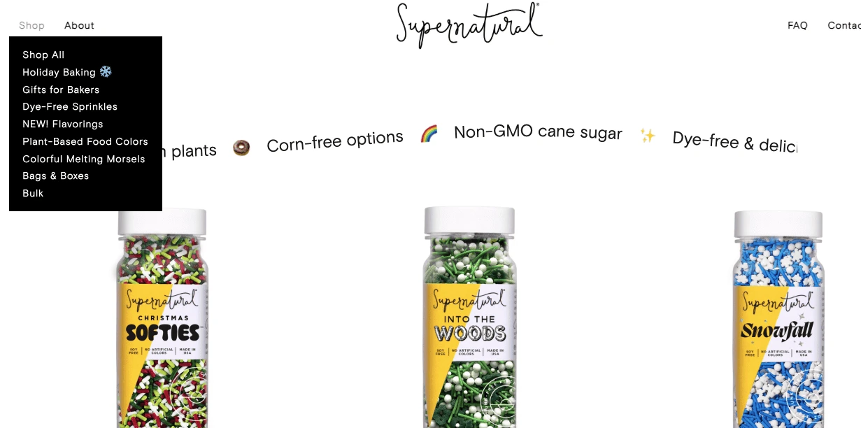
From the top navigation bar, you immediately see their product categories (“Dye-Free Sprinkles,” “Plant-Based Food Colors,” “Bulk,” etc.).
Even a first-time visitor doesn’t have to guess where to click; it’s all right there. Also, the navigation bar is minimalist, making it visually appealing.
Super Natural Kitchen’s homepage hits you with friendly copy (“Old traditions, fresh ingredients.”) and gorgeous product hero-images that align with their niche, natural baking supplies.
It’s less “slick retail site” and more “inviting kitchen-style brand,” which helps build identity and emotional resonance.
And on their homepage, they call out thousands of “five-star reviews,” signaling social validation.
For a small-ish or niche brand, this kind of immediate trust-building can make a big difference in conversion.
What we also loved about this e-commerce site is its clear brand positioning and how they’ve aligned the entire UX around it.
If you haven’t already performed an eCommerce UX audit, now would be a fine time to locate your metaphorical torch and peer into the darker corners of your storefront. By 2026, shoppers will be less patient, more informed, and deeply allergic to friction.
The good news? They’ll happily reward sites that feel calm and considerate.
Here’s what eCommerce UX will quietly but decisively evolve into by 2026.
AI-Powered Personalization That Knows When to Stop: By 2026, personalization won’t shout your name from the header like an overeager barista.
Instead, AI will subtly adjust layouts, product order, and content based on behavior, not guesswork.
Design Decisions Led by Behavior, Not Opinions: UX teams will rely less on gut feelings and more on observed behavior.
Heatmaps, scroll depth, and intent signals will shape layouts, ensuring pages evolve based on how people actually shop, not how we hope they do.
Accessibility Will Be Table Stakes, Not a Checkbox: Accessible design won’t be optional or admirable; it’ll be expected.
Clear contrast, readable fonts, keyboard-friendly navigation, and inclusive interactions will be part of good eCommerce hygiene.
Visual Confidence Over Verbal Overload: 2026 eCommerce sites will say less and show more.
Strong visuals, purposeful whitespace, and selective copy will replace walls of text. If a product needs a novella to explain it, something has already gone wrong.
Search and Filters That Feel Like Mind Reading: Search bars will evolve into quiet problem-solvers.
Filters will anticipate intent, auto-adjust based on behavior, and help users narrow choices without making them feel like they’re filing paperwork.
Smarter Data Capture That Feels Like Help, Not Surveillance: Data collection won’t feel like an interrogation.
Sites will gather insights naturally through preference selectors, gentle prompts, and post-purchase feedback, while giving shoppers something valuable in return.
Microinteractions That Gently Guide, Not Distract: Subtle animations, hover cues, loading feedback, and success confirmations will become essential UX signposts. When done right, they’ll reduce uncertainty and quietly reassure users that everything is proceeding as planned.
Copy Written for Humans, Not Algorithms: User-centered copy will focus on clarity over cleverness.
Shoppers won’t want poetry; they’ll want answers. Transparent pricing, honest delivery timelines, and benefit-led language will win every time.
Interactive Product Experiences That Reduce Doubt: 360° views, contextual zoom, size previews, and real-use demonstrations will replace static images.
The aim is simple: fewer surprises when the box arrives at the doorstep.
Context-Aware UX That Adapts in Real Time: Websites will respond intelligently to context like location, time of day, device, and even environmental cues.
The experience will feel timely, helpful, and situational rather than generic and frozen in place.
If 2026 will have a theme for eCommerce UX, it’s this: shoppers reward the brands that respect their time, their attention, and their patience.
Every example in this list, whether it’s cleaner navigation, faster, smarter product pages, or friendlier checkout flows, shows that improving user experience on an eCommerce website isn’t about fancy technology.
It’s about reducing friction until shopping feels natural and delightful.
As a founder, the good news for you is that these upgrades aren’t distant dreams.
They’re practical, copy-ready ideas you can borrow from real eCommerce website design examples that already work.
Start small, test often, and polish the pieces your customers touch most. When your store feels easy and human, conversions rise almost as a side effect.
And in a world where every click is a small vote of confidence, that kind of experience is the real competitive edge in 2026.
Further Reading: 35 Stunning Examples of Checkout Pages
Subscribe for more articles like this!
Read by 5000+ ecommerce store owners
.svg)
Serving 500+ US eCommerce Brands
New York Office:
555 Madison Avenue,
5th Floor, New York,
NY 10022
Working hours:
9 AM - 6 PM EST