Conversion Optimization
How To Improve Healthcare eCommerce Stores’ Conversion Rate – 47 Amazing Ideas
April 22, 2025


Statistics show:
So, it’s only natural that you will struggle to improve your healthcare store’s conversion rate.
Jump to: 47 Ideas on How to Improve Your Healthcare Store’s Conversion Rates
– But first:
Trust, pricing, shipping times, and the ease of use.
Viral routines, 4 AM ice plunges, and sleep gummies are all the rage. But what has led shoppers to buy healthcare online, so much so that online channels enjoy the biggest market share?
The pricing.

What stops them? Shipping times.
The thing is: healthcare isn’t just about pharmacy anymore, it’s now ‘wellness’ oriented – so shoppers expect:
- personalization
- privacy
- speed
- ease of use
And, all of these are more easily said than done, which is why, we’ve gathered these 47 amazing ideas:
What’s the quickest way to increase conversion rates for a healthcare store?
Get people on the brink of purchasing to complete purchases. How? Bribe shoppers subtly.
Cora Life does it with free samples and free shipping:

If shoppers are doing mental gymnastics to justify your pricing, you're already losing them.
Break down what they’re paying for – especially if it’s premium. Show cost per use, ingredient sourcing, certifications, etc.
Think: “Just $1/day for clearer skin” vs “$30 per bottle.”
Or, you can show how you price products, like Cost Plus Pharmacy does:

Here’s how you can make your price feel more in tune:
- Include tooltips to explain insurance coverage and out‑of‑pocket estimates
- Highlight total savings from subscriptions or promotions
The average shopper spends 25% of their income on healthcare and wellness. So, any benefit goes a long way.
Take inspiration from how One Sol offers BNPL payment, right below the price:

Pro Tip: Make sure your checkout page features some form of a mobile payment option – like GPay or Apple Pay.
If you show you’re FSA/HSA eligible and do not have a process to actually redeem, it will kill conversions (inevitably).
The way out? Show concrete steps on how to avail insurance/funds with a separate callout on the product page, like Elvie does:

Got repeat visitors but no sales in your healthcare store (or a low cart completion rate)?
But you also don’t want to lose margin on free shipping? Here's a way out:
Make shoppers feel like they are Oprah.
Take inspiration from Mello – they let shoppers choose a charity, with a shipping protection package + a free shipping threshold at $100:

Simply featuring icons regarding your policies will not cut it for healthcare stores. People want clarity.
You have to show how much people love your products.
However, it has to be subtle – it can’t be a Jock, in the homeroom, all boastful, and loud. Here’s how Opositiv does it:

Pro Tip: Feature a money-back guarantee with iconography and text below your CTA, to showcase your effectiveness (remember, it’s all about how you frame your words).
Fast beats free in certain verticals. Especially for pharmacy, personal care, and urgent needs.
Nothing kills conversions faster than slow shipping. The way out?
Go the quick commerce route (if you can) – or – offer next day pick-up at select locations (for free) – like Pressed does:

Pro Tip: If you offer local deliveries, make sure your orders have a certain order value (or else you’re just gonna lose money).
Struggling to get more add to carts and conversions for your healthcare store?
Here’s a quick way out: show shipping timelines upfront, not just at checkout. Hello Ned (apart from the guarantee and the cause) features the delivery date estimates along with the shipping location:

You know the basics:
Shorten the form. Enable guest checkout. Auto-fill where possible.
But you can take it a step further. Take inspiration from how Hiya builds their checkout:
- Multi-page checkout, with clear steps
- Shows the savings and the demand for the products
- Features the brand's benefits visually
- Times the checkout

Pro Tips:
- Pre-populate the cart with shopper details, if they’re coming in from your emails (which is what Hiya does)
- Highlight trust signals (secure payments, data encryption, HIPAA compliance)
- Use a progress bar to show customers how close they are to completing checkout
Sometimes, urgency is the nudge shoppers need – but it has to feel natural, not pushy.
Instead, use a limited-time offer popup like “⚡ 20% off ends in 3 hours!” to drive quick action. Time it right – mid-scroll or 20 seconds in – not the second someone lands.
Here’s how Particle does it with a timed pop-up for their Spring Sale:

Pro Tip: If a shopper doesn’t engage with the pop-up, keep it floating on any edge of the screen (on mobile, fix it as a sticky header/footer).
They’re hovering over your logo. Now’s your moment.
Trigger an exit-intent popup with a gentle hook like: “Wait! Take 15% off your first order – just this once.” – or like this example, asking how it sounds:

Pro Tip: Customize your pop-up offers based on where the shopper is in their journey.
Here are a few types that work well for healthcare, wellness, and nutrition brands:
- Welcome pop-up: Offer 10% off for first-time buyers or a free sample on signup
- Lead magnet: “Get our 7-day gut reset guide” in exchange for an email
- Feedback request: Use for returning visitors or post-purchase – "Tell us what you'd like to see next!”
- Calculator pop-up: “Not sure what you need? Take our 30-sec quiz” – great for supplement or routine match
- Goal-oriented offer: “Trying to sleep better? Unlock your personalized 4-week sleep plan”
Nobody wants to get locked into some monthly loop. Especially when most wellness stuff takes a few weeks to show results.
Here’s what you do:
- Offer slower-paced subscriptions – every 60 or 90 days
- Call it something like “Refill Rhythm” or “Your Wellness, Your Pace”
- Say what no one else says – “It usually takes 6–8 weeks to feel a difference”
Here’s Naked Nutrition offering full control over their subscription:

Pro Tip: Nudge people to buy more, without the pressure, with messages like:
- “Subscribe every 2 months, save 15%”
- “Bundle of 3 = more value + fewer refills”
- “A full 90-day supply – set it and forget it”
However, if these messages don’t convert, try downselling – here are a few things you can offer:
- Sample add‑on – $1 trial sachet at checkout
- Subscription trial – 14‑day mini‑subscription before committing
- Post-checkout upgrade offer – Post‑checkout, prompt: “Upgrade to a 30‑day kit + 10% off”
Would you immediately buy pills you’ve never heard of – or try an equipment that claims to reduce belly fat in 2 weeks?
No, right? The way out is to make your claims believable. It can mean:
- Showing credentials (certified, doctor-recommended, lab-tested)
- Using real names & faces in testimonials (shows transparency)
- Showing brand story or manufacturing process
- Displaying who it’s for – the impact of it
Here’s how Happy V does this – note the data from their post-purchase survey and the microcopy offering detailed information, plus the dosage:

Here are some other ideas to try out to build trust and make your healthcare store convert better:
- Badges & Seals – Feature FDA, GMP, HIPAA, or clinical trial logos near CTAs.
- Patient testimonials – Pull real quotes with names/photos on home & product pages.
- Research snippets – Include one–sentence study findings: “45% reduction in symptoms in 8 weeks.”
Pro Tip: Feature a “Recommended by Healthcare Experts” or “Verified by Doctors” badge near the CTA (like Happy V does), feel free to use:
- Doctor video intros – Embed 30‑sec clips of your medical advisors
- Staff spotlights – Show the team who formulates, packs, and ships
- Credentials pop‑up – Hover on a badge to reveal full bio and certifications
You’re not WebMD. Ditch the jargon.
Instead:
- Use analogies – “Think of it like a multivitamin for your gut.”
- Make your copy outcome-driven – if needed, use visuals to support your copy (before/after photos, ingredients)
- Show the right benefits (preferably visually) – like “home delivery available”, “FSA/HSA available”
- Speak like your reviews – note how Clean Nutra features a simple quote along with a shot of their product line-up:

Here are some things you can do to make your healthcare store’s copy to convert better:
- Outcomes as bullet points – “Clinically shown to ease joint pain in 14 days”
- Avoid fluff – No “supports healthy lifestyle” alone – add numbers
- Visual icons – One icon per claim, with a tooltip for detail
Clarity is the goal. Almost all healthcare stores treat this in a varied approach, but all your product pages need are:
- clear proof that your product works
- information about labels and ingredients
- the science behind the product
Here's a shot of this in action from Nemah – note how they show the product in action.

Pro Tips:
- Feature infographics and videos; they are your best friend to showcase how to use your products
- Offer options to upload medical docs (like prescriptions, reports, etc.)
- Feature zoom functionality on labels
- Highlight product safety & approvals (FDA, organic, clinically tested)
- Add a “Who is this for?” section to help customers quickly assess suitability
Also read: 40 High-converting Health/Beauty "Product Page" Examples
Shoppers are done taking your word for it.
Share third-party test results and clinical study excerpts.
Make it digestible – not a PDF dump. What Risewell does is feature a separate landing page for test results on their products:

You can also try featuring your test results as:
- a badge (show a callout on hover)
- a tab on PDPs with a TL;DR version (or as hero‑section callouts with key metrics like purity, potency)
Silence = guilt in the world of public reviews.
Respond with clarity, empathy, and maybe even a fix. “We’re sorry it didn’t work for you – here’s a refund + a product we think might be a better fit.”
It shows you’re listening. Not hiding. Here’s how Unisom does it:

Want your recommendations to convert?
Feature a ‘recommended by {expert name}’ – and display recommendations on:
- seasonal ailments (like allergies in spring)
- a routine (acne with sunscreen)
Here’s how Walgreens does it, with Spring recommendations:

Pro Tip: Make suggestions based on actual needs: “Got gut issues? Pair this probiotic with our bloat support.”
You can also try: Building a quiz that guides users to bundles based on symptoms or goals.
Your FAQ section isn’t a legal document – it’s your second homepage.
Make it searchable, scannable, and sprinkled with personality. Answer objections before they’re even asked.
Check out how Mood does this – note the 60:40 divide (one side has the questions and the other, answers):

Here are some more ideas to make your healthcare store convert better with FAQs:
- Searchable Q&A – Live search with auto‑suggested questions
- Video answers – Record experts answering the top 10 queries
- 360° support link – One‑click to open live chat or schedule a call
Pro Tip: Use actual customer phrasing. “Will this mess with my meds?” > “Is it safe alongside prescriptions?”
Most About pages are just boring timelines. Use this space to answer: Why should someone trust you with their health?
Tell your founder story. Show the research. Talk values. Here’s a perfect example from Brandon, Jawzrsize’s founder:

Skip the overly polished stuff. Shoppers are sharp now.
Share real, raw results – skin texture, body changes, energy shifts. Let the lighting be imperfect.
Here's how Heavy Handed does it, with a text call-out as an overlay:

If it takes 5 clicks to buy your probiotic, that’s 3 clicks too many. The goal is to lead shoppers in as quickly as possible and qualify their needs.
CBD FX does this in the most efficient way possible – they show the most popular product categories, visually:

But, that’s not the end of optimizing your navigation path, you can also try:
- Navigation categories based on customer intent (Pain relief, supplements, OTC, prescriptions)
- Rearrange your navigation items to feature recently browsed products
- Keep your quizzes and refill prescription buttons sticky in your navigation
- Limit top‑level items to 5–7 in number to avoid overwhelming shoppers
- Add intuitive icons (pills, powders, devices) for quick recognition
Your site search bar can serve as inspiration. Got a wildly viral product or a recipe that's gone viral?
Feature it as a suggestion on your search bar, even before shoppers type in
Dr Scholl’s offers not only search suggestions, but also articles, products, and categories:

You can always feature ‘find by symptom’ search suggestions – or – you can also dynamically change your search suggestions to pick up from where the shopper left off.
Need more ideas to make your healthcare store’s site search convert better? Here you go:
- Feature FAQs as suggestions on the product, last browsed “Will this allergy medication stop me from falling asleep”
- Show related products based on browsing history (if there’s no history, just personalize by location)
- Catch misspellings and non-product based queries (for example, ‘did you mean’ for misspellings, and ‘got questions’ nudges for zero search results)
Shoppers love being told what works well together, especially when it comes to an industry as results-driven as healthcare.
The idea here: group products into “routines” or “kits.” Think: ‘Gut Health Starter Kit’ or ‘Period Rescue Stack.’
Prolon does it by pairing goals to products and bundles (which helps save scrolling):

Pro Tips:
Shoppers scan fast, so what’s the best way to make your category pages convert?
Add smart filters, bestsellers up top, and education blocks (e.g., “What’s the difference between Vitamin D2 and D3?”) – which is exactly what The Vitamin Shoppe does:

You can also try:
- Badges for product features like “Vegan,” “Third-party tested,” etc.
- Callout blocks to related content and offers
- Microcopy to bring out offers and the value (note the $0.93/serving)
- Collapsible filters as accordion sections
- The decoy effect (placing higher-priced options beside lower-priced options)
Don’t make shoppers feel like they need a search warrant or answer a long quiz to find a laxative.
What you can do instead: display filters by:
- health goal
- symptom
- delivery format (gummies, capsules, etc.)
- age, gender, body weight
- allergens
- no. of days to complete a course
- popular (but related) searches (this is what Natural Vitality does to cross-sell):

Pro Tip: Remember last used filters and pre‑populate based on user history.
Video builds trust faster than blocks of text.
Add short clips showing:
Here’s an example of this in action from Bellabooty, a fitness brand, showing how their product is incredibly versatile:

Pro Tip: Auto-caption for accessibility and late-night shoppers.
Shoppers are always comparing. Help them do it faster. Preferably after the first two folds.
Create a chart that shows how you stack up. Price, ingredients, testing, dosage – it all counts.
Bonus: You control the narrative. Here’s how Cornbread Hemp does it on their product page:

You can also compare your product variant sizes to show how much difference sizes can make (note how Cornbread does it).
Also: you can feature comparisons within your landing pages and homepage as well.
Sure, you can run a loyalty program for repeat sales, but what if it were as simple as:
Feature a ‘Quick Reorder’ button on the header, like Vitacost does:

Remember, shoppers in the healthcare, wellness, and nutrition segment just need the savings and a bit of personalization.
To increase conversions on your wellness store, simply make sure shoppers can:
- Reorder really quickly – to see recommendations on order history
- Consult and update prescriptions – with the help of experts, of course (telehealth, duh)
- Check their saved payment options – like HSA/FSA/insurance
Pro Tip: Keep a close eye on shoppers in your email list who go through help articles after a purchase (which means it may be time to reach out in real time or via email).
If someone’s been lingering too long, something’s not clicking.
What you can do after 30-45 seconds is trigger a:
- Product walkthrough popup
- “Still browsing?” nudge
- Bundle suggestion based on cart
- “Need help with your {last ordered products}?” nudge
Here’s how One Sol does it:

Pro Tip: Use those signals to trigger a care-first follow-up like:
- “Still figuring out your routine?” → send a quick email check-in
- “Need to talk to a specialist?” → nudge with live chat or support booking
Almost every fitness freak owns a smartwatch. Most joggers log runs on Strava.
So, why not configure your store’s CMS or email marketing tool to log challenges on fitness tracker apps?
Onnit Fitness runs challenges to keep shoppers engaged, and this way, your customer churn becomes a butter churn:

To go beyond recovering churn, try these:
- Celebrate shopper milestones (like brand and shopper anniversaries, 3rd reorder, etc.)
- Create a leaderboard where scores tally across challenges (the reward has to be exclusive brand benefits)
- Hold actual real-life events, where shoppers can come together to interact with your brand
Research shows emails convert 2x more than any other channel when it comes to healthcare.
However, your cart abandonment campaigns have to educate on the value before pushing discounts
So, make sure your drip campaigns escalate the value – “We saved your cart” (loop in a discount if you have one) > “What’s stopping you?” (loop in a quiz) > “Here’s what you’re missing.”

Pro Tip: Personalize your cart abandonment flow for your health and wellness store by creating segments based on:
- fitness level (beginner, intermediate, advanced)
- health concerns (weight management, sleep issues, stress)
- product usage frequency (new users, occasional, loyal)
- purchase motivations (prevention, treatment, enhancement)
All you need to do is target shoppers with a quiz in the second cart recovery email.
Also Read: Healthcare Email Marketing: 26 High-Converting Examples (+ Templates)
Service is marketing. Period.
You can’t afford to lose sales or customers over delays.
Offer a live chat with actual humans, but let an AI handle it first. Research shows most people below 60 are comfortable discussing concerns with an AI bot – here’s how Tru Diagnostics takes advantage of this:

The goal here is to:
- Use AI chatbots to answer common questions instantly (dosage, side effects, shipping)
- Offer live chat with real agents for prescription or health-related concerns
- Add a “Talk to a Pharmacist” feature (if you have that available)
Pro Tip: Highlight response time in chatboxes (“Typically responds in under 1 min”) to reduce hesitation.
Slow sites are silent killers. Every second delay costs conversions (most people will shop on mobile first)
So, make sure you: compress images to WebP, lazy-load content, and ditch unnecessary apps or plugins.
Host videos externally to save bandwidth and improve load speed.
Pro Tip: Set the first fold to launch first – a blank screen can deter shoppers from scrolling further.
Stars and reviews are fine – but community builds obsession.
Instead, highlight customer stories and real-time discussions. This is how Feals shows the power of their community by looping in photos of their shoppers holding Feals packages:

While reviews always work if you want your wellness store to convert like crazy with your community, try these ideas:
- Feature UGC carousels – Real patient selfies using your product across your homepage, category, product, and even your cart pages
- Show dynamic community counters – “Join 12,345 patients on our gut‑health program”
- Feature your social feed – or you can embed Instagram posts tagged #MyGutJourney
Pro Tip: Want to keep your mentions growing? Run a Facebook/Reddit/Discord community (with active rewards and regular events).
Healthcare isn’t always self-explanatory. Let your experts speak. Not everyone likes a quiz.
Here’s how Dr Strum features a whole landing page for virtual consultations:

You can also:
- Maintain a calendar of livestreams on topics, like “Ask a Nutritionist,” “5 Myths About Gut Health,” “How to Start a Supplement Routine”
- Partner with other brands in wellness to create events
Pro Tip: Invest in affiliate programs, where you get practitioners to get benefits of being in partnership with your brand.
Not every influencer needs a million followers.
Micro-partnerships with pilates instructors, nutritionists, or even therapists can bring niche but loyal traffic.
Here’s a perfect example of this in action – a thought leadership post on The Good Trade, a lifestyle and self-care publication:

No one remembers the ad that looks like every other ad. Especially in wellness, where scroll fatigue is real.
Use storytelling, weird hooks, or unexpected testimonials (real ones, ideally).
Think: “I thought adaptogens were fake until THIS happened,” or “My sleep got worse before it got better. Here’s why.”
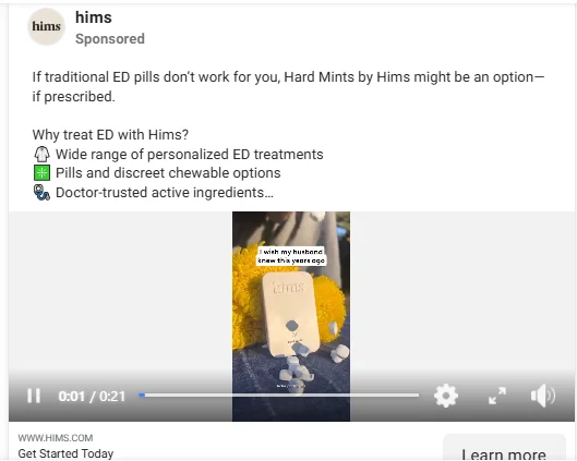
You can also try: Humor or mini-skits. They get shares. Here’s Hims, a sexual wellness brand’s ads:
Pro Tip: Build a funnel that qualifies people before the CTA hits. For example, only show the “Book Now” ad after someone has watched your explainer past the 50% mark. That way, you’re not pitching cold.
Expert recommendations in product pages go a long way.
However, it can go further than just inform – it can activate.
Find ways to nudge readers to actually do something – even while they’re just browsing – for example, you can recommend:
- Products that fit with the theme of the product being browsed
- Micro workouts in blog content – Think “5 moves to reset your posture between Zoom calls”
- Interactive routines in emails and socials – “Desk-bound? Here’s your 1-minute recharge”
Here’s Sun Warrior putting this into action with expert recommendations and recipes for their protein powders:

Personalization shouldn’t be a black box.
Whether you offer custom formulas or routines, show how it’s tailored. Add logic or reasoning post-quiz – or, show how you have done it for other shoppers like FloLiving does:

Need more ideas to personalize your healthcare store to convert better:
- Show dynamic banners based on referral source (email, social, paid ads)
- Feature “Recommended for you” modules powered by past behavior or quiz data
- Include time‑sensitive alerts (low stock, order-time cutoff for next‑day shipping)
- Apply discounts only on a few products – ones that fit the shopper’s conditions
Pro Tip: Use major holidays as “wellness checkpoints” to keep shoppers reeled in – craft themed bundles and messaging that both support your customers (mental reset, self‑care) and nudge them toward your core goal (e.g., weight loss).
Example: For “New Year, New You” (Jan 1), launch a “Resolution Reset Kit” email featuring your:
- metabolism‑boosting supplements
- 5‑day meal‑plan PDF
- a “Stay on Track” 10% off coupon
Build in public. It works. Because people relate to your story, and even more, it shows evolution.
Here are some things you can share on your product pages, email flows, and even PDP banners:
- New clinical trials
- Packaging upgrades
- Sourcing changes
Here’s how Canary Clean does it, by showing their live television feature, influencer collab, and a blog post on their best-selling product:

In health and wellness, misinformation is everywhere.
Use social, email, or PDP microcopy to bust myths like:
- “You can’t take magnesium every day”
- “Ashwagandha works instantly”
Keep the tone science-backed but easygoing.
You can also try: A “Myth vs Truth” carousel – or something like Estroven does:

Text quizzes are fine. Video quizzes? A class apart.
Love Sweat Fitness does exactly this by creating a full walkthrough quiz with short videos (almost reminiscent of video game walkthroughs):

People are tracking everything these days. Weight. Hair growth. Heart rate.
Nearly half of all Americans have used a wearable device at least once, so if you aren’t helping shoppers use that data, you are leaving money on the table.
Help people visualize how your product fits into their lives. Fertility timelines, supplement cost savings, period tracker integrations – whatever fits your brand.
Here’s an example from Natalist and their cycle calculator:

Pro Tip: You can retarget with the result and product links to match – say something like “You’ll need 3 cycles to optimize – grab the 3-month bundle here.”
Just because you sell to individuals doesn’t mean you can’t target businesses.
You can offer a whole separate website/landing page for professionals, or a per-sale basis commission – here’s how Periosciences does it:

Pro Tip: Don’t sleep on bulk orders. Make it effortless for B2B buyers to buy directly—think gyms, clinics, spas, and wellness programs.
To increase bulk orders, your healthcare store’s B2B landing page should include:
- Clear copy + visuals that highlight bulk order benefits
- Upfront mention of minimum order quantity (MOQ) and FAQs
- A prominent “Talk to Sales” option in the first fold
- Curated bundles tailored to business types (e.g., Clinic Starter Pack, Employee Wellness Bundle)
Where your shopper is can change what they need.
So, other than using geo-targeting to highlight local delivery or show region-specific ingredients, prepare for international visitors as well. Here’s how Spotlight Oral Care redirects to its partners in the US:

Big brands fight for big keywords. You don’t have to.
Go after the “weirdly specific” stuff – like “best iron supplement for postpartum fatigue” or “does magnesium help with restless legs?”
Note how the term ‘ear drops for ear wax, vegan’ gets ad visibility for smaller brands:

Pro Tip: These terms might get less traffic, but the intent is 🔥. Add-to-cart buttons on blog posts? Even better.
If you aren't bringing in quality traffic, your CVR will always be low down. The only way out? Get in some quality traffic.
Remember: If you’re not getting quality traffic, your CVR’s already sunk. Fix that first.
Subscribe for more articles like this!
%20Boost%20Conversions.jpg)
Read by 5000+ ecommerce store owners
.svg)

.svg)

.svg)
.svg)
2025 Convertcart, All Rights Reserved
33/1, Castle Street, Ashok Nagar, Bengaluru, India
