Conversion Optimization
5 High-Converting eCommerce Homepages (Thriving Even After Google's February 2026 Update)
February 20, 2026


The February 2026 update arrived with the quiet, unsettling efficiency of a Victorian butler, sweeping away "AI slop" and "clickbait" like so much unwanted dust.
We have spent an inordinate amount of time squinting at analytics and wondering why the online landscape suddenly looks like a cubist painting.
Yet, in our quest for CRO, we’ve realized that while Google keeps moving the goalposts, the most resilient brands are the ones that simply stop trying to play the game and start talking to people like human beings again.
So, here’s a list of 5 homepages that haven’t just survived the wreckage, they’ve bloomed.

There’s something inherently reassuring about a company that treats a shoe not as a high-performance aerodynamic miracle, but as a very soft place to put one’s feet.
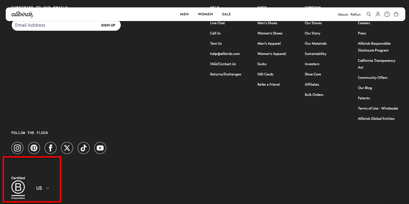
Post-February 2026, Allbirds remains a titan of the SERPs because it has leaned into the "Helpful Content" mandate with the stubbornness of a pack mule.
Their homepage doesn't just sell wool; it narrates a carbon-neutral odyssey.
For you, the lesson is clear: Google’s updated algorithm has a newfound affection for Primary Entity Validation.
By placing their B-Corp status and sustainability metrics in plain, unadorned English, they avoid the "AI-generated fluff" trap.
They aren't just selling sneakers; they’re providing a peer-reviewed argument for why your feet shouldn’t be ashamed of themselves.
It’s clean, it’s authoritative, and it’s remarkably difficult to dislike.
In the hierarchy of human needs, the sock usually sits somewhere below "reliable Wi-Fi" and "a decent cup of tea."
Yet, Bombas has elevated the garment into a social mission that feels, dare I say, actually important.
Their homepage is a masterclass in social proof and mission alignment, two things the February update rewards over keyword-stuffed meta-descriptions.
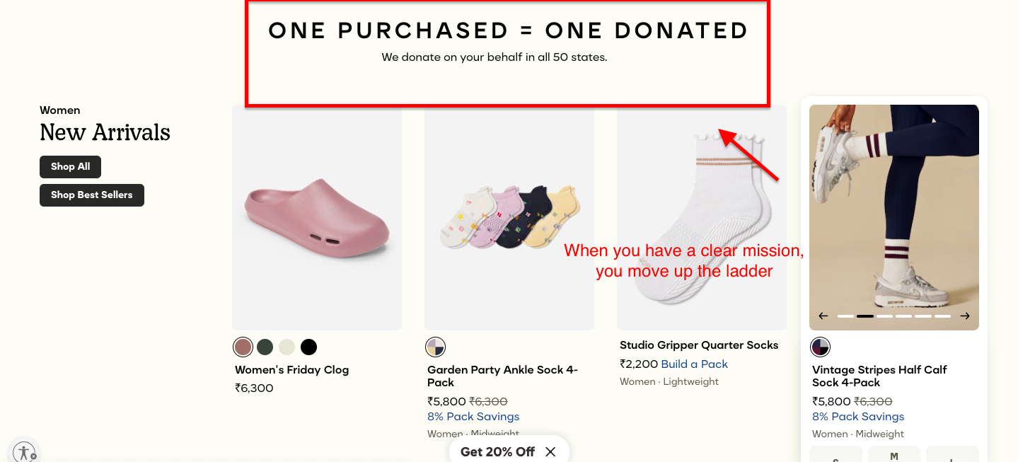
They lead with their "One Purchased = One Donated" mantra, which serves as a giant, glowing beacon of "Human-First" intent.
To the American consumer (and the Google crawler), this feels authentic because it’s specific. It’s not "giving back" in a vague, corporate retreat sort of way; it’s 100 million items donated.
That’s a number so large it’s almost impolite, and in 2026, that kind of data-backed storytelling is conversion gold.

For reasons that remain somewhat mysterious, men spent several decades carrying leather bricks in their back pockets, roughly the size and weight of a Victorian encyclopedia.
Ridge Wallet arrived to stop this madness with a sliver of metal and some very clever elastic.
Their homepage is a marvel of Mobile-First Optimization, which is essential now that Google’s mobile-primary indexing has become even more ruthless.
As a US veteran-owned brand, they don't just "mention" their heritage; they weave it into the product's durability.
The layout is all high-contrast utility, no fluff, no "SEO filler" paragraphs. It’s a site built for someone who wants to buy a wallet in the 30 seconds they spend waiting for a lift.

It’s a rare and wonderful thing to find a brand that speaks with the fiery confidence of someone who knows exactly what they’re doing. Fly By Jing doesn't just sell sauce; it sells the founder’s story specifically, Jing Gao's "highly personal, slightly defiant" journey.
In the wake of the 2026 update, Founder-Led Content is the ultimate shield against the "AI-slop" filters. The homepage is vibrant, loud, and unmistakably Asian-American, providing the kind of "Topical Authority" that a generic bot simply cannot replicate.
For you, this is the blueprint: don't hide behind corporate "we." Lead with the "I."
When you tell a story this specific and this flavorful, Google treats you like a destination.
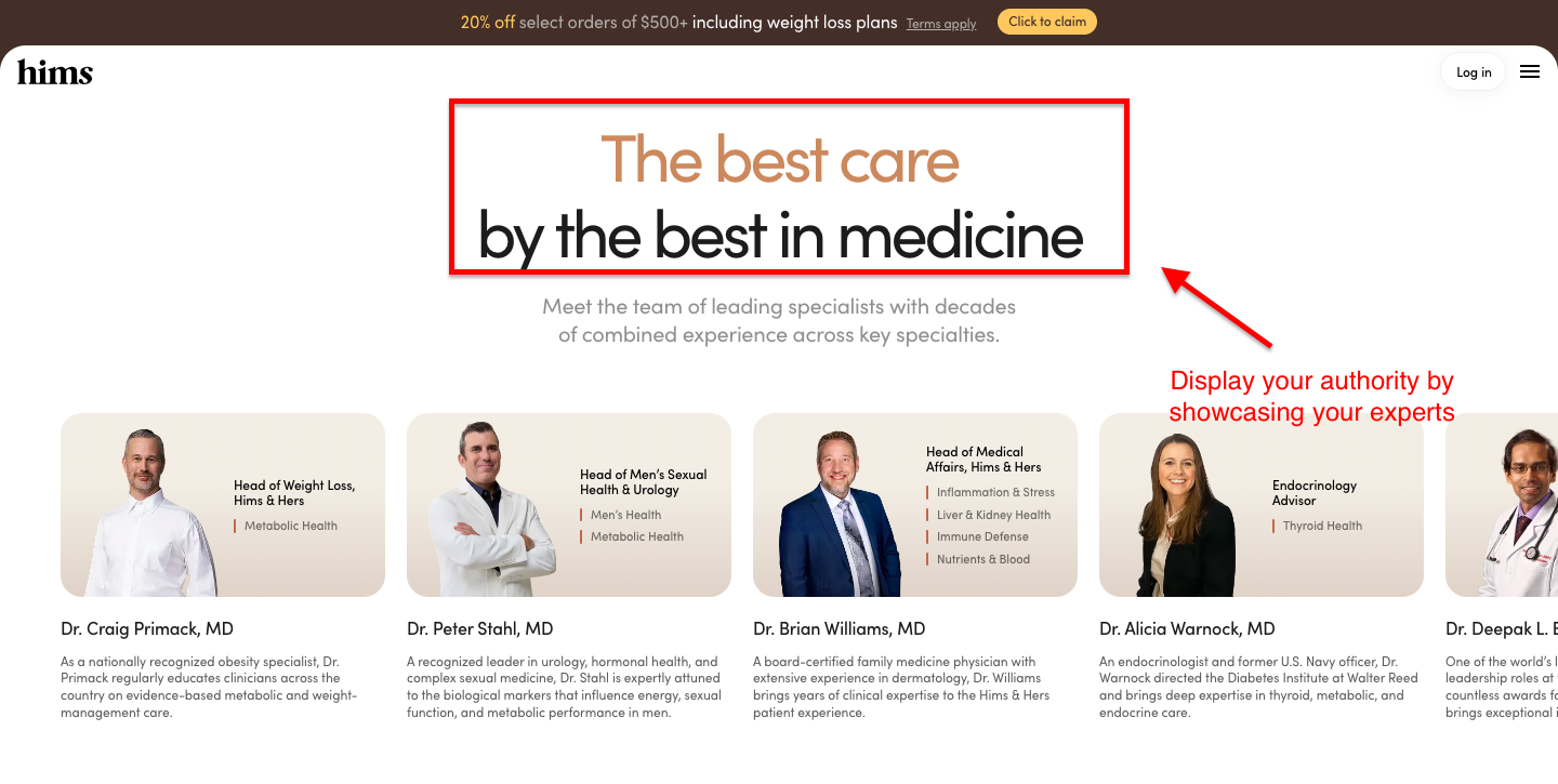
It’s bold to try to make the purchase of hair-loss treatments and erectile dysfunction pills feel as seamless as ordering a pizza, yet Hims makes you feel at ease.
Their homepage thrives post-update because it embodies Expertise, Trust, and Authority (E-E-A-T).
In a world where Google’s 2026 bots are aggressively hunting for medical misinformation, Hims leads with "science-backed" and "clinically proven" messaging verified by actual humans with medical degrees.
For you, the takeaway is the "Medicalization of UX"—by integrating telehealth consultations directly into the conversion flow, they aren't just a shop; they’re a service.
It’s clean, discreet, and carries the kind of institutional weight that makes an algorithm purr with approval.
Navigating Google’s whims is a bit like trying to predict the weather in London; one moment, you’re basking in the sunshine of page-one rankings, and the next, you’re drenched in a sudden downpour of algorithm updates.
But as we’ve seen, the brands that thrive are those that stop obsessing over the "bots" and start obsessing over the humans.
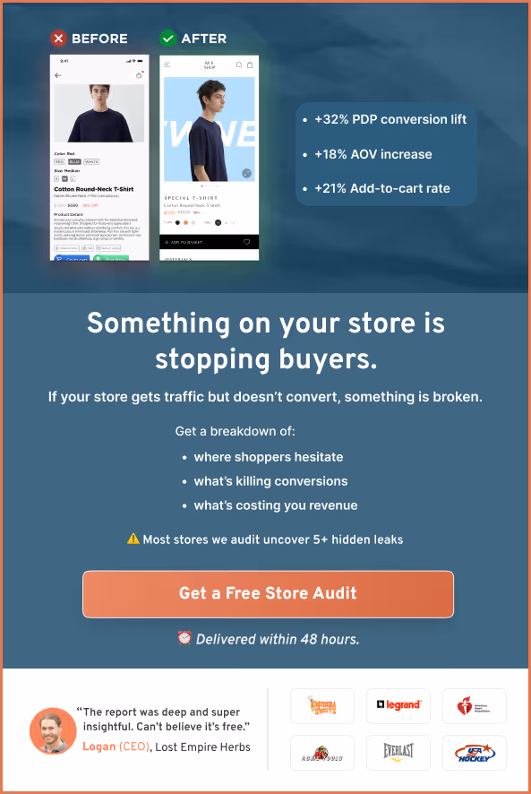
If your homepage currently feels less like a warm welcome and more like a confusing digital labyrinth, it might be time for a fresh set of eyes.
Don't leave your conversion rate to chance. Let us do the squinting for you. Our CRO experts will dive into your site to identify the friction points holding you back from Allbirds-level authority.
[Claim Your Free Site Audit – Let’s Humanize Your Store]
Take the next step in improving your eCommerce storefront:
20 Scientific Strategies to Increase Your eCommerce Conversion Rate
How to Increase Add-to-Cart Rate: 20 Brilliant Ideas
Getting Traffic But No Sales? 24 Reasons Why (+ How To Solve)
Subscribe for more articles like this!


Read by 5000+ ecommerce store owners
.svg)

.svg)

.svg)
.svg)
2026 Convertcart, All Rights Reserved
33/1, Castle Street, Ashok Nagar, Bengaluru, India