Most eCommerce homepages fail before shoppers ever reach a product page.
Not because they look bad. Because they create confusion instead of momentum.
To diagnose that problem, our CRO team came up with a framework that we call HUMAN.
It breaks down homepage performance into five measurable layers; we use it to diagnose what works, what doesn't, and what to fix first.
Convertcart’s 2-Minute HUMAN Audit (To Tell You If Your Homepage Is High-Converting)
H for Hook: Does your above-the-fold pass the 5-second test? U for Usefulness: Does your page help visitors, not just sell to them? M for Message: Is your value prop unmistakably clear and human? A for Authority: Do visitors trust you within the first scroll? N for Navigation: Can every type of visitor find what they need?
Most audits stop here. This one doesn't.
Because knowing what to look at is only half the job and knowing how badly it's broken tells you where to spend Monday morning.
That's what the scoring model does.
The HUMAN Score: How Good Is Your eCommerce Homepage?
A framework tells you what to look at. A scoring model tells you how badly you need to fix it.
Assign each layer a weight based on its conversion impact, add them up, and you get a single number that's harder to argue with than a gut feeling.
Layer
Weight
Why It Matters
H — Hook
20 pts
First impressions are irreversible
U — Usefulness
20 pts
Helpful pages earn longer visits
M — Message
20 pts
Clarity converts; vagueness doesn't
A — Authority
25 pts
Trust is the hardest thing to fake
N — Navigation
15 pts
Lost visitors are lost revenue
Add up your five layer scores and you get a number out of 100.
The number is only useful if it means something, so here's what it means.
Score
Rating
What It Means
90–100
Elite
Your homepage works as hard as you do
75–89
Strong
Solid — a few fixes away from excellent
60–74
Needs Work
Leaks exist; visitors sense them
Below 60
Leaking Revenue
Stop everything. Fix this first
Now you have a score and a tier.
What you need next is the diagnostic that produced it — three questions per layer, a quick fix per row, and enough specificity that you know exactly which corner of your homepage to fix first.
Run through it once. It takes two minutes. Most people find at least two they'd rather not have found.
High-Converting Homepage Examples - Analyzed Using The HUMAN Model
Frameworks make claims. Evidence tests them. Below, we've scored five of the highest-performing eCommerce homepages against the HUMAN model.
These are not endorsements. We independently scored each homepage against the 15 HUMAN audit criteria.
Each criterion was assigned a weighted score based on its conversion impact.
Scores are directional and intended as educational examples rather than definitive performance measurements.
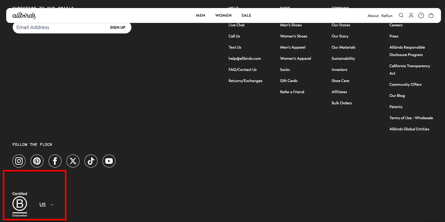
1. Allbirds: Score: 91 / Elite
Layer
Score
What They Nail
H — Hook
17/20
Hero answers all three questions in under 5 seconds; product shown in use
U — Useful
18/20
Materials narrative and carbon scores add genuine informational value
M — Message
19/20
Sensory, tactile copy — feels written for a person, not a crawler
A — Authority
22/25
B-Corp status and carbon footprint in the hero; specific, verifiable claims
Elite — the benchmark for message-led homepage design
The lesson from Allbirds is not to talk about sustainability. It is to make your values specific and verifiable enough that a sceptic cannot dismiss them.
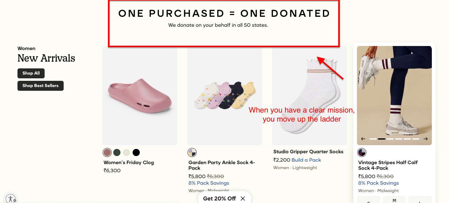
2. Bombas: Score: 88 / Strong
Layer
Score
What They Nail
H — Hook
16/20
Mission-led hero is immediately legible; one small delay on mobile load
Product discovery – barriers that prevent shoppers from finding items
Category/collection pages – improvements that drive deeper product exploration
Product page – what to optimize to convert 2–3x more buyers
Cart – ways to ease hesitation and speed up purchase decisions
“The report was deep and super insightful. Can’t believe it’s free.”
Logan Christopher CEO, Empire Herbs
3. Ridge Wallet: Score: 84 / Strong
Layer
Score
What They Nail
H — Hook
19/20
Problem-solution headline lands instantly; mobile experience is exceptional
U — Useful
15/20
Functional but lean — limited contextual content beyond product features
M — Message
17/20
'Stop carrying a brick' is specific and memorable; veteran-owned trust marker well placed
A — Authority
20/25
Heritage signals strong; could surface more third-party proof in the hero
N — Nav
13/15
Thumb-zone optimised for mobile; desktop nav slightly sparse
Total
84/100
Strong — the benchmark for hook-led, mobile-first design
The lesson from Ridge is that solving one problem with absolute precision beats solving five problems vaguely.
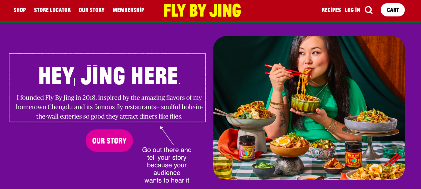
4. Fly By Jing: Score: 86 / Strong
Layer
Score
What They Nail
H — Hook
16/20
Bold, distinctive hero — intentionally takes a moment longer to parse
U — Useful
20/20
Recipes, serving suggestions, and contextual selling are fully native to the page
M — Message
19/20
Founder-led copy is irreplaceable; specific cultural context earns immediate trust
A — Authority
20/25
Strong founder authority; press coverage present; could quantify community size
N — Nav
11/15
Navigation functional but secondary to editorial layout — some visitors will hunt
Total
86/100
Strong — the benchmark for usefulness-led, founder-voice design
The lesson from Fly By Jing is that a brand voice specific enough to belong to one person is a competitive moat. No competitor can replicate it without becoming her.
Telehealth consultation flow embedded in the browse experience; FAQs contextually placed
M — Message
18/20
'Science-backed, clinician-reviewed' is specific; avoids both scaremongering and euphemism
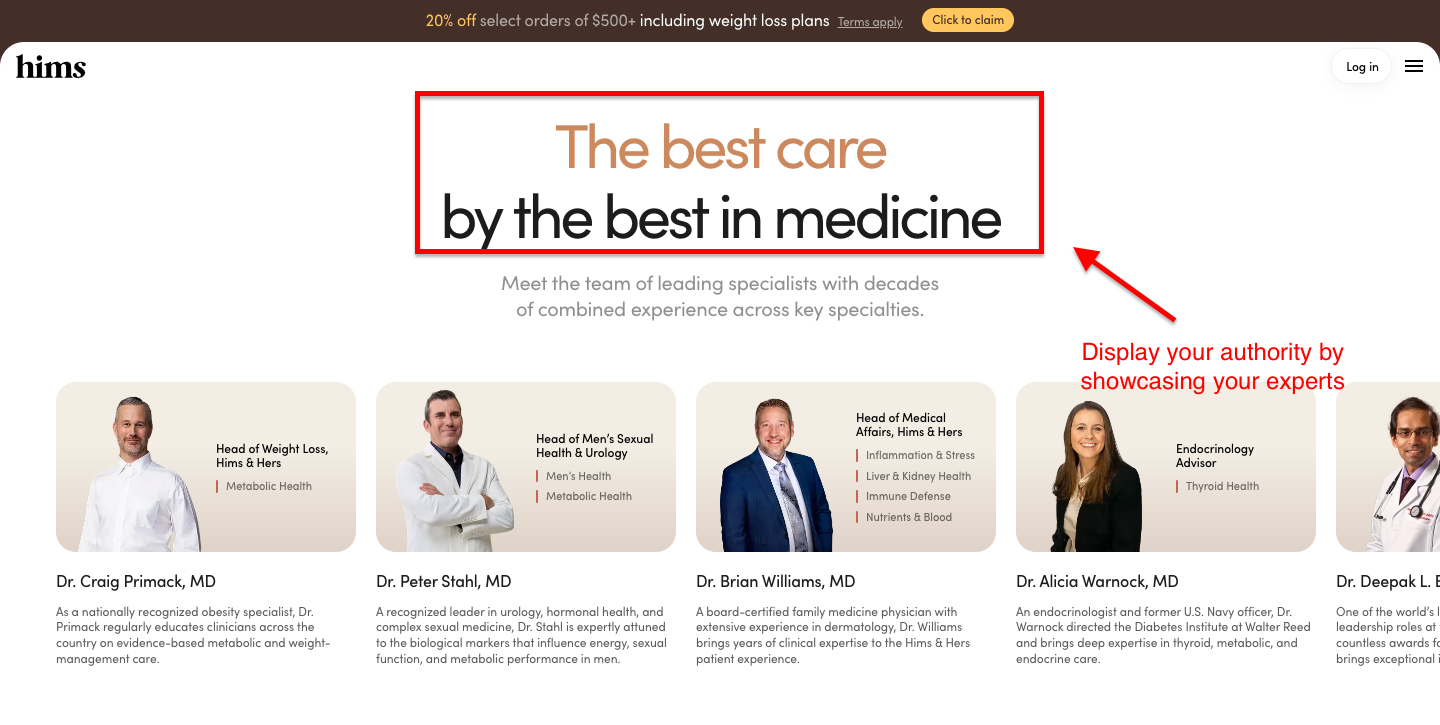
A — Authority
24/25
Medical credentials front and centre; clinical proof language verified by real degrees
N — Nav
13/15
Consultative navigation architecture is innovative; slight complexity cost on first visit
Total
90/100
Elite — the benchmark for authority + navigation in YMYL categories
The lesson from Hims is that in sensitive categories, authority is not optional. It is the entire product.
WHY THE ABOVE EXAMPLES WORK: THE 5 ESSENTIALS OF A HIGH-CONVERTING ECOMMERCE HOMEPAGE
Hook
Usefulness
Messaging
Authority
Navigation
1. The Hook: Your Above-the-Fold Has One Job
Your above-the-fold exists to answer three questions before the visitor can formulate them: What do you sell? Who is it for? Why should I stay? If a stranger cannot extract those answers in five seconds without reading the small print, your hero fails. Full stop.
What belongs above the fold
A hero headline that delivers the value proposition in fewer than ten words
A sub-headline that specifies who the product is for
One primary CTA — one, not three
A trust signal or a single line of social proof
A visual that shows the product in use, not posed on a white background
A homepage that opens with a six-paragraph brand origin story, three animated banners, and a pop-up asking for your email address before you've seen what they sell does not pass this test.
The 5-second test
Hand your homepage URL to someone who has never heard of your brand. Set a timer for five seconds. When it goes off, close the tab and ask three questions: What does this company sell? Who is it for? What does it want you to do next?
If they cannot answer all three, the hero needs work. This is not a sophisticated test. Its simplicity is the point.
Does a stranger know what you sell in 5 seconds? Is there exactly one CTA above the fold? Does your hero show the product in use?
Replace brand-story hero with a benefit-led headline + single CTA
Mistakes to avoid
Splash screens and interstitial delays — every extra second of loading loses a percentage of the audience you paid to acquire
A hero who leads with the brand's story rather than the customer's problem
Multiple competing CTAs above the fold — 'Shop Now,' 'Learn More,' and 'Get 20% Off' all at once create paralysis, not action
Case Study
How Convertcart Helped a UK Auto Brand Lift Homepage Conversions by 39.57% With One Mobile Banner
Emerald Struts sold a perfectly sensible product, automatic boot struts that let you open your car boot without dislocating a shoulder. Their mobile homepage, however, greeted visitors with the visual enthusiasm of a blank wall. ConvertCart added a hero banner with seasonal promotions and clear CTAs.
The result was a 39.57% campaign gain and an 11.25% sitewide lift. One image. One decision. Remarkable what a decent first impression will do.
2. Usefulness: Your Homepage Should Help, Not Just Sell
A useful homepage answers questions the visitor did not know they had. Fly By Jing does this with uncommon confidence. Their homepage does not merely present bottles of chilli sauce. It embeds recipes, serving suggestions, and Jing Gao's own story in a way that makes the visit feel like a discovery rather than a transaction.
What 'useful' looks like on a homepage
Contextual content: recipes, quizzes, guides, or how-to material that lives on the page rather than pointing away from it
Personalised recommendations: surface products based on what a returning visitor has already browsed
Smart search: a search bar that handles misspellings, synonyms, and vague queries — not one that returns 'no results found' when someone types 'sneaker' instead of 'trainer'
Visible policies: returns and shipping information that does not require a treasure hunt through the footer
The content blocks that add topical depth
Google's helpful content criteria reward pages that go beyond selling. A blog preview block, a section of user-generated content, or a brief expert endorsement, when these feel native to the page rather than bolted onto it as an afterthought, signal that the brand knows its subject. That signal matters both to the algorithm and to the human reading the page.
The test is simple: remove the product images from your homepage and ask whether anything valuable remains. If the answer is no, add something that passes.
Does the page help visitors beyond selling? Are shipping and return policies visible without hunting? Does search handle synonyms and misspellings?
Add a quiz, recipe, or guide block; surface policy links above the footer
Mistakes to avoid
A homepage that consists entirely of a rotating product carousel
Return and shipping policies that hide in the footer in eight-point type
A search function that treats every query as an exact-match string
CRO insight: 'The best homepages answer questions visitors didn't know they had.' — ConvertCart CRO team
Is a clumsy mobile layout quietly killing your store's conversions because shoppers find it hard to navigate? Learn how to fix the friction with these high-converting mobile product pages.
3. The Message: The Copy That Makes Humans Stop
Good homepage copy passes a three-question test in one sentence or fewer: What do you do? Why does it matter to me? Why you, rather than anyone else? If the headline on your hero cannot do this, it is not a headline. It is a placeholder.
Writing a value proposition that works
Founder-led narratives earn particular trust. A corporate 'we' says nothing about who made the decision to start this company and why. A founder who tells you exactly what problem they were trying to solve — and is specific enough that you can picture the moment — builds credibility at a speed that no amount of trust badges can match.
CTA copy that converts
Keep it to two to five words — short enough to scan, specific enough to act on
Benefit-led CTAs ('Find My Size,' 'Build My Box') outperform action-led CTAs ('Submit,' 'Click Here') in most eCommerce contexts
Test two versions — ConvertCart's CRO data consistently shows the difference between a first-draft CTA and an optimised one runs to double-digit conversion lifts
Why visitors don’t trust your store within 3 seconds
Why shoppers can’t find what they’re ready to buy
What’s stopping 2-3x more shoppers from clicking “Add to Cart”
Where buyers hesitate right before purchase
Why high-intent shoppers still drop off
“The report was deep and super insightful. Can’t believe it’s free.”
Logan Christopher CEO, Empire Herbs
4. Authority: Building Trust Before the First Click
Authority on a homepage is not claimed — it is shown. One specific number beats ten vague superlatives. 'Donated to over a million families' means almost nothing. 'Donated 100 million items' means a great deal. Bombas understood this early and built its entire homepage architecture around that number.
Trust signals that belong on the homepage
SSL and payment partner logos near checkout entry points — not buried
B-Corp certification, press logos, and industry awards are placed in or directly below the hero
Quantified social proof: Bombas's '100M items donated' is the archetype — a number so specific and so large it becomes its own proof
Video testimonials — visitors are 174% more likely to purchase after watching one
For health and wellness brands: medical credentials and clinical backing displayed prominently — as Hims does by leading with 'science-backed' messaging underwritten by actual medical degrees
Build a brand fingerprint
The brands that weather competitive pressure are the ones with a distinctive identity that a competitor cannot simply copy. A brand fingerprint is the combination of visible expertise, specific human stories, a clear mission, and a founding narrative that makes your homepage feel like it could only have been built by you.
Generic brands are interchangeable. A brand with a fingerprint is not. Ask yourself: if you removed the logo from your homepage, would anyone still know whose it was? If the honest answer is no, you have a fingerprint problem.
Do you show specific numbers, not vague claims? Are trust signals placed near decision points? Do real human faces appear on the page?
Replace 'award-winning' with the actual award; swap stock photos for founder/team imagery
Mistakes to avoid
Too many trust seals — a page plastered with fifteen different badges does not look credible, it looks desperate
Stock photography — images that could belong to any brand in any category undercut every authenticity signal you have earned elsewhere
An absence of human faces, real reviews, or specific credentials — visitors infer that what you cannot show, you probably don't have
CRO insight: 'Authority isn't claimed — it's shown. One specific number beats ten vague superlatives.' — ConvertCart CRO team
How Convertcart Helped Fastenere Lift Desktop Conversions by 26.30% By Making Quality Obvious
When 88% of desktop shoppers and 91% of mobile shoppers expressed uncertainty about product reliability, Fastenere had an authority problem.
Convertcart added quality badges and certifications directly to product pages, the specific, verifiable kind, not the decorative kind. Desktop conversions grew 26.30% on the campaign. Sitewide, conversion rates across devices climbed 172%.
It turns out visitors don't distrust you because your product is bad. They distrust you because you forgot to prove it was good.
5. Navigation: The North Star for Every Visitor Type
Not every visitor to your homepage wants the same thing. A first-time visitor who has never heard of you needs a different experience from a returning customer who knows exactly what they want and is simply checking whether it is back in stock.
Your navigation must serve both of them without confusing either.
The instinct to make navigation 'clean' by hiding everything has produced a generation of eCommerce sites that are beautiful and completely useless. Invisible navigation is not elegant. It is lost revenue.
Design navigation for the visitor awareness level
Unaware visitors: a mega menu or double menu gives them the breadth of the catalogue without requiring them to know what to search for
Product-aware visitors: a sticky nav and a smart search bar let them move fast
Return visitors: personalisation hooks — 'Recently Viewed,' 'Back in Stock,' 'What's New' make them feel the site knows them
Can every visitor type find what they need in 2 clicks? Does the footer earn its scroll? Are there fewer than 7 items in the primary nav?
Fix hover-only dropdowns; add 'Track Your Order' and policy links to footer
How do top-performing brands systematically turn cold traffic into repeat buyers across their entire site? Explore these real-world eCommerce website optimization strategies to scale your revenue.
Menu types and when to use each
Menu Type
Best For
Mega menu
Large catalogues with multiple product categories
Sticky nav
Long-scroll pages; keeps primary actions visible throughout
Double menu
Brands splitting between product categories and editorial content
Hamburger (mobile)
Mobile-first; keep to fewer than 7 items or it collapses under its own weight
Dropdown menus carry three non-negotiable rules: no more than two levels of depth, no hover-only activation (mobile users cannot hover), and consistent visual style across every dropdown. One inconsistent dropdown can undermine the trust your hero section spent two paragraphs building.
The footer as a conversion tool
The footer is the safety net for visitors who scroll all the way to the bottom. That they scrolled that far means they have not yet found what they need. Give them contact information, returns and refund policies, social handles, order tracking, and featured collections.
Every broken link in the footer is a small argument for not buying from you.
Mistakes to avoid
Hover menus that do not track mouse movement, the cursor leaves the menu item before the dropdown opens, and the menu vanishes
More than seven items in the primary navigation, cognitive load climbs sharply past that number
Broken footer links: check them quarterly, because they break more often than you think
Pop-ups that carry critical information, anything a visitor needs to make a decision, should not hide behind a dismissible overlay
CRO insight: 'Invisible navigation doesn't mean clean design — it means lost revenue.' — ConvertCart CRO team
How Convertcart Helped Emerald Struts Drive a 16.05% Gain by Unfurling a Cluttered Nav
Emerald Struts had a navigation bar that, over time, had accumulated the structural logic of a kitchen junk drawer. Categories existed. Finding them was the problem. ConvertCart simplified the desktop nav with structured dropdowns and a cleaner hierarchy.
The campaign registered a 16.05% gain. Nobody congratulates a brand on its navigation. They simply find what they need and buy it, which is, when you think about it, the entire point.
Don't leave your conversion rate to chance. Let us do the squinting for you. Our CRO experts will dive into your site to identify the friction points holding you back from Allbirds-level authority.
A high-converting homepage does five things at once: it hooks the visitor in under five seconds, demonstrates that it is useful beyond selling, delivers a message specific enough to be remembered, builds trust before the first click, and navigates every type of visitor to what they need.
The HUMAN framework measures all five as a single score out of 100.
What should be above the fold on an eCommerce homepage?
A benefit-led headline under ten words, a sub-headline that specifies who the product is for, one primary CTA, a trust signal or social proof snippet, and a visual showing the product in use.
Everything else goes below the fold. If it requires reading, it should not compete for space in the hero.
How do I know if my homepage is hurting conversions?
Run the 5-second test: show your homepage to a stranger for five seconds and ask what the company sells, who it serves, and what it wants the visitor to do. Then score against the HUMAN audit. A score below 60 suggests structural problems that surface-level design changes will not fix.
How does mobile homepage design affect conversion rate?
Most eCommerce traffic arrives on mobile, and Google indexes the mobile version of your site first. Hover-only menus, non-thumb-zone CTAs, slow-loading hero images, and desktop-only navigation patterns all raise mobile bounce rates.
Design for the thumb first and the mouse second.
What's the average conversion rate for an eCommerce homepage?
eCommerce homepage conversion rates vary by category and traffic source, but the industry average sits between 2% and 4%. High-performing sites reach 5% to 8%.
Sites below 1% almost always have a HUMAN score under 60, meaning the problem is diagnostic, not cosmetic.
How often should I update my eCommerce homepage?
Review the HUMAN checklist quarterly. Run a full redesign only when your score drops below 75 or when a structural change to your product range makes the current architecture obsolete.
Cosmetic refreshes more frequently than once a quarter consume resources without moving the conversion needle.


.svg)

.svg)

.svg)
.svg)
