Conversion Optimization
26 Amazing Product Page Design Examples in eCommerce (+ Expert Advice)
April 4, 2025


Online product detail pages are as important as real-world trial rooms.
In fact, 87% of customers feel product content is the most important factor when deciding to purchase an item online.
Now, creating a good product page doesn’t mean loading your page with unnecessary information and flashy product pictures.
So, what makes for a great product detail page design?
To help you answer this question and effectively optimize your product detail page, we’ll be exploring the 26 best product page examples for eCommerce that make for great inspiration.
This post also covers:
6 Reasons Why Most Product Pages Have Low Conversion Rate
6 Quick Ways to Troubleshoot Low Conversions on your Product Page
High-Converting Product Page Templates
Anatomy of a High-Converting Product Page Layout (Best Practices)
Skin and makeup brand Glossier stands out as one of the best eCommerce product page designs because they pay attention to several crucial elements:
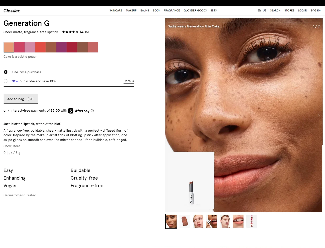
✅ The value proposition draws shoppers in—and the product description backs it up in this eCommerce product page design.
✅ The key ingredient display—a bold callout is flanked by smaller expandable description sections—for as many as 35% of US customers browsing through mobile devices; this improves UX.
✅ The ‘How to Use’ section breaks down complex info to help customers visualize the product in action.
✅ The ‘Get The Look’ section features influencers promoting the lifestyle appeal of the product—while the visuals set in-use context.
Key Takeaway: They way they highlight benefits and make copy nudges explain how the product can make life easier—leading to better conversions.
The best converting product pages have one thing in common: strong perceived value.
In their product page content, Bang & Olufsen uses tactical copywriting to persuade customers—here’s what they get right:

✅ The ease of use—they make it easy to understand how quickly the product can integrate into one’s current lifestyle.
✅ Handing back power to the customer—see how they’re putting the emphasis back on the customers’ current (and perhaps future) needs?
✅ The high pricing is justified—considering the product is “built to last.”
Key Takeaway: A product comparison chart at the end of the product page UI design creates more reason for shoppers to stay back on the page.
We’ve noticed how the best product page examples use storytelling with flair.
Astley Clarke, for example, brings it in like this:

✅ Images create sensory appeal in their product detail page design.
✅ Image labels work to create upselling opportunities, increasing AOV.
✅ The best brand benefits find a place right under the primary CTA—this includes free shipping worldwide, free returns, and a 2-year warranty.
Key Takeaway: The “Inspiration Guide” offers on-the-spot value-added content that can make shoppers confident and help them convert.
Farfetch, which considers itself as a luxury fashion platform, ensures to follow some of the most critical eCommerce product page best practices:

✅ The “View the Look” clickable nudge improves micro-conversions as well as macro ones. Once clicked, this visual cue takes the shopper to a recommendation section that features products from across multiple categories, complementing the main product.
✅ The model’s sizing information in the size guide creates better context for the shopper.
✅ A clear “contact us” section (finally, one brand that hasn’t relegated this to the footer in their eCommerce product page design).
Key Takeaway: For SEO purposes as well as conversions, the “why” behind your brand’s dependability has to feature in your product detail page content.
Sleep product brand Buffy clearly knows how to design product pages in ways that shoppers stop to read and consider:

✅ Their “Free Trial” nudge is a clear differentiator—enabling shoppers to experience the product for 7 days before paying up (that is, if they choose to keep it) – after all, 58% of customers want a hassle-free returns policy.
✅ FAQ answered in a non-linear, engaging layout—with visuals creating context around the product.
✅ They display the most valuable reviews first with an option to view more, on their product details page design.
Key Takeaway: Always create a link to a key brand differentiator in your product page design—Buffy, for example, talks about how the free trial works on the homepage and features the same info on the product page as well.
Sound tech and product company Bose has earned their place in offline & online shopping for a good reason—they set a standard of what a good product page example looks like – and it’s all by prioritizing imagery:

✅ They use multiple visual formats to drive product exclusivity—these include static images, GIFs, and video content.
✅ Feature “Interactive View” AND follow it up with a list of specs to make it more compelling.
✅ Smart product descriptions that pare down the technicalities and talk about the direct experience:
✅ Clarifies the specifics of the product-in-use—this is a great way to convince shoppers sitting on the fence about a purchase.
Key Takeaway: If you’re suggesting an upgrade, it’s a good idea to draw out a visually enriched comparison chart between the new and old editions—this works well to convince shoppers about the price difference.
Fashion eCommerce brand ASOS packs a punch with its product detail page design—especially in terms of using keywords:

✅ Long-tail keywords as product names—this creates great discovery for users who’re searching on-site as well as those who see ASOS’ results on search engines. Long-tail keywords have high search intent with low search volume, low competition, and high conversion rates.
✅ Feature a promo code encouraging first-time visitors to buy (something 80% of customers like)—this is also a subtle on-site SEO move.
Key Takeaway: Always use related keywords in the product description or detail section to further enrich your product page content—ASOS, in fact, uses these as linked microcopy that take shoppers to other pages.
According to Amy Schade, Director of User Experience, Nielsen Norman Group:
“Users scroll when there is reason to. When users fail to see information of value, they stop scrolling.”
Clearly fashion eCommerce brand Missguided optimizes their product detail pages based on a strong first fold:

✅ Use urgency to get that order in faster—the conditional nudge that promises next-day delivery does just that.
✅ They feature specifics that cover a lot of FAQ—both about the product features as well as delivery & returns. With delivery rates shown upfront, there’s transparency when it comes to shipping costs: the main reason 48% of US customers abandon their carts.
Key Takeaway: Offer as much info as you can to resolve customer objections—since space will be a constraint, use microcopy that can further expand into text boxes to show such info.
86% of customers buy from purpose driven companies. Footwear brand Manitobah ensures their eCommerce product page design covers this aspect effectively:

✅ Prioritize featuring the “contact us” info sooner – Manitobah places this right beneath the first fold content.
✅ Combine storytelling with community building to convey authenticity.
✅ Even their email sign-up hook drives the warmth of the community narrative.
Key Takeaway: Want to create the best product detail pages? Establish a consistent brand narrative across product descriptions, images, and even benefit call-outs across the product page.
Detangling product brand Tangle Teezer uses appealing visuals & explainer content in their product page content.
.webp)
✅ Alongside elaborate textual descriptions, the brand uses video—73% of shoppers buy a product after watching video content.
✅ Clear visual hierarchy makes it easy for shoppers to understand the product.
✅ A featured funnel quiz improves the self-help quotient on their product pages.
Key Takeaway: While trying to guide customers through your product page UI design, ensure your content does the following: eases anxiety, clarifies doubt, and hands over the power to make precise purchase decisions.
Designer label Bloomingdale’s makes browsing and discovery on their product pages an undaunting process:

✅ Their recommendations are subtle—they drive these by keeping the similar product recommendations inconspicuously on the side.
✅ A detailed sizing guide (“size chart”) in their clothing section is a boon for shoppers who’re trying to convert fast.
Key Takeaway: Product pages that convert (like Bloomingdale’s) remind us that it’s a good thing to be less pushy to make shoppers convert—just offer them all the info that will help them choose, and step back.
When you’re looking for product page design inspiration, look no further than Nudie Jeans:

✅ An auto-play experience that comes with a manual pause button—this allows shoppers more control over their own viewing experience.
✅ The ability to “filter” options after the first scroll—this ensures shoppers can view products that are in line with the main product they’ve chosen.
✅ The product call-outs and the description deepen the experience—quick phrases on the nature of the product enable shoppers to imagine themselves using it:
Key Takeaway: Focus on the way you create your VR layout—if it’s integrated and compact, like what Nudie Jeans does, the experience will cause a lesser cognitive load.
eCommerce footwear brand Birkenstock knows how to keep things grand—and all for the good reason of justifying their exclusive styles and prices. Here are some tactics + product detail page examples from Birkenstock:

✅ Clarity about the brand’s USP—which also drives the UVP for interested shoppers.
✅ Membership account nudge to make a purchase—while only some select limited edition styles carry this clause, Birkenstock ensures high-intent shoppers roll into their membership program.
Key Takeaway: Use textured images along with value-driven text to drive home how dependable you are as a brand.
You'll love reading: Hiring a CRO agency: 12 *Key* Considerations (and Expert Advice)
Sustainable brand Everlane is one of those eCommerce product page examples that puts the buyer’s ease at the forefront:

✅ Feature a uniform 365-day return guarantee—this reduces the perceived risk around new products and encourages trials.
✅ They pour their brand’s essence into their descriptions—this leads to shoppers considering their product recommendations more seriously, leading to increased AOV.
✅ A ‘Transparent Pricing’ section that breaks down the costs of the product.
Key Takeaway: Make every bit of your product page copywriting count (yes, we mean, even the microcopy), as this instantly puts shoppers at ease.
eCommerce beauty and makeup brand uses their eCommerce product page design to improve the way shoppers engage with a product and its related content:

✅ They bring out the science behind the product’s make—and not just through the description; they even use a video later to throw light on the “technology.”
✅ Offer more product info with supporting visuals—when you scroll down—this gives shoppers an opportunity to go in-depth into the product’s benefits.
✅ Show the results through images—the more, the merrier (as long as you let ‘em use horizontal scroll).
Key Takeaway: It’s absolutely essential that your brand call-outs, description, and proof of results consistently convey the same narrative across your product detail page design.
eCommerce makeup brand Cult Beauty uses pricing transparency as a persuasion aid and how:

✅ Feature a highly compelling discount label on the image—this drives home the price slash even further. Similarly, if you see the above, they also clearly call out the taxes that are involved.
✅ The not in stock email nudge drives home the pricing advantage even more, making the product more desirable.
Key Takeaway: Make it clear what the product is originally valued at and then offer info on the discount—an “originally valued at $” nudge can further make this kind of pricing strategy effective.
Well-known brand MAC Cosmetics uses some of their product page test ideas to target segmented audiences—for example, this one is all about targeting gifters during the holiday season.
After all, gift sets help 33% of last-minute buyers shop based on how soon they can get them.

✅ The “Gift Perfectly” callout helps in increasing AOV.
✅ They clarify what the receiver has in store for them—further driving customer trust in the purchase. MAC also wins over customers by bringing flexibility into gifting options.
Key Takeaway: Even if you’re using gifting as a special nudge in your product page content, make sure it’s placed strategically—MAC, for example, places it right after the delivery options.
87% of customers favor brands that actively support environmental and social initiatives, and 46% track if a brand’s actions align with their promises.
eCommerce brand Cariuma builds product pages that convert by focusing on the ONE thing that makes up their ethos: sustainability.

✅ The nudge that draws attention to their “Buy 1 pair plant 2 trees campaign”—the background info supports to convince shoppers.
✅ Complete transparency on the make of a product—this is in line with the brand trying to create trust in the cause.
✅ A visual block of information that helps shoppers understand brand values without having to go over to their “our story” section.
Key Takeaway: The best eCommerce product page design that hinges on cause marketing also ensures necessary trust badges are featured—Cariuma, for example, showcases their “Certified B Corp” emblem.
eCommerce skincare brand The Ordinary, is all about science, yes, but their product detail page design also prioritizes social proof to get conversions going.

✅ Highlight the “most helpful favorable review” and the “most helpful critical review” right at the top of the review section—along with the quick review snapshot, it helps shoppers reach a balanced perception.
✅ The self-disclaimer on how they believe in featuring mixed reviews also helps establish deeper trust.
Key Takeaway: Consider making your reviews cover more areas in your product page test ideas—whether it’s talking about a customer’s age, skin tone, problem that needed solving, and whether the reviewer received a free product!
Now an eCommerce brand too, Hermes has been at the designing end of luxury since 1837.
Among the eCommerce product page examples we love, Hermes has won us over with their storytelling.

✅ Feature the story behind the creation of the product.
✅ By stating the “100% silk” composition, Hermes justifies the high pricing of the product.
✅ The recommendations section pulls out not-to-be-found-anywhere-else products to pair with the main product—further adding to the story in the customer’s mind.
Key Takeaway: If you’re resorting to product storytelling, ensure it covers what the brand stands for and what customers will truly like or feel grateful for having spent on.
Krave Jerky is a producer of culinary-style meat and protein snacks that are not processed with chemicals.
This eCommerce product page layout design is created such that it is over within a scroll—here are a few things that work:

✅ The layout keeps all necessary information together—and this includes a super bold CTA.
✅ Intelligent use of microcopy to reduce the amount of space text takes up.
Key Takeaway: If you’re selling a unique product (and you hold a patent to the ingredients or the flavor), it may be better if you cut out product page recommendations—in Krave’s case, the varied pack sizes work as recommendations themselves and serve to reduce the number of scrolls.
Scientific formulation brand Aesop is known for having one of the best product page designs—mainly because they feature editable product bundles. Here are some inspirational ideas to take from Aesop’s product detail page examples:

✅ Introduce checkboxes for each of the products in the bundle—this helps customers who want even just one of the products convert faster.
✅ They use dropdowns for each product to offer an overview—”learn more” takes shoppers to the separate product pages.
Key Takeaway: Strategic use of whitespace in your product page content can create a less cluttered visual experience for shoppers—leading them to want to explore more, and convert as well.
eCommerce giant Amazon is known to not just push for conversions on their product page UI design.
Instead they help shoppers actively wishlist:

✅ They allow endless number of products to be added—and the wishlist being right under the primary CTA helps.
✅ Highlight the benefits of wishlisting in the first place—the major one being shoppers able to bring multiple categories to sort from.
Key Takeaway: Highlighting wishlists is always a great idea—it’s an easy enabler for micro-conversions to happen before the conversions kick in.
Skincare brand Amala knows shoppers will have questions that their human agents won’t always be available to solve—so here’s how they’ve optimized their live chat AI:

✅ They prioritize an FAQ layout—which is a great way to create self-help.
✅ Offer a menu which shoppers can pick live chat options from—including a way to track their order status.
Key Takeaway: One way to humanize your product page live chat is to ask, “What are they likely to want answers to right away?”—and if you want to follow in Amala’s footsteps, you’d even want to feature your working hours.
eCommerce brand Cole Haan lets customers opt for back-in-stock notifications on the product details template page.

✅ The positioning of the “notify me” nudge—it’s unmissable, even in microcopy form.
✅ Elaboration on why the product works so well—this further nudges the shopper to click on “notify me” in case the size or product is out of stock.
Key Takeaway: Clearly strike out sizes that aren’t available for shoppers to want to hit “notify me”—any confusion about the availability of size or product beats the purpose of this micro-nudge.
There’s a lot to learn from how eCommerce luggage brand Away creates product pages that convert—it’s the way they help shoppers personalize that takes the cake:

✅ The “Personalize It” callout is right above the primary CTA—plus a quick add-on that can potentially increase the AOV.
✅ A separate personalization page that keeps the experience clutter-free—it allows customers to personalize their luggage tag using any three letters of their choice.
Key Takeaway: Creating a seamless personalization experience that allows shoppers to see a value-add without taking away from their add-to-cart experience is critical to conversion success.
The most high converting product page examples are simple, targeted, and tactical.
When creating your product page layout design, take into account:
✅ the nature of your product
✅ who your target audience is, and
✅ what the goals of the page are.
Taking all these elements into consideration, along with some ideas from the best product pages we’ve reviewed above, you’ll have a solid product page that will convert your potential customers.
We should, however, also mention that a great product detail page design does more than just conversion optimization.
That’s only a start.
Just like you would observe in our example pages, a great product page also fosters brand trust and loyalty and seeks to increase customer lifetime value.
Need more ideas on how to design product pages for eCommerce? Check out ↓
45 Proven Ways To Increase Product Page Conversions
Product page UX: 22 data-backed secrets for high conversions
27 Ways to Boost Mobile Product Page Conversions (eCommerce)
Remember, people take just about 50 milliseconds to respond to a good first impression!
To help with that, here’s a quick glimpse at some of the most common reasons why even the best eCommerce product pages fail to convert -
Do check out: Why Is Your Conversion Rate Low: Possible Causes + Solutions
Here are two templates to inspire your next move on improving your product details page design:
What's great about this product page’s design: Full Functionality Product Page Layout Design, Complex UI

What's great about this product page’s design: Simple Product Page Layout Design, Consistent UI

Here are a few ways to know if your PDP templates conform to the best product page designs:
Don't forget to read: Product Listing Pages: 23 High-converting Examples For 2024
Here’s what you should keep in mind while writing your product description —
BlackMilk fulfills all of these optimal points in its product description layout:

Below are tips to ensure your CTA delivers:
Take the 3-second test: Place your CTA right under the product name and next to the product image. If you don’t see it for 3 seconds, you have work to do.
Pick the right color: Bright is right. Your CTA button should stand out from the rest of the page.
(Button) Size matters: The CTA should be large enough to click without taking a second try. 42-72 pixels is the ideal range when it comes to the CTA button.
Action text: The call to action could be as simple as Add to cart or Buy now. You could innovate, but it should do its job of conveying the action you want the user to take.
Builtathletics can give you CTA goals in their awesome example of high-converting product pages:
They even use a sticky menu to enhance the experience:

Talk about the features of your product and how it can solve their problem. Keep it crisp.
Explain technical jargon with its purpose.
Here’s how Gymshark specifies what their Legacy Lifting Gloves are all about in their high-converting product detail page:

87% of Americans opine that pricing is extremely important.
Setting uber-specific prices works as a persuasion tactic. Let’s say, instead of $50, use $49.99.
As per a study, it was found that customers perceive rounded figures to be artificially inflated.
Savings are a psychological trigger and influence decision-making.
Here’s some product page design inspiration from this Booty Band example – check how it effectively combines uber-specific pricing with savings.
It uses the principle of price slashing and uber-specific pricing. It mentions 15% savings, which works as a psychological hook.
The money-back guarantee works as an assurance to eliminate buyer’s remorse.

Guided selling replicates the in-store experience that identifies the needs and wants of the customer.
It enables product discovery, customer experience, and smooth navigation, making decision-making easier.
Muroexe has a size guide that specifically helps customers who clearly don’t know their preferences.

Followed by a step-by-step questionnaire.

In short—provide an experience that eliminates the barrier of physical presence to create a high-converting eCommerce product page.
Visual guides don’t have to be product demo videos but high-quality images showing the intricate details of the product.
As per a study, 87.6% of customers stated that clear product images provide a quality online shopping experience.

eCommerce brands that have great quality products have three things in common:
Here’s an example of Ikea’s product images.

Notice how the chair is the center of attention. It has a white background and is not pixelated. The below image shows the seat underneath.
Product imagery has a direct connection to its sales. If customers aren’t compelled by your product images, they are going to checkout.
Limited time offers create buzz.
Under Armour drives urgency well by including a limited-time offer on its product detail page:

The above example shows a 25% discount. This works effectively since millennials are a sizable chunk of Under Armour's target market.
Close to 70% of millennials look for a deal before making a purchase.
69% of customers believe product demo videos help them in making purchase decisions.
Product demo videos must have these things:
71% of customers prefer videos over other types of content.
Here are a few things you can do:
- Highlight a “try something similar” section
- Offer them two to three suggestions to “complete the look” or “complete the experience”
- Feature similar products that are “on sale” at the moment
A live chat function can solve more problems if you enable it with the co-browsing option.
It’s especially helpful when customers are confused about the process of virtually trying out products, requesting a replacement, or wondering how to return a purchased product.
Co-browsing lets agents take over from time to time to help the customer navigate.
92% of customers are more likely to trust non-paid recommendations than other forms of advertising.
Here’s a customer review on Bite where the customer is narrating his experience.
It narrates how doubtful he was about this product being useful to him.

Social proof isn’t limited to customer reviews, testimonials, or ratings.
Case in point, NewAir uses the purchase frequency as a form of social proof nudge.

98% of visitors who visit an eCommerce site—drop off without buying anything.
Why: user experience issues that cause friction for visitors.
And this is the problem ConvertCart solves.
We've helped 500+ eCommerce stores (in the US) improve user experience—and 2X their conversions.
How we can help you:
Our conversion experts can audit your site—identify UX issues, and suggest changes to improve conversions.
Subscribe for more articles like this!

Read by 5000+ ecommerce store owners
.svg)

.svg)

.svg)
.svg)
2025 Convertcart, All Rights Reserved
33/1, Castle Street, Ashok Nagar, Bengaluru, India
