Oops! Something went wrong while submitting the form.
Conversion Optimization
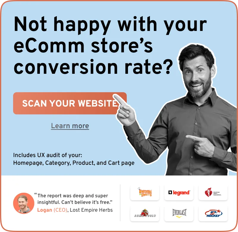
Your Shopify Store Has Traffic But No Sales? 31 Possible Causes (& Solutions)
June 3, 2025
So, your Shopify store has traffic but no sales? Yes?
No worries—’cause in this article, we’ll not only discuss why your Shopify store isn’t converting, but also drop in the exact fixes.
Sounds good? Let’s go!
But, Where Is Your Shopify Store Losing Sales?
Shopify store or not, most online stores lose a good chunk of traffic before making the first sale. Statistics show only about 30% of all traffic proceeds towards the cart stage, on the avg. eComm store.
The average Shopify store loses the largest amount of traffic in these two scenarios:
→ Visitors bounce off the landing/product page/homepage
OR
→ Visitors initiate checkout but leave without purchasing
So, the first step: identify where exactly visitors leave your Shopify store. Check your Shopify metrics first, for:
How many shoppers actually land on your Shopify store (and from where)
How much time (on average) do shoppers spend in your store
What searches do they make on your search bar
What is the difference between the number of add to cart sessions vs the number of sessions that reached checkout
The second step:
Check your product pages if: the total number of sessions vs the no. of add to cart sessions has a gap of more than 90%
Check your collection pages and product listing display if: people don’t move from search to cart
Check your cart experience if: the number of add to carts and the number of sessions that reached checkout has a drop off of greater than 80%
Check your checkout experience if: the number of ‘reached checkout’ sessions and the number of ‘completed checkout’ differ hugely (but if you’re getting like 20 people a month to your checkout page, you have to just get more traffic)
We know it does not answer the WHY,but it does tell you WHERE people are abandoning your site.
And it’s a start – you know where to start looking for UX issues.
And WHY are those shoppers dropping off? We describe 31 possible reasons below 👇
Why Is Your Shopify Store Not Driving Sales: 31 Specific Reasons
⚠ A word of caution: If your Shopify store gets less than 1000 visitors a month, you need more traffic. It ain’t nearly enough traffic to even convert into sales.
1. Your pop-ups could be intrusive
Picture this: You have just landed on a Shopify store that you just discovered, and you see this pop-up:
Now, ask yourself this: would you want to stay?
Getting 10% off on your next purchase doesn’t matter as much—you haven’t made the first one yet. 🤔
✅ Proven pop-up fixes if you’ve traffic but no sales on Shopify
Show the pop-up as a sticky widget (which users can interact with)
Trigger the popup on exit-intent behavior (or after the user has made some engagement on the page)
Check if your page contains your socials, domain email, phone number, and address
Add sections like 'New Arrivals', 'Featured Collection', and 'Hot Sellers' on the homepage to help keep customers updated on new products and expose them to new collections
💡 Quick Tip: Avoid using a ‘myshopify’ domain – it raises red flags. 🚩
3. Your page don’t load fast enough (or elements break as they load)
32% of users will give you about 3 seconds for your store to load (8 seconds if there’s some evidence of you being trustworthy).
Now, imagine your Shopify store looks like this, as it loads:
✅ Proven load time fixes if your Shopify is not getting sales
Consider serving all images in WebP—this will help with the load time
Lessen the use of third-party JavaScript as much as possible (think external analytics tools)
Regularly check your Google Search Console for better reports on page quality (think Core Web Vitals)
💡 Quick Tip: Check for dead links (links that lead to 404 errors) – they are great at causing drop-offs.
Nothing kills sales faster than low-quality pages—take a look at this example:
✅ Proven mobile UX fixes for a non-converting Shopify store
Open your store on mobile—check how long it takes for you to scroll and see every image and element
Do you have a sticky header or do you have to scroll up to find a menu
Are there sticky widgets on mobile that interrupt the UX
Is there a text-to-image ratio of 60:40 (60% images and 40% text)
💡 Quick Tip: Look at your Google Search Console—specifically the Page Experience and Core Web Vitals—these metrics will help you understand how your users are experiencing the pages.
5. Your navigation doesn’t guide users or offer support
When a navigation menu just offers a logo, without any additional context – shoppers might not find a reason to stick around.
Instead:
a. Frame your header navigation to help shoppers explore (and build trust)
✅ Tested header fixes if your Shopify gets visitors but no sales
Feature your top categories, best sellers, and new arrivals
Show your latest brand updates, like ongoing sales, collaborations
Make sure you include an ‘about’ section – cover brand updates, FAQs (only if space remains)
Add images to your menu items and in your submenus to feature products (this way, off-screen menus act like a full page)
Feature options to change currency, search, and view cart (keep the view cart option always on view, no matter the device)
Use your notification bar to feature quick one-liners about your store ratings, your brand benefits
Pro Tip:
Ensure shoppers don’t have to scroll through on mobile for too long (not more than 2 folds)
Also, it’s not always a great idea to keep the shopper stuck in your navigation, layering in sub-menus to find a specific category (feature 2-level menus at max, so all it takes is 2 clicks to see collection pages)
b. Ensure the footer navigation shows clear support options
✅ Proven footer fixes if your Shopify store’s not selling
Have options to ‘track my order’, ‘raise a return’ mandatorily
Provide full addresses, contact nos., for your support, and emails
Offer clear maps to your policies (think: returns, general terms, privacy policy, loyalty program)
Feature a section about your USPs, above the footer
Link out to your social media profiles with relevant icons, with an option to signup for your email newsletters
Have a live chat, keep it sticky, but dismissable – offer clear support options through even more FAQs
Turn the footer into an accordion section on mobile, with neat categorization (note the ‘discover’, ‘customer’, and ‘quick links’ accordions):
Remember: Your navigation must look good on mobile too, without overloading the shopper – but enough to inspire trust. Note how this Shopify store features certification in their logo bar, and a “charities” menu item in the top bar, with a hamburger icon:
6. You could be showing zero search results
This is equally serious as having broken/dead links (links that lead to 404 errors).
Here’s why: it leads to a horrible UX (and users have no option but to leave).
✅ Proven site search fixes for Shopify stores to convert traffic into sales
Offer a pre-filled help text on the search bar as suggestions
Load up error text such as “Uh-oh! We don’t have what you may be looking for – but you may like these”
Show your bestsellers or use NLP search analysis to show the best possible suggestions
💡 Quick Tip: Take stock of all search queries your visitors have made to find patterns – if there are none – consider changing the design of the search bar.
9. Your collections pages do not display enough information
Let’s pit two product displays against each other to understand this better—which of these two displays would you trust?
Option A ▽
Option B ▽
If your answer is Option B, we wouldn’t be surprised—let’s explore why:
✅ Proven UX fixes on collection pages to convert traffic into sales on Shopify
Label your products clearly—include sizing, reviews, colors, etc
Use microcopy on your product displays to show updated stock/social proof/promotions
Offer clear CTA’s to help users go deeper—note the “add to cart” CTA on Option B
Avoid irrelevant text such as “No questions yet…question!” on Option A
💡 Quick Tip: Consider apps like Glo Color Swatch, and Swatch King for better product displays on product and collection pages.
10. You could be showing very few products on your collections page
Not having many products in your collections pages looks suspicious to most users—note this example:
✅ Proven collection pages fixes, if no sales on Shopify
Use enlarged layouts that help users focus better on the collection
Use image carousels or a quick view to showcase more details
Showcase your returns and shipping policies better
Make sure your thumbnails are consistent (but not so much that they look the exact same) – have the same size and background, but have slight differences (like trust badges, and shot angles)
💡 Quick Tip: Use subtle triggers like “best-selling” or “selling fast” to move the sales along.
11. The CTA buttons could be confusing users
Take a look at this product page below—the sizing options specifically—note how the lack of interactivity leads to increased frustration:
✅ Proven CTA fixes for low sales on Shopify
Offer error text or help text, when the intended action isn’t made
Change the colors of the button when it is selected
Tune your copy to help users select the right option first—“Step 1: Choose your fit” and “Step 2: Choose your size” would have helped deliver better UX
12. Your reviews don’t seem too trustworthy
Believe us when we say, users can smell fake reviews a mile away—take a look at this example:
✅ Tested social proof fixes for a Shopify store not converting
Embed your social media feed to help with building trust
If you don’t have reviews just yet—consider using some UGC from your employees
If required, provide a free sample (and remember to ask them to review it)
Reply to all kinds of reviews – especially if they are negative ones
Feature an option to filter through reviews by rating, positive or negative reviews, and buzzwords from the reviews that highlight product features (like “easy to use”)
💡 Quick Tip: Create a product video from your UGC – show the product in use – this can help convert your traffic into customers.
Will your customers like it when you offer the same recommendations twice (at the same time)?
If you think, the answer’s yes—we recommend taking a look at this example:
This example is interrupting enough on Desktop—imagine seeing it on mobile.
✅ Proven upsell/cross-sell fixes if you’re not driving sales on Shopify
Ensure you don’t have multiple apps for cross-sells and upsells
Avoid upsells/cross-selling beyond the cart page—continue after the purchase
Consider smart value upgrades such as “insurance” or “subscriptions”
Pro Tip: Don't have the ‘subscribe’ option selected by default – and if you do, make sure, you select the lowest cost option – and also the one that offers long gaps between each refill (this way you make the buy-in easy).
This stands especially true for products with high AOV (especially if your products go above the $80 mark).
The discovery phase happens on mobile and ends on desktop—which is why users may be dropping off.
So, if you’re wondering how long does it take to get sales on Shopify – the answer is: it depends on your AOV – the higher it is, the longer it will be.
✅ Proven fixes for long purchase spans on Shopify
Assess if your product page copy communicates the value in terms of materials, warranty, etc
Check if you’ve highlighted purchase protection like easy returns, money-back guarantee
Offer some form of flexibility in terms of payment, like BNPL payment
Do you provide some sort of push for live support when exit intent behavior occurs
💡 Quick Tip: Set up micro-conversions that help users towards a sale (think coupon code contests, newsletter signups, live streams, etc.).
26. What kind of ads are you running – Is your traffic quality traffic? Bad traffic = Zero Sales
If you’re advertising on Meta or running display ads for traffic, you may be optimizing yourself for zero sales.
Your goal should be to make your ad copy as minimal as possible—try using multiple variations of your ad copy to appeal better, as ‘The Pacii’ does (to avoid ad fatigue):
✅ Proven ad fixes for Shopify stores with visitors but no sales
Check your Ad platform analytics and check who’s seeing your ads—FB Ads Manager offers a feature like this:
Recheck and reconfirm your choices—also incorporate your existing follower demographic into your audiences:
Create at least 4 variations of your ad copy/videos (and refresh them at least once monthly, to avoid ad fatigue)
Repurpose your best-performing TikTok video (or replicate a viral style)
Focus on other types of advertising, such as Google Search Ads and Shopping Ads—and use them to retarget users who viewed a product
Stay away from partner site placements—such as the Audience Network (often a reason for low-quality traffic)
Use the “Sales” objective on FB ads for better performance—you will need to create a catalog on Facebook Ads Manager
💡 Quick Tip: It takes any ad algorithm at least a month to optimize your ads for the best results—which is why it’s a good idea not to use limits on audience targeting at the get-go.
27. Is your messaging on landing pages connected with the ads you are running
If it isn’t, it may as well be the reason for getting zero sales from your traffic.
Let’s take an example of how to tie a landing page to an ad—it promises a BOGO offer along with a money-back guarantee and a “Gastroenterologist endorsed” microcopy:
Similarly, the first fold of the landing page offers the same along with an expert review from a doctor:
However, what else does this landing page have to tie itself to the ad (and what could’ve been better)?
Pros:
Interactive product carousel with clear information about the product (and that too in the right size)
Clear value addition through the free e-book “30-day gut fix guide”
Live chat on standby—shown as a subtle push notification
Cons:
Promotion on the notification bar could be toned down
The designation of the expert could have been mentioned to help with the continuity
No mention of the money-back guarantee in the first fold
28. Your SEO strategy isn’t really bringing in quality traffic
More specifically, you aren’t bringing in traffic with buying intent. Why? Because your Shopify store doesn’t rank for things that genuine buyers search for.
Here are some ideas to set up your SEO so you can get your Shopify store to make sales:
a. Optimize product titles to include keywords and key product details
Product titles on your product and category pages need to answer the ‘why’ and ‘what’ of your product. This way, you can set yourself up for people who’re actually searching for exactly what you offer.
✅ Proven SEO fixes for no sales on Shopify
Mention material, size, color, and product category, with the brand name
Have subheads to showcase product use cases
Set up ‘product’ schema markup so search engines and AI agents can pick up information extremely quickly
Here’s a great example from FirstGear, a Shopify store, showing a clear product title with size, color, and brand name:
b. Build collection pages by use cases for quality traffic
If your Shopify store doesn’t get sales, it might be because you only optimize for broad keywords, like “wireless earbuds deals” or “buy organic skincare set.”
Meaning: you’re only reaching shoppers at the very start of their journey.
Instead, update your collection pages to target a specific use case with strong buying intent – like “best running shoes for plantar fasciitis under $100” or “best waterproof Bluetooth speaker for outdoors under $200.”
This way, you can attract more quality traffic to convert into sales on your Shopify store.
✅ Proven organic traffic fixes for no sales on Shopify
Feature collection pages on seasonal gifting ideas – and create subcategories by use case, gender, age, and price (example: Christmas gifts for men under $30, Mother’s Day Gifts for expecting mothers, etc.)
Create subcategories for your primary product categories to act as pre-made filters (like Fragrances under $X, Skincare under $X)
Ensure your collection pages have banners with title text, specifying the use case (but make sure the banner is not so big it interrupts UX)
Add descriptions to category pages, feature short blurbs on best products, and offer pairing ideas
Here’s an example of a collection page from Trendhim, a Shopify store – note how the "Gifts for active men" category is further broken down into more subcategories:
c. Partner with bloggers/influencers to get quality traffic
Backlinks help you rank, but what if they could also solve your Shopify no sales problem?
✅ Proven SEO fixes for a Shopify store with no sales
Build trackable affiliate links – and send them to top bloggers in your niche
Curate guest posts that solve pain points – for example, “how to fit a led bulb inside a halogen headlight”
Match images to product pages, so shoppers don’t bounce off, when they do arrive from those posts
Pro Tip: When you author blogs or place affiliate links, retarget viewers on those partner websites (display ads) and people who visited your site from those links/websites (think: search or Facebook ads).
d. Create your own content
Or else, shoppers are just gonna arrive, and they’re gonna leave. Because they usually need more than just a product description – they want to see your expertise.
Plus, it’s better for your SEO – someone who comes in after reading a ‘how-to’ from you is far more valuable than someone who just saw an ad – and was curious.
✅ Proven SEO fixes to convert Shopify traffic without ads
Create monthly style routines like a ‘this month’s picks’
Cover contests, how-to content, influencer recs
Employee-generated content is always a plus (on your socials, blogs, and YouTube)
Make the content extremely visually appealing, with a clear aesthetic and clear expertise (so it actually ranks)
Repurpose your content across channels in various formats – and retarget engagers from your content through ads (like someone who visited your blog pages and read an article for more than 30 seconds)
Here’s how Mint Velvet creates 'MV World' to feature their own content, authored by their social media manager:
Especially the ones for Google Merchant Center. Because: if search engines drive shoppers to out-of-stock product pages, you’re done.
Also: make sure you de-index permanently out-of-stock products for search engines (like for Google search, use Google Search Console)
29. Your social media game isn’t strong enough
The truth is: a barely functioning website can still make sales, if shoppers know how valuable you are.
Look at this:
Inconsistent product images, a huge header bar – but the site still makes sales.
Wonder why? Well, here’s their TikTok profile – check out the number of followers:
This simply proves that social proof in social media is always a ‘must have’ – and that you need to keep creating content, so you stay on top of the shopper's mind.
✅ Proven social media fixes if you’ve no sales on Shopify
Conduct live streams at least once a month
Have an option to shop your Instagram feed (also acts as social proof)
Show proof of collaborations in product pages, landing pages, and homepages
Feature UGC like unboxings, haul videos, and a ‘how-to’ in your product pages (acts both as social proof and a tool to convince shoppers)
30. You could be sending shoppers off-your-store for discounts
Sure you offer a welcome signup bonus.
But do you provide the code over email? Yes? Well, that just stops buyers.
✅ Tested CRO fixes for Shopify stores not making sales
Give X% off immediately and extra XX% more when they verify. This way, you get way way waymore completions
Or, you can simply give shoppers an option to ‘reveal’ their discount:
Make sure you automatically apply the code – or add it to their account (meaning you create an account immediately on email signup):
Pro Tip: Make sure it doesn’t actually interrupt the shopping experience – don’t go too heavy on copy – and always have a clear ‘x’ button.
Apart from Amazon, Walmart, and Target dominating search, your Shopify may not even get sales if you list your products on Amazon or any multi-brand eCommerce marketplaces.
Their domain authority is always going to pull away traffic from your store.


.svg)

.svg)

.svg)
.svg)