Conversion Optimization
51 Checkout Abandonment Reasons (And How to Fix Them)
March 27, 2026


Checkout abandonment is often treated as a page-level problem.
In reality, it’s a system failure.
What happens at checkout is the result of everything that came before it — user expectations, perceived trust, input friction, performance, and payment flexibility. When any of these elements misalign, even high-intent users drop off.
At scale, these misalignments don’t appear as isolated issues. They stack, interact, and amplify each other, making checkout optimization far more complex than a checklist of best practices.
Reducing checkout abandonment requires minimising friction, improving transparency, and optimising the checkout experience for speed and trust. Below, we break all 51 reasons into 5 core forces and show you how to fix them.
This post covers:
Checkout Abandonment Due to Friction (Momentum Breakers)
Unexpected Costs That Cause Checkout Abandonment
Trust Issues That Cause Users to Abandon Checkout
Checkout Friction and Complexity Issues
Decision Reversal Triggers in Checkout
Here's something counterintuitive: high-intent shoppers feel friction more acutely than casual browsers. A drifter shrugs and moves on. But someone who has genuinely decided to buy has invested in the outcome and is more likely to pause when something disrupts their confidence.
Buying intent isn't a switch. It's a flame. A small gust puts it out.
Three things drive abandonment even among committed shoppers:
New information shifts the maths: A shopper happy to pay $45 becomes considerably less happy when checkout adds $6.99 shipping and an eight-day wait. Nothing about the product changed, but the perceived value of the transaction did.
New effort feels like a tax: Long forms, OTP verification, mandatory passwords — each is minor in isolation. But after the mental work of deciding to buy, any extra effort lands disproportionately hard.
Commitment triggers second-guessing: The moment of pressing "Place Order" often sparks a sudden urge to reconsider. Is this the right size? Does the date work? Is something better available elsewhere? Checkout reopens the decision instead of closing it.
Checkout works on momentum, not logic. These are the interruptions that stop a shopper mid-flow and hand them a reason to reconsider.
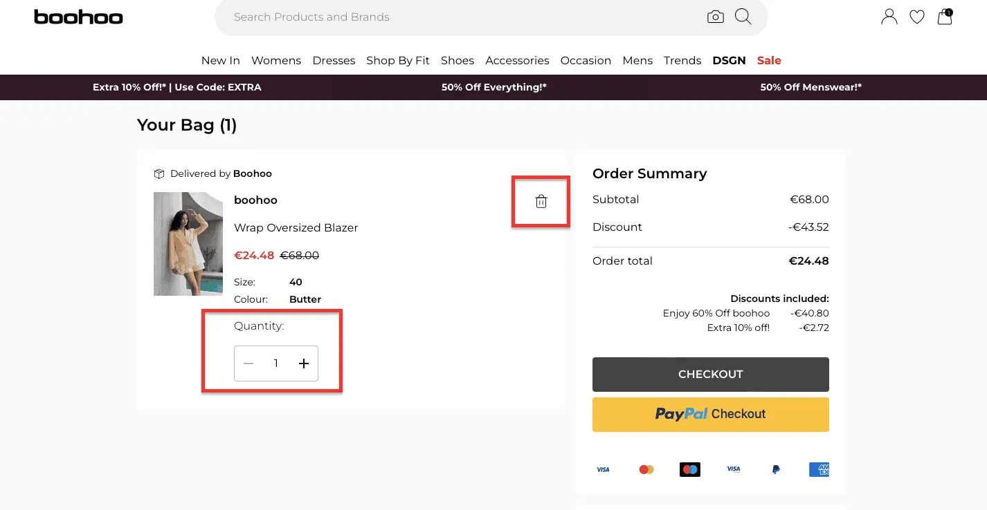
1. Page reloads mid-checkout: Every unnecessary reload is a hard reset on the mental flow you've spent the entire funnel building.
2. Slow checkout page load times: 50% of shoppers won't tolerate a checkout taking longer than 30 seconds. The average shopper waits about 10 seconds for payment verification. After that, you're losing people not because they changed their mind, but because they got bored and suspicious at the same time.
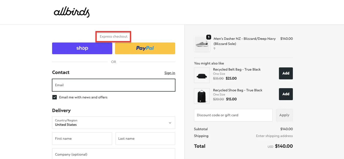
3. Forced account creation in checkout: The shopper wants to buy a thing. You want a relationship. Springing the second on someone mid-purchase kills the first. 43% of shoppers prefer guest checkout for many stores; it's the smarter default.
4. Payment errors with no helpful recovery: 48% of sites don't use Luhn validation to catch implausible card numbers before submission. One in three shoppers abandons after being asked to re-enter card details, an entirely avoidable exit.
5. A back button that ejects shoppers from checkout: On mobile, an accidental back-button tap can send someone out of the flow entirely. If your back button doesn't keep shoppers inside checkout, it's a trap door.
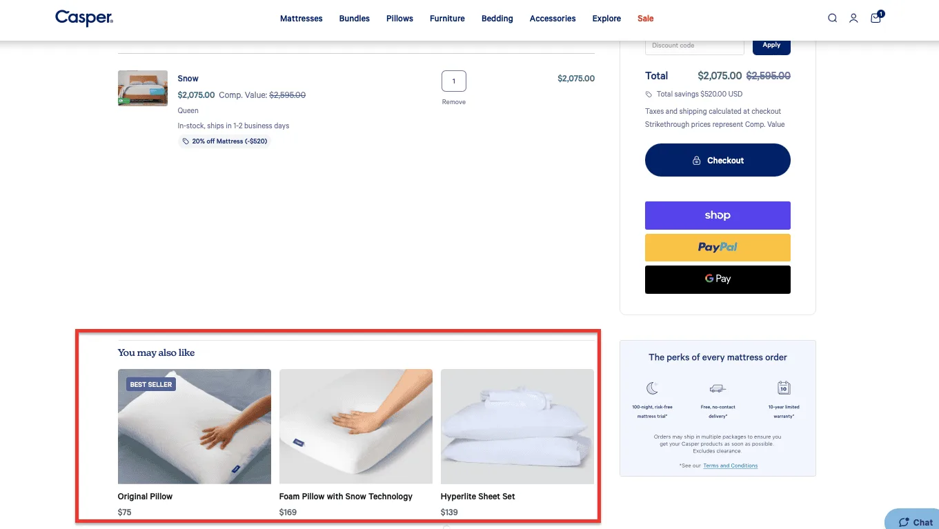
6. No ability to edit the order at review: 80% of stores don't let shoppers edit directly at the review step. If someone spots a mistake, they have to navigate backward through the entire flow, and most don't bother.
7. No checkout progress bar: Shoppers with no sense of how far they've come are more likely to abandon than shoppers who can see they're nearly done. A visible progress bar is one of the cheapest conversion improvements available.
8. Poor mobile checkout experience: Mobile abandonment sits at 85.65% versus 69.75% for desktop. Buttons too small to tap, fields triggering the wrong keyboard, layouts requiring horizontal scrolling, none of this should exist in 2025.

9. No auto-detection of location from postal code: 28% of stores make shoppers manually fill in city and state after entering a postcode. Auto-detecting removes a step that shouldn't exist.
10. No autofill support: Google Autocomplete cuts form-completion time by around 20% and reduces mobile errors significantly. Not supporting it is adding friction for no reason.
Shoppers don't abandon because the total is too high. They abandon it because it's higher than they expected. Expectation is something you set — and these are the moments stores set it wrong.
11. Unexpected shipping costs revealed too late: 63% of shoppers abandon because of surprise shipping costs — the single most common reason for checkout failure. The word is unexpected—shoppers who know the cost upfront factor it into their decision. Shoppers who discover it at step three feel ambushed.
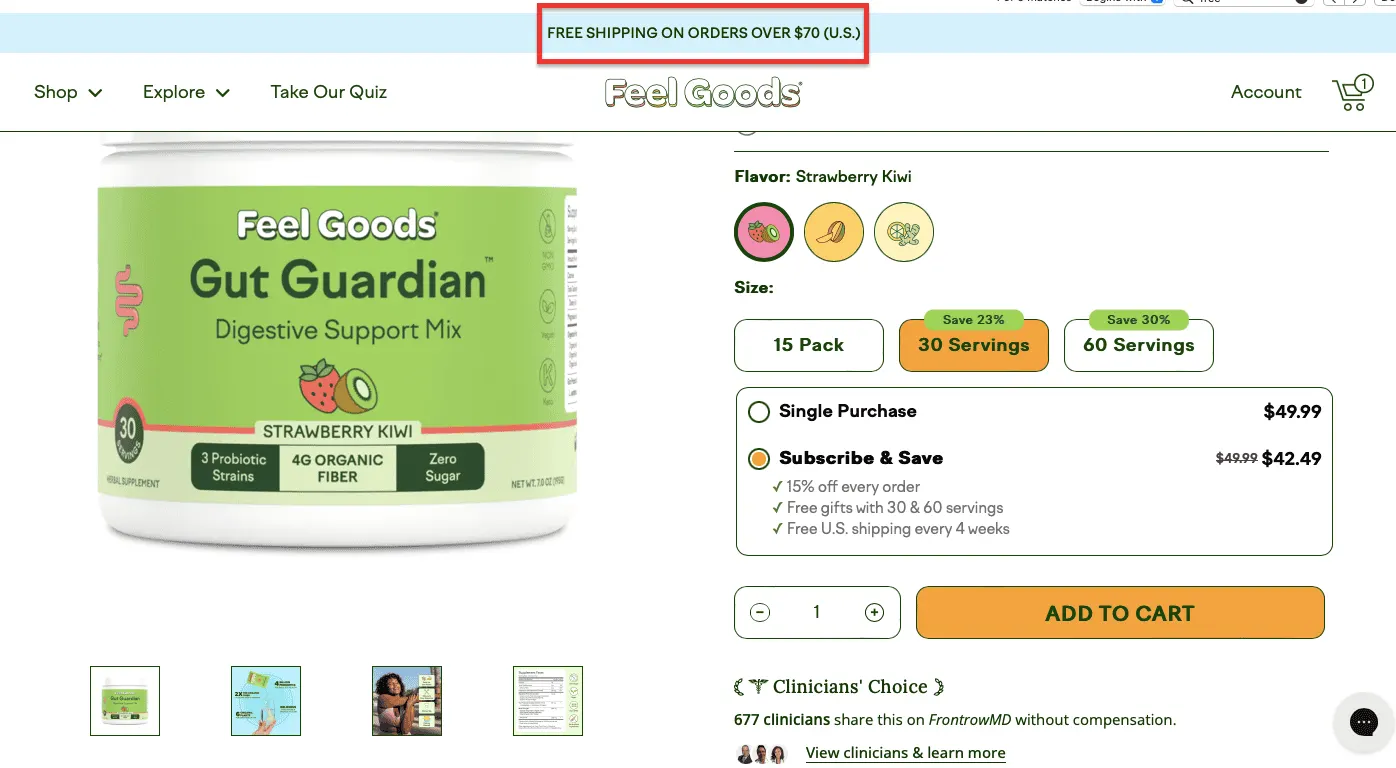
12. No free shipping option: Free shipping has moved from differentiator to baseline expectation. Stores that can't offer it universally should at least offer it conditionally. A threshold gives shoppers something to work toward and often increases average order value.
13. No free shipping progress indicator: If you have a free shipping threshold and don't show shoppers how close they are to hitting it, you're leaving money on the table twice in the abandoned cart and in the upsell you never made.
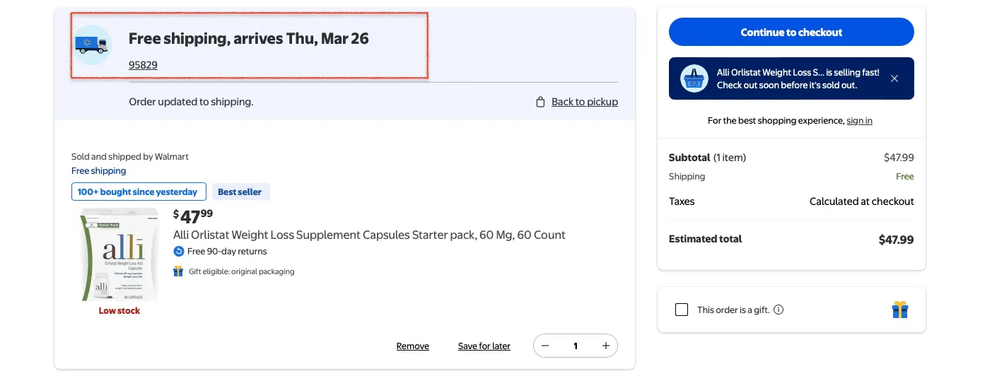
14. Delivery speed shown instead of delivery date: "3–5 business days" forces shoppers to do calendar maths in their head. "Arrives by Thursday" doesn't. One feels like a promise. The other feels like a hedge.
15. No multiple delivery options: A shopper who needs something by Friday and only sees standard shipping has two choices: pay for an upgrade if it exists, or leave. Tiered delivery options give shoppers control over the cost-speed trade-off.
16. Taxes appearing at the payment step: Like shipping, tax is far less damaging when it's visible early. A shopper who sees it added at payment experiences it as a last-minute price increase, psychologically very different from one who budgeted for it.
17. Discount codes that don't apply correctly: Few things deflate purchase momentum faster than a discount code that errors out. And few things are more quietly infuriating than completing a purchase only to realise the discount didn't apply.
18. A discount code field that's too prominent: 9 in 10 shoppers use discount codes when they can, which means a highly visible discount field tells every shopper without a code that they're probably overpaying. Put it behind a dropdown.
19. No local currency for international shoppers: A shopper asked to pay in a foreign currency has to do a mental conversion at the exact moment they need it to feel confident. Showing prices in local currency removes an unnecessary variable.
20. Product recommendations priced well above the cart value: Showing a $200 add-on to someone buying a $30 item doesn't feel like a helpful suggestion. It feels like a store that doesn't know them.
Trust is most fragile right before payment. Everything up to this point has created a provisional level of trust checkout is the moment it gets tested hardest.
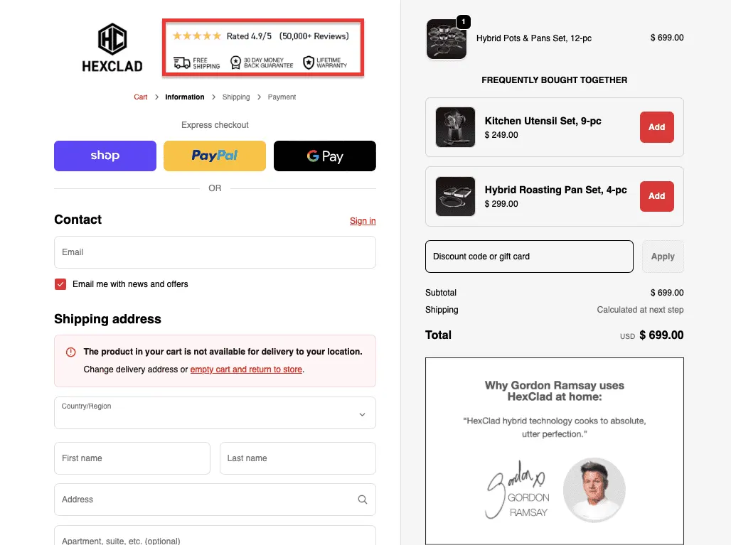
21. No visible security indicators at payment: Almost 1.4 million Americans reported identity theft in a recent year. Trust badges, SSL indicators, and recognisable payment logos aren't decorative, they're active reassurances at the moment shoppers need them most.
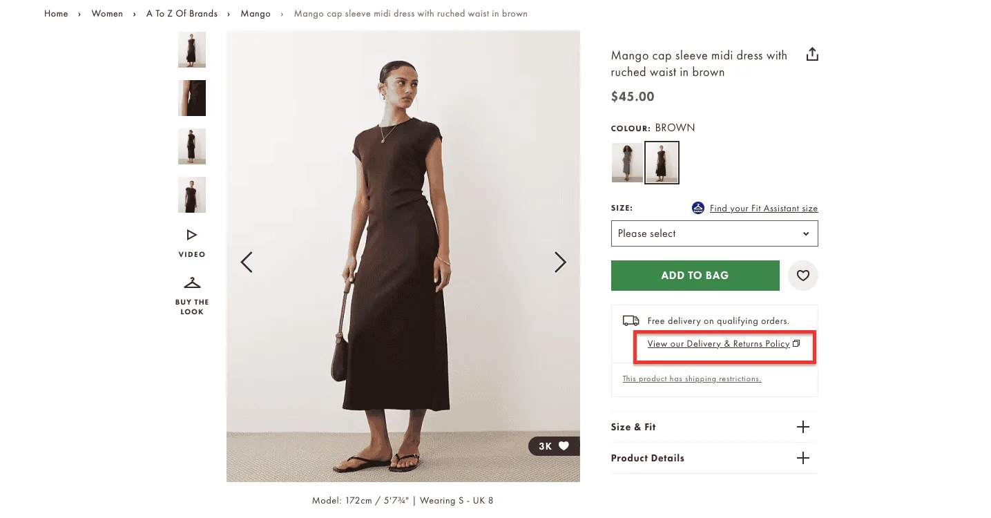
22. An unclear or hard-to-find returns policy: 12% of shoppers cite a frustrating returns policy as a reason for abandoning. A buried or legalese-heavy policy tells the shopper something about the store's priorities, none of it good.
23. No customer reviews on the checkout page: 79% of shoppers say social proof significantly affects their purchasing decisions. Doubt can resurface at checkout, especially for first-time buyers. A reminder that other real people have bought this and been happy is surprisingly effective at the final step.
24. Weak or absent purchase guarantees: A money-back guarantee or satisfaction promise shifts the downside from the shopper to the store. That changes the psychological calculus of pressing Confirm Order.
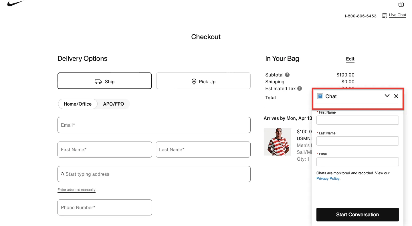
25. No live chat or visible support option: 70% of Shopify Inbox conversations happen with shoppers actively making a purchase. A shopper who can't find a quick answer has two options: abandon or take a chance—many abandon.
26. A checkout that looks different from the rest of the store: Different fonts, different colours, a third-party domain in the URL bar, shoppers notice. Even those who can't articulate what's wrong will feel a vague unease. Consistency is a trust signal.
27. No FAQ access during checkout: Shoppers who hit a question mid-checkout and can't find an answer without leaving the flow face a bad choice: proceed with uncertainty, or leave to find the answer. A lightweight FAQ block in the checkout footer prevents both outcomes.
28. Missing familiar payment methods: A shopper who reaches the payment step and doesn't see their preferred payment method experiences a trust wobble. PayPal's buyer protection, for instance, is a meaningful reassurance that its absence is noticed.
29. No clarity on what happens after purchase: Will I get a confirmation email? When will it ship? How will I track it? A store that doesn't answer these questions before the shopper hits Pay is asking them to trust blindly.
30. Corporate or evasive copy at checkout. "Order details will be communicated upon transaction completion" is doing the opposite of reassuring. Direct, warm, plain-English copy at checkout signals a store that's confident in what it's offering.
Effort tolerance at checkout isn't fixed; it depletes. Every step along the way has already worn down the shopper's patience. These are the moments the process demands more than they have left.
31. Long or redundant checkout forms: Every field you don't strictly need is a field that shouldn't be there. Each unnecessary question is a small tax on attention, and they compound.
32. No autofill or Google Autocomplete support: Autofill cuts address entry time by around 20%. Not supporting it means asking shoppers to type things their browser already knows.
33. Forced account creation before purchase: Worth repeating in this context: the effort dimension is distinct. Creating an account means choosing a password, confirming an email address, and possibly verifying via OTP for a shopper who just wants to buy something. This feels wildly disproportionate.
34. Clunky OTP and two-factor verification at payment: Security verification has its place. But when switching apps and retrieving a code, hoping it hasn't expired, it introduces peak-effort moments when you can least afford it.
35. No social login option: For shoppers willing to authenticate via Google or Facebook but not create a new account, social login is a genuine shortcut. Not offering it makes the account-creation problem worse than it needs to be.
36. Card entry that doesn't autoformat: Typing 16 digits as a continuous string generates typos. Autoformatting spaces prevents errors; Luhn validation catches the ones that slip through.
37. No saved payment details for returning customers: A shopper who has bought from you before and still has to re-enter full card details is being treated like a stranger. Offering to save payment information — with clear consent — removes an entire category of effort for your most valuable customers.
38. Absent or unhelpful microcopy: Small contextual cues, such as a sample phone number, a tooltip clarifying a field, prevent the minor confusions that cause shoppers to pause, second-guess, or fill in fields incorrectly.
39. No inline editing at the order review step: If a shopper spots a mistake at review and can't fix it in place, they must navigate backward through the entire flow. Most don't. They either proceed with the error or abandon.
40. Checkout untested on actual mobile devices: Mobile abandonment runs nearly 16 points higher than desktop. Buttons too small to tap, wrong keyboards triggering on number fields, layouts requiring horizontal scrolling, these aren't edge cases. They're the majority of your traffic.
41. No one-click or accelerated checkout option: Shopify found checkout-to-order rates are 1.7x higher with Shop Pay than standard checkout. That gap is almost entirely explained by effort reduction.
These don't slow shoppers down or make them feel overcharged. They do something more fundamental, they reopen a question the shopper had already answered.
42. Unclear or missing delivery timelines: A shopper who needs a gift by Saturday and can't find a clear delivery date isn't going to assume it'll arrive in time. Vague estimates force a calculation under uncertainty, and many resolve that uncertainty by choosing not to buy.
43. Limited payment options at checkout: A shopper who reaches payment and doesn't see a method they trust isn't just inconvenienced they're suddenly reconsidering whether this is the right store entirely.
44. No buy now, pay later option: BNPL has moved from novelty to expectation for a meaningful segment of shoppers, particularly on higher-ticket items. A shopper planning to split the cost who discovers that option doesn't exist may decide the full upfront payment feels like too much, even if they could afford it.
45. No product thumbnails in checkout: A small image of each item's right variant, right colour serves as a quiet confirmation: yes, this is what I chose. Without it, doubt can creep in.
46. No product summary at the review step: Some shoppers want to see the specific details confirmed before paying, such as size, colour, and configuration. A summary is as much a reassurance mechanism as an informational one.
47. Checkout slow enough to allow comparison shopping: A shopper who stalls at checkout has idle time. Idle time is dangerous; it's when tabs open, competitors are checked, and perfectly good purchase decisions are abandoned.
48. No gifting options at checkout: A shopper buying for someone else needs gift wrapping, a message, and possibly a different delivery address. A checkout that can't accommodate this doesn't just inconvenience them, it sends them to a store that can.
49. Loyalty points not surfaced at checkout: A member who doesn't see their points balance or doesn't know they could be earning has been given incomplete information at a moment when complete information matters.
50. Upsells that reopen the original decision: A recommendation too different from what's in the cart doesn't feel helpful. It feels like an invitation to reconsider whether the shopper chose the right thing. That's not a thought you want in their head at step three or four.
51. No positive reinforcement at the final step. A small, genuine acknowledgment copy that confirms their choice was a good one provides a micro-reassurance that carries a surprising number of shoppers over the line. Its absence isn't fatal. Its presence is quietly powerful.
The 51 reasons above are really five underlying problems. Here's how to address each:
Show all costs upfront: Shipping, taxes, fees — surface everything before the shopper reaches the payment step. There is no such thing as a pleasant surprise at checkout, only unpleasant ones.
Enable guest checkout: Make it the default, or at minimum, the equal option. Capture account creation after the purchase, when the shopper is in a receptive mood rather than a transactional one.
Optimise checkout speed: Every second counts at payment. Autofill, autocomplete, one-click options, and accelerated checkout. The goal is to make the process feel shorter than it is.
Add trust signals where they matter most. Near payment fields, not just in the footer. Security badges, reviews, guarantees, and plain-English copy all do trust work but only if they're placed where doubt actually peaks.
Offer multiple payment options. Card, PayPal, Apple Pay, Google Pay, BNPL. Each missing option is a potential exit for the shopper who expected to find it.
Simplify your forms. Remove every field you don't strictly need. Ask once for information you already have. Autoformat, autodetect, autofill wherever possible.
Fix mobile: Test your checkout on a real phone, with real thumbs. If anything requires pinching, horizontal scrolling, or fighting the keyboard, fix it.
Checkout abandonment is when a shopper begins the checkout process, entering shipping or payment details, but leaves before completing the purchase. It's distinct from cart abandonment, which happens earlier in the journey.
The average checkout conversion rate across eCommerce is roughly 45–55%, meaning around half of shoppers who begin checkout complete it. High-performing stores push this to 60–70% through friction reduction and trust optimisation.
The most common reasons are unexpected costs (especially shipping), friction in the process (long forms, forced account creation, slow pages), lack of trust at the payment step, poor mobile experience, and limited payment options.
Start with the highest-impact fixes: show shipping costs early, enable guest checkout, add trust signals near payment fields, support accelerated checkout options like Shop Pay or Apple Pay, and test your checkout on mobile. Small improvements compound quickly at scale.
Cart abandonment occurs when someone adds items to their cart but never proceeds to checkout. Checkout abandonment happens after they've started the checkout process. Checkout abandonment is generally more salvageable — the intent was higher to begin with.
Checkout abandonment rarely stems from a single major failure. It comes from five or six small ones: a shipping cost revealed too late, a form field that shouldn't exist, a delivery date left vague. Individually, each is minor. At scale, they're expensive.
The good news: most of it is fixable. And fixing even two or three of the forces above can meaningfully improve your completion rate.
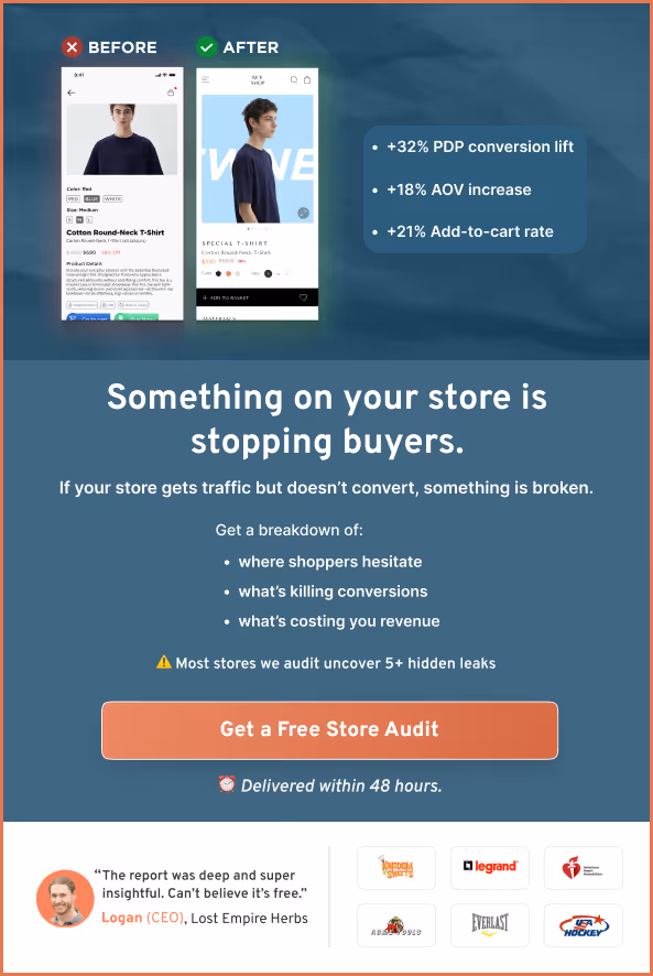
If you'd like to know exactly where your checkout is losing people, we offer a free conversion audit, a real analysis of your store by a CRO specialist, not an automated report.
Related Reading:
eCommerce Checkout Optimization: What's Actually Working Right Now
How Many Steps Should Your eCommerce Checkout Have?
How Do I Increase My Website’s Checkout Rate? (21 Proven Ideas)
Subscribe for more articles like this!


Read by 5000+ ecommerce store owners
.svg)

.svg)

.svg)
.svg)
2026 Convertcart, All Rights Reserved
33/1, Castle Street, Ashok Nagar, Bengaluru, India