
eCommerce Checkout Process
Optimization Guide
User experience, best practices, mistakes-to-avoid, examples, and more.

- What is Checkout in eCommerce?
- What Makes a Great Checkout Experience?
- How Can You Improve the Checkout Experience?
- How Do You Optimize the Checkout Process for Mobile?
- What checkout page mistakes should you avoid?
- One-Click Checkout Examples (🏆 Most Popular Checkout Page Optimization Trend)
- 7 Checkout Page Examples to Inspire eCommerce Brands
- Build the Perfect eCommerce Checkout Pages
Designing a checkout page might seem simple.
You know the most common components –
- product list,
- price summary,
- billing and shipping information, and
- payment options.
Shoppers can abandon carts due to various reasons.
That’s why we’ve compiled a step-by-step eCommerce checkout optimization guide to improve checkout conversion rates.
Check it out (pun, absolutely intended)
What is Checkout in eCommerce?
So, does checkout mean to pay?
Technically, yes.
The checkout page is a webpage where you order and pay for goods or the process of paying for goods/products.
Facts:
- average eCommerce checkout conversion rates are around 2.12%
- average eCommerce add-to-cart conversion rate is 6.96%
In between is the dreaded zone of cart abandonment — and there are several reasons your shoppers leave without buying.
That’s why, eCommerce checkout optimization is so important.
What Makes a Great Checkout Experience?
Great checkout experiences will establish your brand’s presence in a customer’s mind.
Here are some best practices to improve eCommerce checkout experience:
- Simple & minimal steps
- Clear and transparent pricing
- Multiple payment options
- Mobile optimization
- Guest checkout
- Social logins
- Progress indicators
- Auto-fill
- Trust signals & security
- Flexible shipping choices
- Instant order confirmation
- User-friendly error handling
- Thoughtful cross-selling prompts
- Fast loading times
How Can You Improve the Checkout Experience?
Checkout might be the last stage in the buying cycle, but it’s a step that leaves a lasting impression.
Customers expect a fast and easy buying process.
That’s why, it’s important to tap into their needs to decrease checkout abandonment rates.
See how you can set apart your eCommerce checkout process from the rest.
1. Absolutely avoid hidden costs
On the checkout page, shoppers don’t like surprises.
Unless it’s a discount.
They like to know the costs upfront including:
- subtotal,
- applicable taxes,
- surcharges,
- delivery costs, and
- the final cart value.
If they see additional fees right before the checkout, shoppers will drop off, causing a decline in conversions.
You need to be transparent to customers about the breakdown of costs early in the eCommerce checkout process.
Nike is a great example of this eCommerce checkout optimization.
They show the entire breakdown at an early stage while a customer is filling out their shipping details.

2. Simplify your forms
Since they’re on the checkout page, shoppers have decided to purchase.
Asking them too many questions can lead them to abandon their cart.
You need to determine what information is necessary for customers to complete the checkout.
A quick eCommerce checkout optimization:
Keep those fields mandatory. Leave the rest to the customer’s discretion.
Research shows that websites with fewer form fields have a better chance of increasing their website checkout rate.

Also, look into data validation & auto-complete options.
If you need a customer's name during the payment process, use the auto-fill option on Chrome and Safari that fills the details by itself.
Say, a customer’s billing and shipping address are the same.
Instead of asking them to fill it twice, have a checkbox below indicating the details, which they can tap for the details to be auto-filled.
This reduces the number of steps in the process and increases the likelihood of checkout.
3. Always autofill (or autocomplete) for shoppers
No one likes filling out information to make a purchase.
Least of all the returning customers who have already given their information before.
So how can you make it easy for them?
Here’s a quick eCommerce checkout optimization:
Set up a form that can auto-fill their information.
Whether it’s their name, email ID, contact number, or shipping address—everything can be saved when they make a purchase the first time.
It becomes more convenient with tools that can look up the address of the customers based on their postal code and auto-fill it.

This reduces the number of steps in the process and makes it easier for customers to keep going until they complete the transaction.
4. Help customers update as they please
Customers change their minds often.
Often, at the checkout page.
‘One problem we recently fixed was how we allow users to edit their delivery information in the checkout while trying to keep them in the checkout flow.’ Kathrina, Marketing team, Droppe
At the same time, you need to make it easy for shoppers to continue shopping after they’ve added items to the cart.
Here’s a quick eCommerce checkout optimization example:
Flash Tattoos shows a pop-up window after a customer adds an item to the cart.
Potential customers can either proceed to checkout or continue shopping from here on.

Erdem does it on a single-page layout.
Instead of showing a pop-up window, they notify users about the cart details through a side panel when they are still on the product page.

5. Keep promo codes at easy access
Picture this.
A potential customer added products to cart and is on the checkout page.
BUT they see no coupon codes, discounts, or offers.
What do they do?
Search for a coupon code externally (which can take a while & end up frustrating them) or drop off and abandon cart.
This is a reality for a ton of eCommerce businesses — very likely including yours — since 46% of customers leave because their discount code didn’t work.
Here’s a quick eCommerce checkout optimization:
Keep your promo codes easily accessible.
Ensure they’re available on the checkout page itself.
After all, why would you want engaged customers to go off that page?
Take a note from Lord & Taylor. on how easy it is for a customer to make a saving AND check out.

6. Offer guest checkout
‘A guest checkout option significantly reduced friction, resulting in increased conversions and a smoother checkout process’, says Dhari Alabdulhadi, CTO and Founder, Ubuy Kuwait
These could be the first-time customers got directed from ad campaigns—and you don’t want to turn them away by asking to make a profile before purchase.
It’s counterproductive for your store.
A study found that asking people to make an account first is the second most common reason for cart abandonment.
Here’s a quick eCommerce checkout optimization example:
Take a leaf out of Walmart’s marketing strategy below.
They allow visitors to checkout without creating an account, thus, attracting more visitors.

We do get that at some point you’d want your customers to sign up.
After all, that’s how you can get their information to target them for future purchases.
You’d want to know about their preferences, dislikes, and behaviors to spin a marketing strategy.
We get all of that.
And you know the best way to do it? Check out how Nike gets customers to sign up.
They offer free delivery to members who sign up.
People would spend a few minutes making an account if they’re saving money in return.

7. Offer ‘subscribe & save’ options
Amazon is popular for its Subscribe & Save offer.
Here’s what it constitutes:

This worked phenomenally for the brand and helped improve their Customer Lifetime Value.
And this eCommerce checkout optimization might just be for you too
Subscriptions continue to be the latest trend in eCommerce – from beauty products to coffee or even dog food – subscriptions have been taking off.
When shopping online, many shoppers are looking for the best deal possible and subscriptions allow them to receive discounts for some time in exchange for automatic shipping and regular deliveries.
For stores, it’s a great way to connect with their customers and build long-lasting relationships.
8. Be upfront about delivery dates
The second most important factor when checking out online is providing estimated delivery dates & shipping costs early in the process.
You want to provide instant gratification to customers every single time.
Providing an estimated or guaranteed delivery date will tell them when they can expect the order, fulfilling their need to know.
Here’s an eCommerce checkout optimization example:
See how Amazon tells you when you can expect the order if you decide to buy a product in a stipulated time frame.

9. Throw in supplementary items during checkout
The truth is that most customers shop with a purpose.
They’re very likely buying something for a certain reason — and they would be interested in other products that are good for the occasion.
For example, if they’re buying a sports t-shirt, they’d likely also be interested in joggers, shoes, or accessories.
Here’s a quick eCommerce checkout optimization example:
See how Under Armour does here.
When you build an entire picturesque ensemble for that purpose, it gets them excited and they’re more likely to check o

10. Express the urgency
Want to increase checkout rates?
Get them to hurry up.
A great way to do that is with urgency tactics.
People respond to emotion.
So, when we’re a little more emotional (for example, at the end of a sale), we’re much more likely to make impulsive decisions.
Here’s a quick eCommerce checkout optimization example:
Urgency tactics are persuasion triggers that rely on scarcity and deadlines, like in this example from Debenhams.

Urgency tactics don’t have to be limited to a certain time frame.
You can also use urgency about the danger of missing out or scarcity, building on the feeling of FOMO.
These are great with limited edition deals, Selling Out Fast tags, and Sold Out in X Days reminders.

Your eCommerce checkout flow can become a solid reason for either lost customers or skyrocketing conversions.
Of course, you’d want it to be the latter.
Work from reverse, i.e. optimizing the checkout flow to get the most bang for your buck.
How Do You Optimize the Checkout Process for Mobile?
Mobile payments are growing in popularity.
The market value of mobile payments is anticipated to reach $12.6 trillion by 2027.
The key focus lies in offering a frictionless mobile checkout experience to help close the sale.
The more user-friendly the mobile payments page, the more likely it will be for sales to close.
Some of the common reasons for low mobile checkout conversion rates are:
- lack of a secure checkout process
- product details not clearly visible
- difficult navigation
- no option to compare products/prices etc.
- difficulty in updating customer information
Here are some eCommerce checkout optimizations for mobile experiences for your retail business:
1) Authenticate payment details
Route payments through payment arbiters.
With the presence of arbiters like ApplePay and PayPal, customers can easily purchase products without having to re-enter their card details every single time.
Help shoppers access their payment information securely and rapidly.
‘We streamlined our checkout process and a frictionless payment alternative that employs biometric authentication was implemented. By mitigating the issue of customers abandoning the checkout process as a result of security apprehensions and protracted payment procedures, this approach substantially increased the checkout rate,’ says Steven Athwal, Managing Director and Tech Enthusiast, The Big Phone Store
Moreover, they offer customers greater control over their data and identity.
2) Simplify mobile navigation
‘To reduce risk, we added Amazon Pay as a payment method and put the logo front and center. By leveraging Amazon as a trust factor, my conversion rate increased significantly for higher-priced items,’ said Jason Vaught, Director of Content, SmashBrand
Utilize customized keypads when entering sensitive information.
A customized keypad allows shoppers to enter authorization codes, passcodes, or patterns, making the eCommerce checkout process more secure.
This way, it deters fraudulent programs from accessing your touch coordinates.
Avoid manual data entry with a card scan method.
Since most customers use mobile to complete their payments, you can offer an option to scan their card and automatically update the details through character recognition.
Auto-detect their geographical location and address.
You can do this by asking for their PIN code and then pulling up the city and state through API.
3) Nudge shoppers
Add a progress bar to improve your mobile form UX immensely.
It helps shoppers visualize and estimate how much time it’ll take for them to complete.
They’ll also feel less frustrated about sharing the details as they have an end goal in sight.
Field labels, inline hints, and error messages go a long way in making filling out forms a breeze for customers, increasing the chances of completing the form as well.
These are called ‘microcopy’ or small blocks of text that help users complete an action or offer context to help them perform a task.
A clear and concise microcopy on your mobile payment forms can help users get an overview of what data they need to fill in and how to complete filling them.
This makes the form far less overwhelming to them.
What checkout page mistakes should you avoid?

Statistics show that the average cart abandonment rate across all eCommerce industries is nearly 69.82%, meaning only three in ten shoppers will buy.
Baymard Institute reported that sellers lose $260 billion of recoverable money due to checkout flows and design flaws.
1. Offering too many cross-sell options
Giving shoppers options could help them make quicker and more informed buying decisions.
Ironically, the more choices they have, the less likely they’ll buy.
Hick's law says the time it takes to decide depends on the number of available choices.
Too many options could become a cognitive burden.
It triggers choice paralysis and makes the sales journey unnecessarily longer.
Offer only a small number of cross-selling products, limiting it to between two and five items.
The rule of three suggests that a trio of events or words grouped into threes are more appealing or effective than other numbers.
Three is the magic number, but four is not bad either.
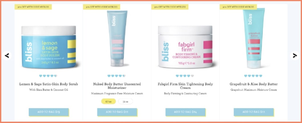
Bliss cross-sells multiple products but displays them in a set of fours, making their options less overwhelming.
In addition, shoppers can use the navigation arrow to reveal more options.
2. Not flaunting your sales activity (if it’s happening)
Humans love to follow the crowd.
It’s a natural, evolutionary trait.
People conform to group behavior for various reasons, including:
- Need to win approval
- The belief that everyone cannot be wrong on the same thing at the same time
- Fear of missing out (FOMO)
Show live notifications of sales as they happen to create a bandwagon effect.
Shoppers see it as social validation and are more open to buying.
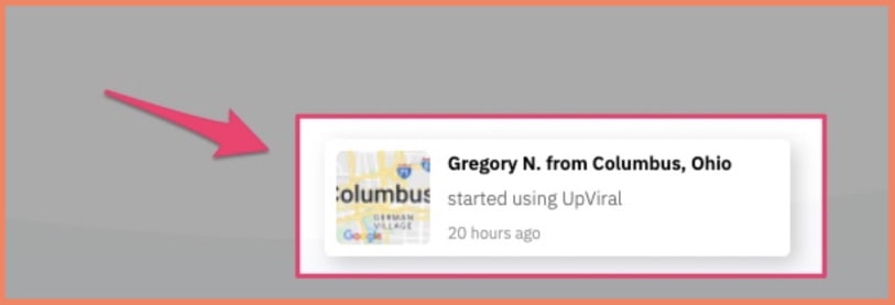
Live sales notifications play on shoppers' fear of missing out and reinforce social validation to persuade them to complete their purchases.
However, fake sales alerts are a colossal mistake.
Shoppers can see through the charade, and you won't want them to see you as untrustworthy.
3. Offering cross-sell offers outside the 10% to 50% range
Cross-selling products that are above customers' budget is a huge mistake.
The price of the product they add to the cart can give you an easy clue of how much they're willing to spend.
Suggest products within their budget will stand a chance to convert, and we recommend products between 10% to 50% of the main product’s price.
Anything higher than that price range is tempting fate.
Of course, recommending a $100 product to a shopper who added a $10 item to the cart is a big ask.
It doesn’t even make sense. It’s one of the easiest ways to lose the sale.
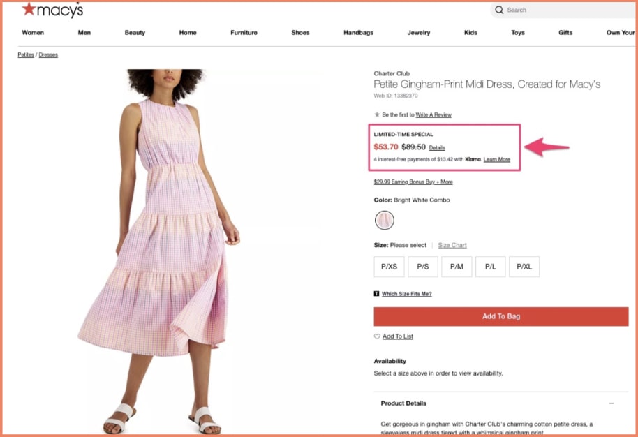
Macy's probably understands how ineffective the practice is, so it often recommends products that have comparable prices with the items buyers added to the cart .
For instance, the brand suggested clothes with prices ranging between $33.99 to $64.75 when I added a $53.70 Charter Club Petite Gingham-Print Midi Dress to my cart.

Below is the product I added to my cart.
Here’s another example from The Iconic.
They cross-sell items I might like right on the checkout notification popup; you’ll notice that their prices remain within the product’s 10% to 50% range.
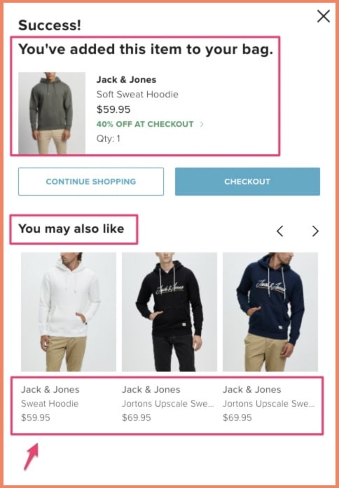
This website has products that sell for significantly higher but won’t show them on this page, knowing the conversions won’t be high.
4. Ignoring assisted shopping (where possible)
Shoppers often get distracted, confused, or need a little nudge when completing checkout.
So, you don't want to leave them feeling stranded at those critical moments.
That’s where assisted eCommerce comes into the picture.
Enable assisted shopping throughout the buying journey to streamline customer experiences, making shopping more convenient and fun.
Make a human customer service agent available or use a chatbot to assist shoppers in real-time and provide support without interrupting the experience.
Also, virtual assistants can guide them through their buying journey and provide hyper-personalized product recommendations.
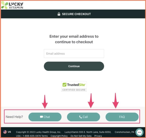
LuckyVitamin uses assisted shopping to make sure buyers complete their purchases.
The health and wellness brand provides helplines right on its uncluttered checkout page.
Shoppers can get instant help through these channels:
- Phone call
- Chatbot
- FAQ for self-assisted customer support
5. Violating tax laws when selling to international buyers
Violating tax regulations is a crime, and you won’t want a face-off with the law.
Make sure you comply with local tax laws.
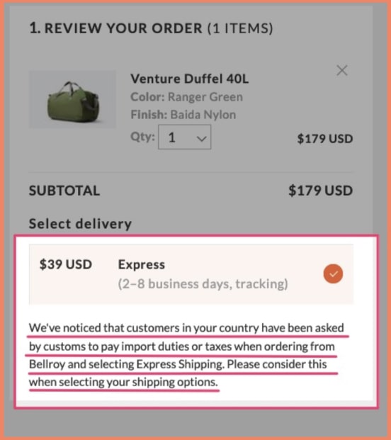
Some countries will require you to pay taxes on the products you ship into the country, including customs fees.
So even if you offer free shipping worldwide, ensure you take care of any taxes or let buyers know they’ll pay the charges the product might incur from arriving at the country's port.
Belroy ensured shoppers from Brazil knew of the customs charge that comes with using express shipping to Brazil.
Not disclosing your product as a sale might get your buyer on the right side of the law, making you lose brand loyalty with them and reducing your chance of repeat sales.
Set clear expectations by detailing these additional fees and the final price payable by the customer.
Consider using third-party fulfillment services to reduce shipping costs and delivery time and improve operating efficiency.
If you want to take this point seriously, hire an experienced eCommerce lawyer to help you take care of any international commerce complexities.
6. Forcing the local language on all site visitors from a country
Not all 30 million tourists who visit Paris speak French.
However, that doesn't mean they won't find services in a language they understand.
In the same fashion, users love eCommerce sites that they can read and understand, and this is not only about the English language.
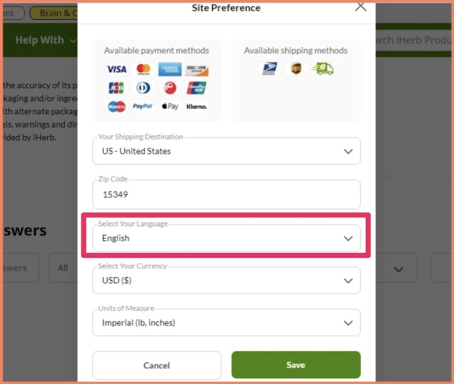
Make your site design responsive to buyers so they can change languages if the default site language is different from the one they understand.
A multilingual website means more customers and more customers equal higher conversion.
Since most eCommerce businesses are buying into this, you must step up your game and build your site to reach broader markets by making it available in several languages.
iHerb caters to its international buyers—the eCommerce brand supports up to 17 languages, allowing customers to shop in their local languages.
7. Not using the scarcity principle to drive urgency
The fear of missing out (FOMO) is one of the primary drivers of impulse buys.
But what’s interesting is that consumers like impulse buying.
In one study, 72% of respondents said impulse buying improved their mood.
So, you’re doing a good thing when you use a message that triggers buyers to act on the spot.
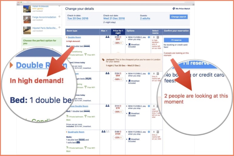
Phrases like "3 items left" and "5 people are looking at this item” help them get decisive.
Copies like that also remind the buyer that the product might be off the shelf soon, so they must make a decision now.
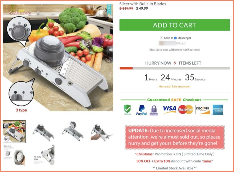
See the “Update,” in this example below, warning buyers that the product is selling out fast.
And then, there’s the time pressure created with the countdown timer, plus the “6 items left” notification on the timer to send a clear message to the buyer to either buy now or miss out.
The mix of a discount offer and time pressure would make it hard for shoppers to ignore the deal.
However, please don't abuse this tactic or lie about your sales performance or product availability.
And don't take it too far. If your product doesn't have this sales activity, don't display it.
Employ other legitimate tactics.
Why?
You can lose buyer trust and brand equity and get yourself in trouble with the law.
For example, the online ticket seller, Viagogo, attracted the attention of the Australian Competition and Consumer Commission (ACCC) when it falsified its marketing message by abusing this tactic.

One-Click Checkout Examples (🏆 Most Popular eCommerce Checkout Optimization Trend)
eCommerce brands with one-page checkout have seen a difference of as much as 21.8%
Want to know why?
Shoppers know exactly what’s required for them to bring their cart home.
A one-page checkout also lets them review their order & information simultaneously, saving them the trouble of checking again and again.
1. Under Armour
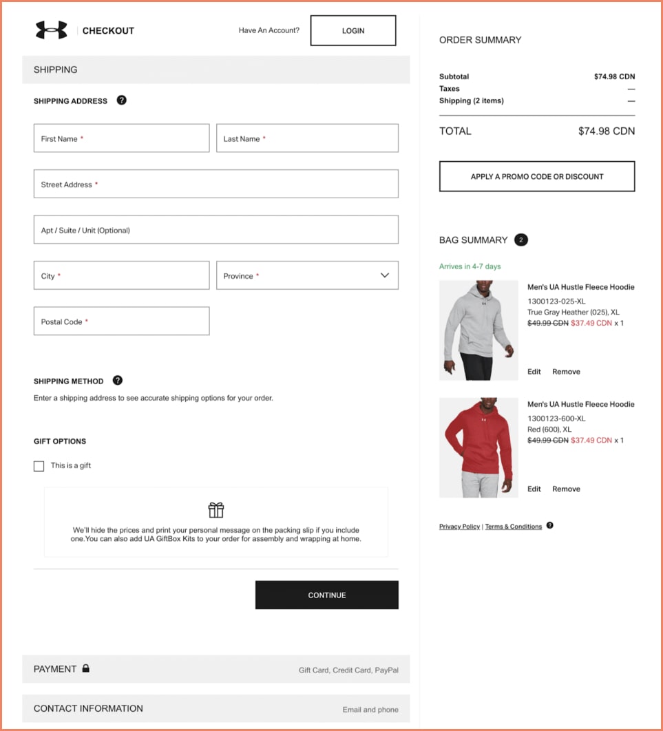
This one-page checkout from Under Armour really does the trick and here’s why.
The simple interface allows you to see your order history, shipping details, and terms and conditions all at the same time.
It even offers gift options right on the checkout page!
2. Threadless

Fun fact: keystroke exhaustion is a thing.
That means that the more a user has to type, the more likely they are to get fatigued and drop off the page.
A simple, three-point, one-page checkout , such as the one in this example from Threadless, is a great way to avoid that.
3. ASOS

Here’s what we love about ASOS: their one-page checkout is committed to making the customer experience easier.
For that, they’ve enabled:
- drop-down menus,
- easy access to promo codes,
- email address,
- shipping & delivery addresses as the same,
- terms & conditions, and
- added an Edit button for the cart.
Pretty impressive overall!
7 Checkout Page Examples to Inspire eCommerce Brands
1. Everlane
A millennial-driven brand, Everlane is known for its modern clothing and accessories.

The Everlane checkout page optimization has a step-driven format with an expandable menu for each.
This allows customers to fill out the checkout page in their own time without being overwhelmed by a barrage of information.
It finally ends with an order review and a prominently placed ‘Place Order’ tab.
What eCommerce checkout optimization stands out: PayPal checkout. These checkouts allow customers to securely make their purchases without having to register with the brand. This gives them the flexibility as well as the ease to actually go ahead and complete the order.
2. Couture Candy
Couture Candy brings together a variety of prom dresses, wedding dresses, and gowns from exclusive designers at affordable prices.

Like Everlane, Couture Candy follows the step-by-step format for their checkout page optimization.
What’s even better is that they have a guest checkout & AmazonPay option on the very first step.
What eCommerce checkout optimization stands out: Guest checkout. One of the biggest motivators in eCommerce is the need for speed — when customers can quickly complete their purchase, they’re more likely to check out and even make repeated purchases.
3. Quip
An oral health company, Quip is known for its people-first messaging as well as its durable range of products.

The checkout page optimization Quip uses is a multi-page checkout flow that is optimized for subscriptions as well as one-time payments.
What’s interesting is that they also offer gifting capabilities and let you fill in different addresses simultaneously, while also offering delivery options.
What eCommerce checkout optimization stands out: Gifting capabilities. A lot of customers turn to eCommerce brands for their gifting solutions. By optimizing for this and providing gift wrapping as well as delivery options, brands can expand their vertical.
4. Chubbies Shorts
Focusing on “radical shorts for the weekend”, Chubbies Shorts goes the extra mile by providing free shipping, exchanges, and guaranteed fits.

This checkout page example is an inspiration for those in the fashion space.
It considers everything by having an editable cart, a clear order summary, and even giving customers the chance to opt for text alerts.
What eCommerce checkout optimization stands out: Editable cart. Especially when it comes to fashion, customers like being able to make changes even at the last moment. By allowing them to change the quantity, and size, and even add/remove items, they help ease the last-minute anxiety that customers sometimes face.
5. Sierra Designs
Established in 1965, Sierra Designs has become a premier vendor of high-performance camping gear and outdoor clothing.

This page quickly captures all the necessary information before moving on to the next step: the payment.
It provides an overview of the order and provides shipping costs for delivery.
What eCommerce checkout optimization stands out: The shipping section. Why? It only asks what’s needed to calculate the shipping cost (also providing free delivery where possible), before customers commit to the total cost. It keeps things transparent.
6. Brandless
Brandless is an omnichannel commerce platform committed to helping people care for themselves.

This checkout page is a classic. It has all the essential elements built on a classic template, yet what’s different about it is the color palette. By maintaining a color palette across the website, they can build it as a brand differentiator for a unique recall proposition like Amazon has in the example below.
What eCommerce checkout optimization stands out: Email/text me with news and offers. Having this capability in place allows the brand to score some emails for their newsletters and then engage customers & drive more value.
7. Samsung
A leading technology brand, Samsung provides cutting-edge electronics ranging from smartphones to home appliances.

The Samsung checkout page is a great example of a brand in the technology space. It offers multiple payment options, prominently displays trust seals, has a modifiable cart section, offers a place for the promo code, and has wishlist capabilities.
What eCommerce checkout optimization stands out: The overall page design. Everything on this page is well-thought-of and accounts for the shoppers’ mentality in the eCommerce electronics space.
Build the Perfect eCommerce Checkout Pages
Now, that you have reached the end of this eCommerce checkout optimization guide, you’re equipped to design checkout pages that see high conversions.
However, to build the perfect checkout page, it’s important to A/B test. Here are free hypotheses to test on the checkout page:
- Is the information in an accurate order?
- Are the form fields deterring experience?
- Are customers feeling safe to pay?
- Are there visual cues for different actions?
- Are there any distractions?
It’s important to fine-tune the eCommerce checkout process optimization. It takes time and constant experimentation.
Once you get it right, you’ll start seeing results and happy customers who will return to shop again.