
eCommerce
Product Page Guide
Design, user experience, examples, templates, and more.

- What is an eCommerce product/product detail page?
- What is the purpose of a product page?
- How do I write an eCommerce product page?
- How do I design my eCommerce product page better?
- Why is product page content so important?
- What should be included in an eCommerce product page?
- Where can I get a product page template?
- Where can I see some great product page examples?
- What are some best practices for ecommerce product pages?
- Why is my product page not converting?
- How do I build an effective mobile product page?
What is an eCommerce product/product detail page?
An eCommerce product page helps shoppers discover the specifics of a product.
The specifics include:
- Name of the product
- Features
- More detailed visuals
- The price component
- Shipping and returns policy,
- Recommendations on similar or complementary products
- Wishlisting options
- Important CTAs such as Add-to-Cart or Notify Me
When optimized well, an eCommerce product/product detail page can bring in more business.
It’s because it poses a win-win situation for you as the brand owner (because you get to make a case for a product and why it can make a difference).
It’s the same for shoppers who’re looking to purchase (because they know more once they’ve been to a product page, they can thereafter make an informed decision).
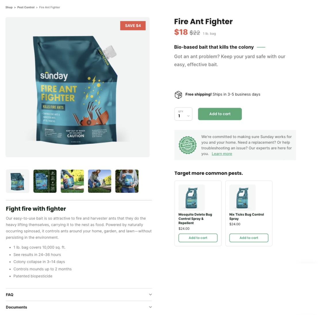
Sunday Lawn Care keeps its product pages relevant and easily skimmable
What is the purpose of a product page?
The main purpose behind creating an eCommerce product page is to help shoppers make the decision to buy.
The in-depth detail of a product page is meant to offer a closer-to-life shopping experience in the absence of a brick-and-mortar store.
Here are a few reasons why a product page exists beyond the function of promoting a brand’s product.
- To create an authentic brand experience (in the absence of an in-store experience)
- To engage the target audience (even if they don’t buy immediately)
- To make browsing more effortless and delightful
- To be a guiding force along the buyer’s journey
- To create a narrative that inspires brand recall
To get your eCommerce product page right is to meet your target audience where they are. And this is why we’ve written down our observations on the elements that create a high-performing product page.
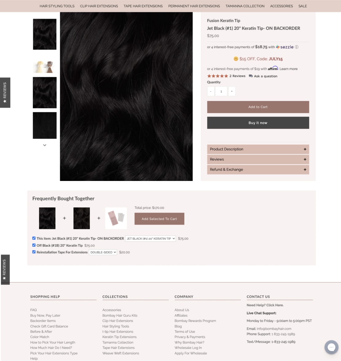
Bombay Hair offers all necessary information upfront
How do I write an eCommerce product page?
The ideal way to put the informational elements of an eCommerce product page together is by putting yourself in the customer’s shoes. Some simple questions to ask before you begin the process are -
- What would help the customer know the product better? (Talk about features and what they do to make the product work in the customer’s favor. A balance of features and benefits is always a great idea.)
- How would the customer know how to use the product? (Detailed instructions on how-to-use can be beneficial especially for categories like cosmetics and technology. For others such as fashion, talking about how a product can be used in various ways or can be paired with other products, can be valuable.)
- What other information about the product would the customer be better off knowing? (The materials used and what can potentially harm the product can be useful. Specific care instructions can also be helpful for the customer to be able to enjoy the product to its fullest.)
- What would help them act on the next steps? (Thinking about what these next steps could be, is a good starting point. For example, a section of shoppers would want to buy the product - so a relevant CTA must be featured. There will also be people who may not want to buy it right away - so introducing a wishlist can be helpful. Giving shoppers the choice to checkout immediately with the specific product and to continue shopping is also essential.)
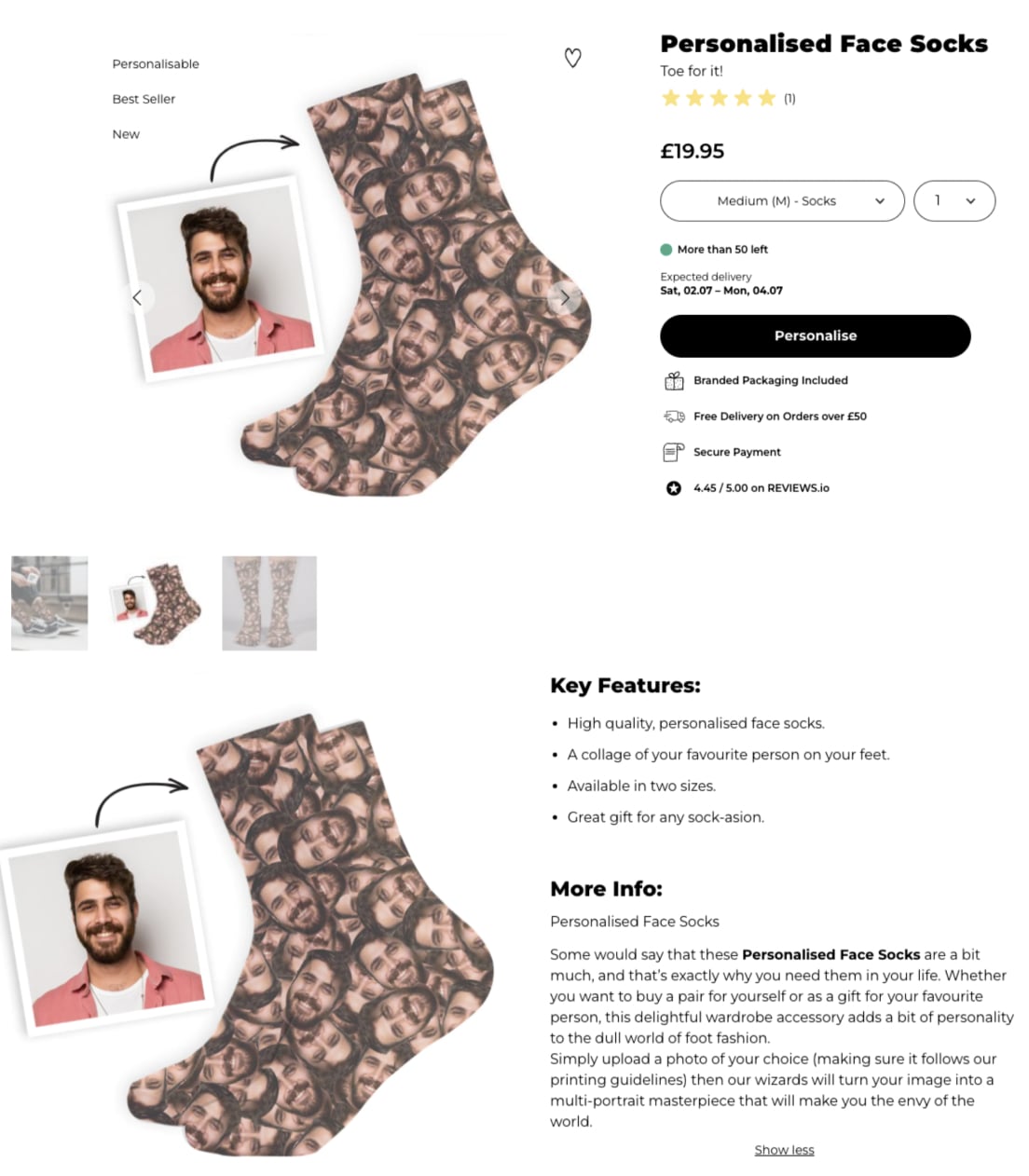
Firebox crafts a clear and interesting narrative through snappy copy
How do I design my eCommerce product page better?
The main principle that you can fall back on to design your eCommerce product pages better is user experience.
When it comes to product pages, good UX amounts to the user getting the information they need (price, visuals, how much to pay, applicable discounts) in one quick glance.
However, put to practice it’s more complex because users have many reasons to land up on a product page.
Some could be browsing product information in-depth before they make the final decision to buy.
Some may already know they want the product but aren’t ready to buy it yet.
And there would still be others, who might be jumping from one product page to another to get a better sense of the brand.
As a business leader though, you’ll have to assume the ideal scenario - that a customer lands up on your product page, finds it worth their time and is inspired enough to convert sooner than later.
You’ll have to design your eCommerce product page keeping this in mind.
But if during A/B testing, it turns out that your product page design isn’t user friendly, you may have to look at creating
- High quality product images that clarify from every angle what the product looks like and what it might be like to use it.
- Easy navigation that enables shoppers to visit other parts of your website, including other product pages.
- Information layering based on what you want the shopper to take away and how you want them to act (the idea is obviously for them to convert in as short a time frame as possible).
- Optimization specifically for mobile to help mobile users convert faster and with lesser doubt.
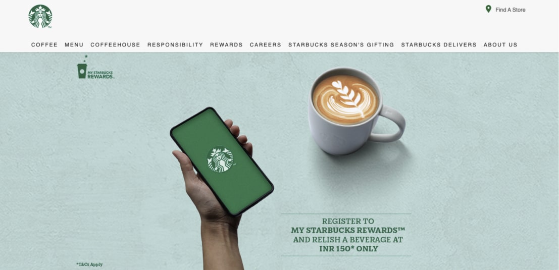

Starbucks gets a lot of design aspects right through their desktop & mobile sites
Why is product page content so important?
While the main idea behind an eCommerce product page is to drive ease in purchasing, good product page content helps propel some less obvious aspects as well.
Here are five aspects we’ve consistently come across while working with small and big brands alike.
One of them is brand building. In the absence of an in-person, in-store, brick-and-mortar experience, a product page establishes why a shopper can trust your brand.
Your approach on your eCommerce product page, textually and visually, conveys what your brand stands for and why it will be able to solve at least some of the problems a shopper comes with.
Your product page content also helps in establishing the authority you hold in the category your business is in.
For example, if you have a fair refund and return policy, it goes on to speak directly about how you transact and do business.
Then, product page content is also essential for establishing customer focus.
If the elements in your product page help the shopper act immediately with the least amount of friction, you have a winner in your hands.
Product pages also invariably help optimizing your eCommerce store and improving your website search rankings, when done well.
For example, a shopper has a very specific product query, which when read by Google, throws up one of your product pages as a result.
The chances of them converting become even higher if your product page is right up there in the results. And this means with relevant content on a product page, your eStore has chances of ranking higher.
Finally, product page content is super relevant because it can potentially help customers stay on course with their buying journey on your eCommerce website.
It can help in reducing cart abandonment by offering shoppers more reason to continue browsing or head straight to make a purchase - by telling a good brand story, by engaging through stunning visuals and by recommending related products that a shopper would be interested in.
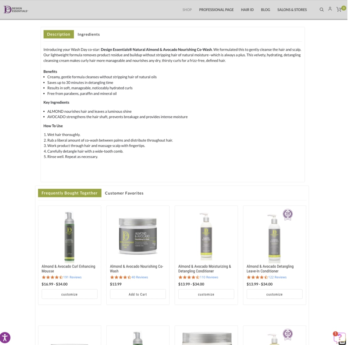
Design Essentials ensures shoppers find their product page content super relevant
Here’s a round-up of the most important eCommerce metrics that will help you maximize the changes you run to make your product pages more worthwhile.
What should be included in an eCommerce product page?
Product pages are custodians of a superlative brand experience.
While the homepage is often treated as the main gateway to the rest of your eCommerce store, product pages serve multiple purposes - that of building a brand, answering the customer’s questions and bringing them closest to an actual purchase.
And this is why several elements come together to create a cohesive, memorable experience for the shopper while they are on your product page.
The following are some of the indispensable ones that invariably heighten user experience and improve conversions.
- Relevant product and product-in-use photography (to offer a life-like experience)
- A relevant product name (that reflects the brand while standing out from competition)
- Detailed product description (that also tells a story)
- A relevant and prominent CTA (to make the copy compelling/creative)
- Clear pricing, discount and/or offer details (to keep things super transparent)
- Shipping cost (& even if it’s free!) and returns/refund details
- Quantity picker (make this one prominent)
- Wishlisting options (for shoppers to come back later)
- Color & size variants (thumbnails > text)
- Size guide (if applicable)
- Trust badges (especially if the product is highly technical or fragile)
- Live chat (but don’t interrupt)
- Link to detailed FAQ page (to offer deeper understanding)
- Customer reviews and testimonials (because social proof help conversions)
- The option to write a review (and deepen engagement with your brand)
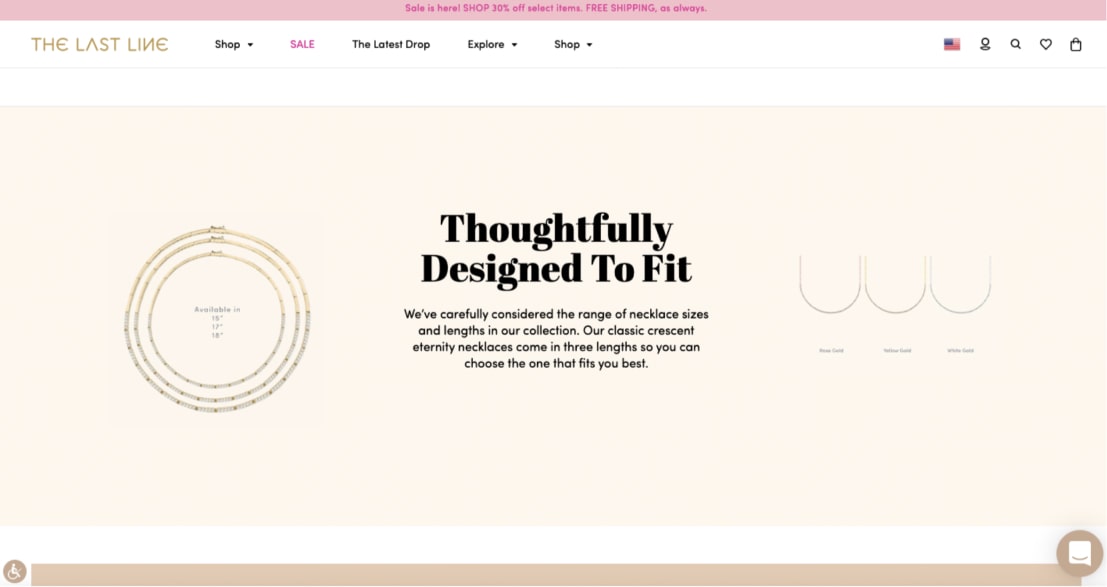
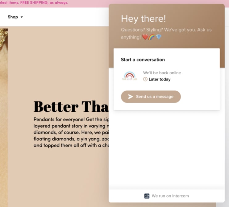
The Last Line throws in a lot of their brand individuality into their product pages while being functional
Sounds like something you would want to know more deeply? Read 23 proven ways to increase product page conversions for richer insights.
Where can I get a product page template?
It’s a great question to ask when you’re starting to make changes to your eCommerce storefront for better conversions.
The good news is that there are a host of great free and paid templates to choose from.
However, what’s interesting is that a template does not mean much by itself.
It offers a structure and layout for you to put your page elements together.
Now, if that’s making you wonder why we are talking about templates at all, we hear you.
In our attempt to help clients come up with super effective product pages, we’ve found that every template has a takeaway worth considering.
Right from how you place your CTA buttons to how you craft your product descriptions to how efficiently you make use of above-the-fold space.
Here are a few ways to know if a product page template will help you move a step forward or not. It would tell you how to -
- Maximize the effectiveness of your photo gallery
- Guide users through compelling CTAs and descriptions
- Recommend products that would seem highly relevant to the shopper
- Use emotion in weaving a story that’ll make your brand more sticky
- Showcase reviews in a way that influences the shopper
- Talk about features that matter the most
…and a host of other things.
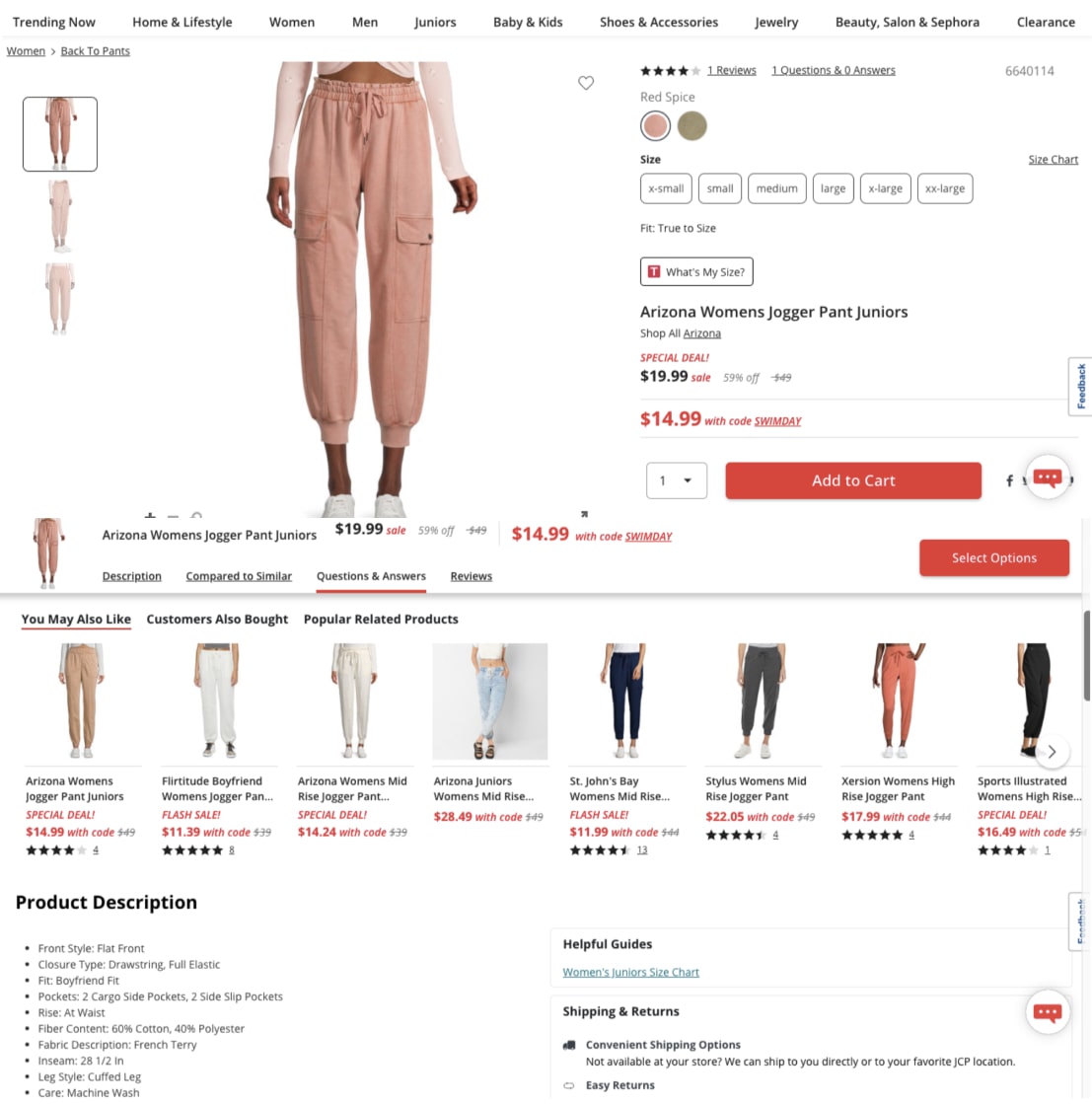
JC Penney keeps building on their product page context as a shopper keeps scrolling
But to cut to the chase, we’ve rounded up the best templates that can offer you a peek into world-class product page design, while inspiring you to supercharge your current product page design.
Where can I see some great product page examples?
Right here, where you will not only find some well-defined examples but also takeaways that you can immediately implement to make your own eCommerce product pages gain more traction.
What are some best practices for ecommerce product pages?
There are quite a few best practices to ensure your customers don’t drop off your product pages.
Here’s a quick round-up of what we think can elevate your eCommerce product page with just a few tweaks.
- Relevant copy that exudes emotion. Because even though customers are on the hunt for precise features and specifications, they want to be told how a product will make their lives better.
- Images that bring the product to life. In the absence of a real store experience, shoppers want to get as close to tangibly feeling into a product as possible.
- And great images amounting to a 360 degree view can contribute to something closer to lived experience.
- Complete transparency in terms of policies. No half-hidden terms and conditions around pricing, shipping, refunds and returns, please.
- Inspiring and compelling CTAs. And we’re talking about the placement, the color blocking, the words used and the contextual relevance.
- Personalized product recommendations that warrant exploration. After all, cross-sells and upsells can increase the average order value, but how you display them is crucial.
Knowing the mistakes that can drive customers away while building your eCommerce product page content can also be equally valuable.
Why is my product page not converting?
Getting to make your product page convert can be a tough task. But once you remember people take just about 50 milliseconds to respond to a good first impression, you would want to look into what would make your product pages work harder.
But to help with that, here’s a quick glimpse at some of the most common reasons why product pages fail to convert -
- Lack of trust in the brand and/or product
- The copy fails to convey a convincing narrative
- The pricing does not seem fair or competitive
- The value proposition does not come out instantly
- Your cross-sell and upsell tactics seem far-fetched
- The UX does not cater to the ease of mobile users
There are also many other nuanced problems at work when it comes to product pages not converting.
And if there are problems, there must be ways to troubleshoot too, some of which we’ll share with you right away
- Introduce trust symbols (and make sure they’re easily recognizable)
- Write copy that ties the product with the brand and the bigger picture
- Work around to create pricing structures that align you with that of competitors
- Make the value proposition visible as soon as they land on the page
- Find ways to make smarter product recommendations
- Don’t just optimize for mobile - build for mobile!
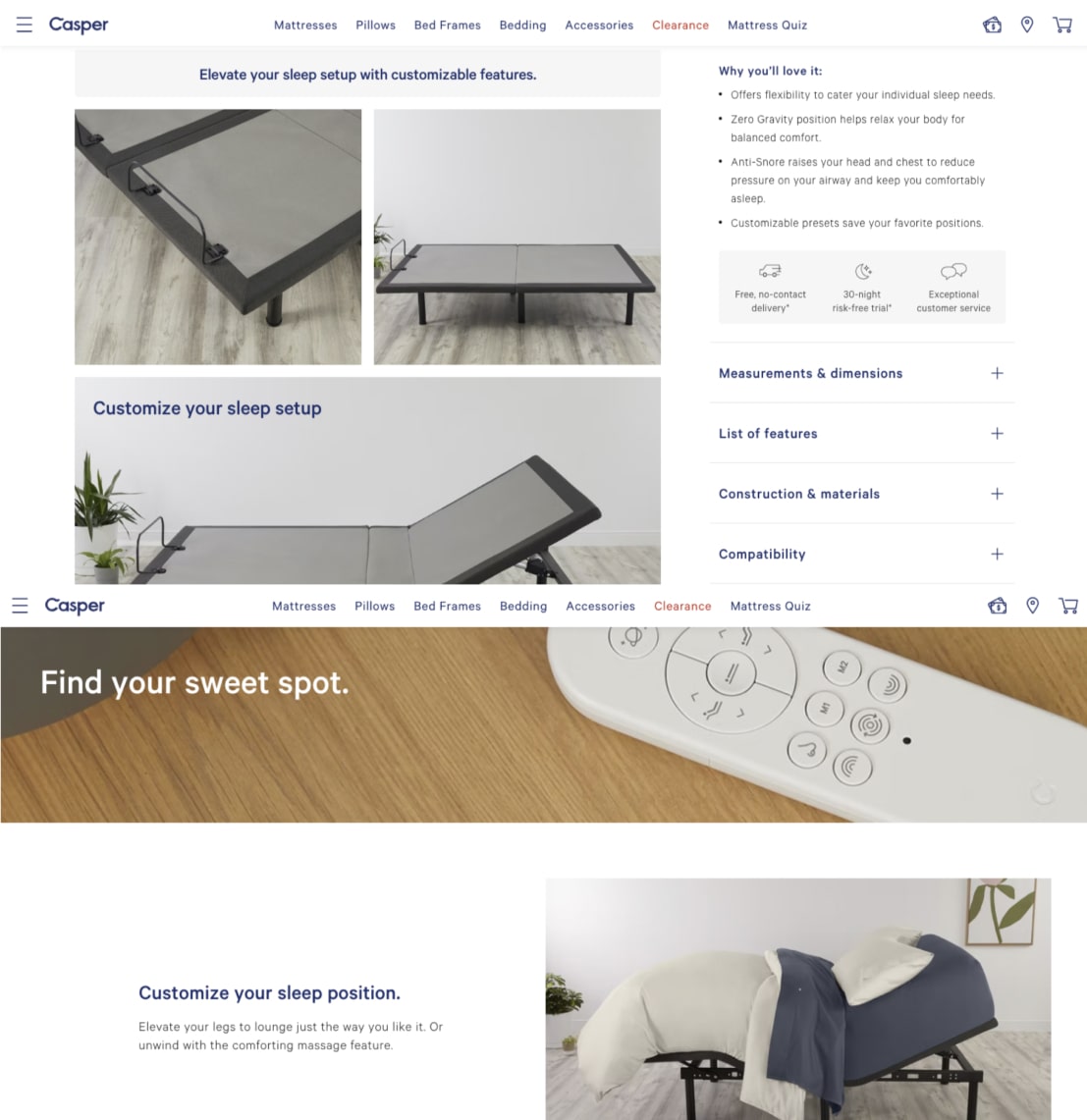
Casper offers all the right reasons to shoppers to want to buy
Since there’s a whole lot more to know about low conversions and how each problem can be resolved, we’ve put together a piece that integrates our deepest learnings on why product pages don’t convert.
How do I build an effective mobile product page?
The answer to this question is simple, and also, not simple.
The simple part is where you dig deeper into why you need to think differently to optimize your mobile product pages.
The main reason why you need to build specifically for mobile is because mobile users behave differently than desktop users. For one, mobile users are always on-the-go.
This is a good thing because 46% of mobile shoppers claim that they do their research first on mobile and then pick a product from the store, if required.
The not-so-simple part is where you need to break down the motivations behind these user behaviors to arrive at scalable strategies that will work in the long run.
Here are a few suggestions that we’ve often shared with clients to great success.
- Make your copy have a story that also reflects quick takeaways
- Create less friction by incorporating strategies that work for “touch”
- Convey less through words, and more through indicative symbols & signals
- Use features that immediately lessen effort (like autosuggest)
- Introduce thumbnails to create more visual context for shoppers
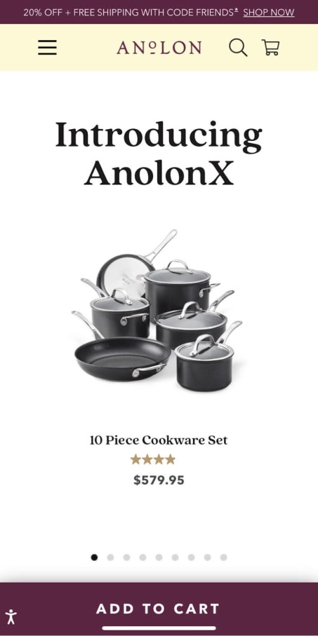
Anolon keeps their product pages crisp - and equally accessible on mobile!
To tell you the truth, this is just the tip of the iceberg. Here’s a thorough round-up of our learnings at what can truly help you pin the effectiveness of a mobile product page.